ServiceNow CAS – Performance Analytics (PA) Exam Questions Total Questions: 272 – 5 Mock Exams
Practice Set 1
Time limit: 0
0 of 60 questions completed
Questions:
1
2
3
4
5
6
7
8
9
10
11
12
13
14
15
16
17
18
19
20
21
22
23
24
25
26
27
28
29
30
31
32
33
34
35
36
37
38
39
40
41
42
43
44
45
46
47
48
49
50
51
52
53
54
55
56
57
58
59
60
Information
Click on Start Test
You have already completed the Test before. Hence you can not start it again.
Test is loading...
You must sign in or sign up to start the Test.
You have to finish following quiz, to start this Test:
Your results are here!! for" ServiceNow CAS - Performance Analytics (PA) Practice Test 1 "
0 of 60 questions answered correctly
Your time:
Time has elapsed
Your Final Score is : 0
You have attempted : 0
Number of Correct Questions : 0 and scored 0
Number of Incorrect Questions : 0 and Negative marks 0
Average score
Your score
ServiceNow CAS - Performance Analytics (PA)
You have attempted: 0
Number of Correct Questions: 0 and scored 0
Number of Incorrect Questions: 0 and Negative marks 0
You can review your answers by clicking on “View Answers” option. Important Note : Open Reference Documentation Links in New Tab (Right Click and Open in New Tab).
1
2
3
4
5
6
7
8
9
10
11
12
13
14
15
16
17
18
19
20
21
22
23
24
25
26
27
28
29
30
31
32
33
34
35
36
37
38
39
40
41
42
43
44
45
46
47
48
49
50
51
52
53
54
55
56
57
58
59
60
Answered
Review
Question 1 of 60
1. Question
Which of the following is NOT related to the breakdown type?
Correct
Correct: C. Peer Groups
Detail: Peer Groups is NOT a standard, pre-defined Breakdown Type or Breakdown Relation Type used out-of-the-box in ServiceNow Performance Analytics (PA), especially when dealing with hierarchical data like Assignment Groups. While the term describes a logical relationship, the built-in PA functionality for navigating related breakdown elements focuses on the established hierarchical relationships.
Incorrect: A. Child Groups
Detail: Child Groups is a type of relationship that can be established using Breakdown Relations. This allows users to drill down from a Parent Group to all its direct Child Groups, enabling hierarchical navigation and filtering within the Analytics Hub or a dashboard.
Incorrect: B. Sibling Groups
Detail: Sibling Groups is a type of relationship that can be established using Breakdown Relations. This relation is used to show other elements at the same hierarchical level (siblings) as the currently selected breakdown element, which is a common requirement when navigating group hierarchies.
Incorrect: D. Parent Group
Detail: Parent Group is a type of relationship that is fundamental to hierarchical breakdowns, often implemented using Breakdown Relations or directly using the Parent field on the sys_user_group table as the basis for a breakdown. This allows users to navigate up the hierarchy from a Child Group to its direct Parent Group.
Incorrect
Correct: C. Peer Groups
Detail: Peer Groups is NOT a standard, pre-defined Breakdown Type or Breakdown Relation Type used out-of-the-box in ServiceNow Performance Analytics (PA), especially when dealing with hierarchical data like Assignment Groups. While the term describes a logical relationship, the built-in PA functionality for navigating related breakdown elements focuses on the established hierarchical relationships.
Incorrect: A. Child Groups
Detail: Child Groups is a type of relationship that can be established using Breakdown Relations. This allows users to drill down from a Parent Group to all its direct Child Groups, enabling hierarchical navigation and filtering within the Analytics Hub or a dashboard.
Incorrect: B. Sibling Groups
Detail: Sibling Groups is a type of relationship that can be established using Breakdown Relations. This relation is used to show other elements at the same hierarchical level (siblings) as the currently selected breakdown element, which is a common requirement when navigating group hierarchies.
Incorrect: D. Parent Group
Detail: Parent Group is a type of relationship that is fundamental to hierarchical breakdowns, often implemented using Breakdown Relations or directly using the Parent field on the sys_user_group table as the basis for a breakdown. This allows users to navigate up the hierarchy from a Child Group to its direct Parent Group.
Unattempted
Correct: C. Peer Groups
Detail: Peer Groups is NOT a standard, pre-defined Breakdown Type or Breakdown Relation Type used out-of-the-box in ServiceNow Performance Analytics (PA), especially when dealing with hierarchical data like Assignment Groups. While the term describes a logical relationship, the built-in PA functionality for navigating related breakdown elements focuses on the established hierarchical relationships.
Incorrect: A. Child Groups
Detail: Child Groups is a type of relationship that can be established using Breakdown Relations. This allows users to drill down from a Parent Group to all its direct Child Groups, enabling hierarchical navigation and filtering within the Analytics Hub or a dashboard.
Incorrect: B. Sibling Groups
Detail: Sibling Groups is a type of relationship that can be established using Breakdown Relations. This relation is used to show other elements at the same hierarchical level (siblings) as the currently selected breakdown element, which is a common requirement when navigating group hierarchies.
Incorrect: D. Parent Group
Detail: Parent Group is a type of relationship that is fundamental to hierarchical breakdowns, often implemented using Breakdown Relations or directly using the Parent field on the sys_user_group table as the basis for a breakdown. This allows users to navigate up the hierarchy from a Child Group to its direct Parent Group.
Question 2 of 60
2. Question
Which Widget category contains the Cascading Filter widget?
Correct
Correct: C. Interactive Filters
Detail: The Cascading Filter widget is part of the Interactive Filters category in ServiceNow Performance Analytics (PA) dashboards. Interactive Filters allow users to filter the data displayed in multiple reports and PA widgets on a dashboard simultaneously based on the selections made in the filter. Cascading Filters specifically enable a parent-child relationship between filters, where the selection in one filter dynamically limits the options available in the next.
Incorrect: A. Reports
Detail: The “Reports“ category in the widget picker refers to the list of traditional ServiceNow reports that can be added to a dashboard. While the Cascading Filter widget affects these reports by filtering their data, the filter widget itself is a separate type of widget, which is categorized under Interactive Filters.
Incorrect: B. Reporting Filters
Detail: While the Cascading Filter is a tool that filters reporting data, “Reporting Filters“ is not the precise name of the widget category in the ServiceNow dashboard widget selection menu. The correct category name is Interactive Filters.
Incorrect: D. Performance Analytics
Detail: The “Performance Analytics“ category contains widgets that display time series data, scores, and breakdowns derived from the PA collection process (e.g., Score, Time Series, Breakdown widgets). Although the Cascading Filter widget is used on PA dashboards and influences PA widgets, it is functionally grouped with the other filter types under the Interactive Filters category, not the primary PA data visualization category.
Incorrect
Correct: C. Interactive Filters
Detail: The Cascading Filter widget is part of the Interactive Filters category in ServiceNow Performance Analytics (PA) dashboards. Interactive Filters allow users to filter the data displayed in multiple reports and PA widgets on a dashboard simultaneously based on the selections made in the filter. Cascading Filters specifically enable a parent-child relationship between filters, where the selection in one filter dynamically limits the options available in the next.
Incorrect: A. Reports
Detail: The “Reports“ category in the widget picker refers to the list of traditional ServiceNow reports that can be added to a dashboard. While the Cascading Filter widget affects these reports by filtering their data, the filter widget itself is a separate type of widget, which is categorized under Interactive Filters.
Incorrect: B. Reporting Filters
Detail: While the Cascading Filter is a tool that filters reporting data, “Reporting Filters“ is not the precise name of the widget category in the ServiceNow dashboard widget selection menu. The correct category name is Interactive Filters.
Incorrect: D. Performance Analytics
Detail: The “Performance Analytics“ category contains widgets that display time series data, scores, and breakdowns derived from the PA collection process (e.g., Score, Time Series, Breakdown widgets). Although the Cascading Filter widget is used on PA dashboards and influences PA widgets, it is functionally grouped with the other filter types under the Interactive Filters category, not the primary PA data visualization category.
Unattempted
Correct: C. Interactive Filters
Detail: The Cascading Filter widget is part of the Interactive Filters category in ServiceNow Performance Analytics (PA) dashboards. Interactive Filters allow users to filter the data displayed in multiple reports and PA widgets on a dashboard simultaneously based on the selections made in the filter. Cascading Filters specifically enable a parent-child relationship between filters, where the selection in one filter dynamically limits the options available in the next.
Incorrect: A. Reports
Detail: The “Reports“ category in the widget picker refers to the list of traditional ServiceNow reports that can be added to a dashboard. While the Cascading Filter widget affects these reports by filtering their data, the filter widget itself is a separate type of widget, which is categorized under Interactive Filters.
Incorrect: B. Reporting Filters
Detail: While the Cascading Filter is a tool that filters reporting data, “Reporting Filters“ is not the precise name of the widget category in the ServiceNow dashboard widget selection menu. The correct category name is Interactive Filters.
Incorrect: D. Performance Analytics
Detail: The “Performance Analytics“ category contains widgets that display time series data, scores, and breakdowns derived from the PA collection process (e.g., Score, Time Series, Breakdown widgets). Although the Cascading Filter widget is used on PA dashboards and influences PA widgets, it is functionally grouped with the other filter types under the Interactive Filters category, not the primary PA data visualization category.
Question 3 of 60
3. Question
What ‘related lists‘ are available on the formula indicator form? Select 3 Answers from the below options.
Correct
Correct: A. Breakdowns
Detail: The Breakdowns related list allows you to specify the breakdown relationships for the formula indicator. Breakdowns are dimensions (like Assignment Group, Priority, or Location) that you can use to split indicator scores into smaller, more granular segments for analysis. You must add breakdowns here to be able to analyze the formula indicator‘s scores across different breakdown elements.
Correct: B. Contributing Indicators
Detail: The Contributing Indicators related list is unique to Formula Indicators. It lists all the base (automated or manual) indicators that are referenced within the formula statement defined for the formula indicator. This list provides an easy way to view and navigate to the indicators whose scores are used in the calculation of the formula indicator‘s score.
Correct: D. Targets
Detail: The Targets related list allows you to define desired performance goals for the formula indicator. Targets can be set to track the formula indicator‘s performance against expected values, and they can be configured with specific start dates, review dates, and optional application to specific breakdown elements.
Incorrect: C. Signals
Detail: Signals is a feature related to the ServiceNow Predictive Intelligence (specifically the Anomaly Detection capability) and is typically managed or viewed through the Analytics Hub or specific Anomaly Detection related lists or tables, but it is not an out-of-the-box related list found on the standard Formula Indicator form for configuration purposes.
Incorrect
Correct: A. Breakdowns
Detail: The Breakdowns related list allows you to specify the breakdown relationships for the formula indicator. Breakdowns are dimensions (like Assignment Group, Priority, or Location) that you can use to split indicator scores into smaller, more granular segments for analysis. You must add breakdowns here to be able to analyze the formula indicator‘s scores across different breakdown elements.
Correct: B. Contributing Indicators
Detail: The Contributing Indicators related list is unique to Formula Indicators. It lists all the base (automated or manual) indicators that are referenced within the formula statement defined for the formula indicator. This list provides an easy way to view and navigate to the indicators whose scores are used in the calculation of the formula indicator‘s score.
Correct: D. Targets
Detail: The Targets related list allows you to define desired performance goals for the formula indicator. Targets can be set to track the formula indicator‘s performance against expected values, and they can be configured with specific start dates, review dates, and optional application to specific breakdown elements.
Incorrect: C. Signals
Detail: Signals is a feature related to the ServiceNow Predictive Intelligence (specifically the Anomaly Detection capability) and is typically managed or viewed through the Analytics Hub or specific Anomaly Detection related lists or tables, but it is not an out-of-the-box related list found on the standard Formula Indicator form for configuration purposes.
Unattempted
Correct: A. Breakdowns
Detail: The Breakdowns related list allows you to specify the breakdown relationships for the formula indicator. Breakdowns are dimensions (like Assignment Group, Priority, or Location) that you can use to split indicator scores into smaller, more granular segments for analysis. You must add breakdowns here to be able to analyze the formula indicator‘s scores across different breakdown elements.
Correct: B. Contributing Indicators
Detail: The Contributing Indicators related list is unique to Formula Indicators. It lists all the base (automated or manual) indicators that are referenced within the formula statement defined for the formula indicator. This list provides an easy way to view and navigate to the indicators whose scores are used in the calculation of the formula indicator‘s score.
Correct: D. Targets
Detail: The Targets related list allows you to define desired performance goals for the formula indicator. Targets can be set to track the formula indicator‘s performance against expected values, and they can be configured with specific start dates, review dates, and optional application to specific breakdown elements.
Incorrect: C. Signals
Detail: Signals is a feature related to the ServiceNow Predictive Intelligence (specifically the Anomaly Detection capability) and is typically managed or viewed through the Analytics Hub or specific Anomaly Detection related lists or tables, but it is not an out-of-the-box related list found on the standard Formula Indicator form for configuration purposes.
Question 4 of 60
4. Question
What could be the potential reasons for a Performance Analytics Widget not following the Dashboard Breakdown Source? Select 3 answers
Correct
Correct: A. ‘Follow Element‘ is not checked in the Widget data settings
Detail: For a widget to respond to a dashboard breakdown selection (which is a form of an element selection), the ‘Follow Element‘ setting must be enabled in the widget‘s configuration. If this setting is unchecked, the widget will not automatically filter its data based on the selection made in the breakdown component, thus ignoring the Dashboard Breakdown Source.
Correct: D. The Indicator in the Widget has no configured Breakdowns
Detail: A breakdown source is applied to an indicator to segment its scores. If the Indicator being used by the widget does not have a Breakdown configured (meaning the breakdown is not linked to the indicator), the widget cannot filter or slice the indicator‘s scores based on that breakdown source, even if the widget is set to follow the element.
Correct: E. The Widget is prevented from seeing the data due to Element security
Detail: Performance Analytics uses Breakdown Element Security to restrict which breakdown elements (e.g., specific assignment groups or locations) a user can view. If the user does not have permission to view the breakdown element that is currently selected on the dashboard, the widget will fail to display the filtered data, effectively “not following“ the breakdown source.
Incorrect: B. The Widget is configured to follow an Interactive Filter
Detail: Being configured to follow an Interactive Filter is a different mechanism from following a Dashboard Breakdown Source. A widget can be configured to follow both. The configuration of an Interactive Filter does not inherently prevent a widget from following a dashboard breakdown; they are designed to work together to filter the data.
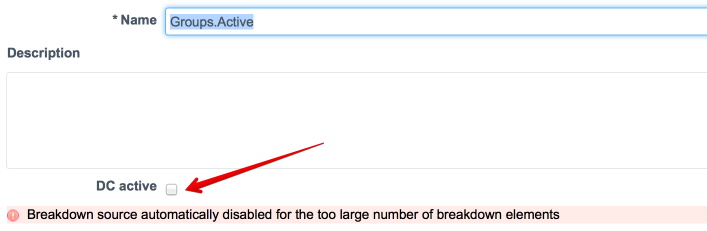
Incorrect: C. The Breakdown Source is not Active
Detail: If a Breakdown Source is not Active, it means data collection for that breakdown is likely halted or never initiated, and its breakdown elements would not be properly populated or available. While this would certainly cause issues with the breakdown itself, the question asks about the Widget not following the Dashboard Breakdown Source. In a scenario where the source is inactive, a user would likely not be able to even select an element from that source on the dashboard, making this a root data issue rather than a widget configuration or security reason for not following a selection that was made. The indicator not having a configured breakdown (Option D) is a more direct reason why the relationship between the dashboard filter and the widget would fail.
Incorrect
Correct: A. ‘Follow Element‘ is not checked in the Widget data settings
Detail: For a widget to respond to a dashboard breakdown selection (which is a form of an element selection), the ‘Follow Element‘ setting must be enabled in the widget‘s configuration. If this setting is unchecked, the widget will not automatically filter its data based on the selection made in the breakdown component, thus ignoring the Dashboard Breakdown Source.
Correct: D. The Indicator in the Widget has no configured Breakdowns
Detail: A breakdown source is applied to an indicator to segment its scores. If the Indicator being used by the widget does not have a Breakdown configured (meaning the breakdown is not linked to the indicator), the widget cannot filter or slice the indicator‘s scores based on that breakdown source, even if the widget is set to follow the element.
Correct: E. The Widget is prevented from seeing the data due to Element security
Detail: Performance Analytics uses Breakdown Element Security to restrict which breakdown elements (e.g., specific assignment groups or locations) a user can view. If the user does not have permission to view the breakdown element that is currently selected on the dashboard, the widget will fail to display the filtered data, effectively “not following“ the breakdown source.
Incorrect: B. The Widget is configured to follow an Interactive Filter
Detail: Being configured to follow an Interactive Filter is a different mechanism from following a Dashboard Breakdown Source. A widget can be configured to follow both. The configuration of an Interactive Filter does not inherently prevent a widget from following a dashboard breakdown; they are designed to work together to filter the data.
Incorrect: C. The Breakdown Source is not Active
Detail: If a Breakdown Source is not Active, it means data collection for that breakdown is likely halted or never initiated, and its breakdown elements would not be properly populated or available. While this would certainly cause issues with the breakdown itself, the question asks about the Widget not following the Dashboard Breakdown Source. In a scenario where the source is inactive, a user would likely not be able to even select an element from that source on the dashboard, making this a root data issue rather than a widget configuration or security reason for not following a selection that was made. The indicator not having a configured breakdown (Option D) is a more direct reason why the relationship between the dashboard filter and the widget would fail.
Unattempted
Correct: A. ‘Follow Element‘ is not checked in the Widget data settings
Detail: For a widget to respond to a dashboard breakdown selection (which is a form of an element selection), the ‘Follow Element‘ setting must be enabled in the widget‘s configuration. If this setting is unchecked, the widget will not automatically filter its data based on the selection made in the breakdown component, thus ignoring the Dashboard Breakdown Source.
Correct: D. The Indicator in the Widget has no configured Breakdowns
Detail: A breakdown source is applied to an indicator to segment its scores. If the Indicator being used by the widget does not have a Breakdown configured (meaning the breakdown is not linked to the indicator), the widget cannot filter or slice the indicator‘s scores based on that breakdown source, even if the widget is set to follow the element.
Correct: E. The Widget is prevented from seeing the data due to Element security
Detail: Performance Analytics uses Breakdown Element Security to restrict which breakdown elements (e.g., specific assignment groups or locations) a user can view. If the user does not have permission to view the breakdown element that is currently selected on the dashboard, the widget will fail to display the filtered data, effectively “not following“ the breakdown source.
Incorrect: B. The Widget is configured to follow an Interactive Filter
Detail: Being configured to follow an Interactive Filter is a different mechanism from following a Dashboard Breakdown Source. A widget can be configured to follow both. The configuration of an Interactive Filter does not inherently prevent a widget from following a dashboard breakdown; they are designed to work together to filter the data.
Incorrect: C. The Breakdown Source is not Active
Detail: If a Breakdown Source is not Active, it means data collection for that breakdown is likely halted or never initiated, and its breakdown elements would not be properly populated or available. While this would certainly cause issues with the breakdown itself, the question asks about the Widget not following the Dashboard Breakdown Source. In a scenario where the source is inactive, a user would likely not be able to even select an element from that source on the dashboard, making this a root data issue rather than a widget configuration or security reason for not following a selection that was made. The indicator not having a configured breakdown (Option D) is a more direct reason why the relationship between the dashboard filter and the widget would fail.
Question 5 of 60
5. Question
Select the valid Reporting Properties below. Choose 3 answers
Correct
Correct: C. Maximum number of choices for radio button and checkbox interactive filters
Detail: This is a valid system property related to the reporting and dashboard features in ServiceNow. The property name is typically glide.homepage_interactivity.ui_ctrls_max_display_options. It controls the maximum number of options (choices) displayed in radio button and checkbox-style Interactive Filters before the filter control switches to a different display method or truncates the list.
Correct: D. Open drilldown information in new tab or window
Detail: This is controlled by a valid system property, often glide.chart.drill.open_new_win, found in the Reports > Administration > Properties module. When enabled, clicking a chart item in a report or widget will open the resulting detailed list of records in a new browser tab or window instead of overwriting the current page.
Correct: E. Use new report Designer
Detail: This is a property that controls which interface users see when creating or editing a report. The property, often found under Reports > Administration > Properties, allows the administrator to enable or disable the Report Designer (the modern, four-section interface: Data, Type, Configure, Style) for users with report creation permissions.
Incorrect: A. Number of minutes that widgets are cached in the browser, for responsive dashboards
Detail: While dashboard caching properties exist (e.g., controlling cache timeout for a dashboard tab), the phrasing “Number of minutes that widgets are cached in the browser“ is not a direct, standard, single reporting property. Widget caching is complex and often controlled by various internal mechanisms or properties like com.glide.dashboard.cache.timeout_in_seconds for the dashboard cache itself, but this specific option is not a recognized, singular property title for the given options.
Incorrect: B. Enable responsive dashboard
Detail: Responsive dashboards are the default dashboard experience in modern ServiceNow instances (replacing the older non-responsive homepages). There is generally no single property named “Enable responsive dashboard“ that an admin needs to check because the functionality is platform-level and enabled by default for new dashboards.
Incorrect
Correct: C. Maximum number of choices for radio button and checkbox interactive filters
Detail: This is a valid system property related to the reporting and dashboard features in ServiceNow. The property name is typically glide.homepage_interactivity.ui_ctrls_max_display_options. It controls the maximum number of options (choices) displayed in radio button and checkbox-style Interactive Filters before the filter control switches to a different display method or truncates the list.
Correct: D. Open drilldown information in new tab or window
Detail: This is controlled by a valid system property, often glide.chart.drill.open_new_win, found in the Reports > Administration > Properties module. When enabled, clicking a chart item in a report or widget will open the resulting detailed list of records in a new browser tab or window instead of overwriting the current page.
Correct: E. Use new report Designer
Detail: This is a property that controls which interface users see when creating or editing a report. The property, often found under Reports > Administration > Properties, allows the administrator to enable or disable the Report Designer (the modern, four-section interface: Data, Type, Configure, Style) for users with report creation permissions.
Incorrect: A. Number of minutes that widgets are cached in the browser, for responsive dashboards
Detail: While dashboard caching properties exist (e.g., controlling cache timeout for a dashboard tab), the phrasing “Number of minutes that widgets are cached in the browser“ is not a direct, standard, single reporting property. Widget caching is complex and often controlled by various internal mechanisms or properties like com.glide.dashboard.cache.timeout_in_seconds for the dashboard cache itself, but this specific option is not a recognized, singular property title for the given options.
Incorrect: B. Enable responsive dashboard
Detail: Responsive dashboards are the default dashboard experience in modern ServiceNow instances (replacing the older non-responsive homepages). There is generally no single property named “Enable responsive dashboard“ that an admin needs to check because the functionality is platform-level and enabled by default for new dashboards.
Unattempted
Correct: C. Maximum number of choices for radio button and checkbox interactive filters
Detail: This is a valid system property related to the reporting and dashboard features in ServiceNow. The property name is typically glide.homepage_interactivity.ui_ctrls_max_display_options. It controls the maximum number of options (choices) displayed in radio button and checkbox-style Interactive Filters before the filter control switches to a different display method or truncates the list.
Correct: D. Open drilldown information in new tab or window
Detail: This is controlled by a valid system property, often glide.chart.drill.open_new_win, found in the Reports > Administration > Properties module. When enabled, clicking a chart item in a report or widget will open the resulting detailed list of records in a new browser tab or window instead of overwriting the current page.
Correct: E. Use new report Designer
Detail: This is a property that controls which interface users see when creating or editing a report. The property, often found under Reports > Administration > Properties, allows the administrator to enable or disable the Report Designer (the modern, four-section interface: Data, Type, Configure, Style) for users with report creation permissions.
Incorrect: A. Number of minutes that widgets are cached in the browser, for responsive dashboards
Detail: While dashboard caching properties exist (e.g., controlling cache timeout for a dashboard tab), the phrasing “Number of minutes that widgets are cached in the browser“ is not a direct, standard, single reporting property. Widget caching is complex and often controlled by various internal mechanisms or properties like com.glide.dashboard.cache.timeout_in_seconds for the dashboard cache itself, but this specific option is not a recognized, singular property title for the given options.
Incorrect: B. Enable responsive dashboard
Detail: Responsive dashboards are the default dashboard experience in modern ServiceNow instances (replacing the older non-responsive homepages). There is generally no single property named “Enable responsive dashboard“ that an admin needs to check because the functionality is platform-level and enabled by default for new dashboards.
Question 6 of 60
6. Question
What does anti-signal indicate in KPI Signals?
Correct
Correct: C. Long-term stability
Detail: In ServiceNow KPI Signals, an Anti-Signal indicates a prolonged period during which no signal (i.e., no significant or abnormal variation) has been detected in a KPI‘s scores. This state suggests that the underlying business process is stable, under control, and producing predictable outcomes, confirming its long-term stability.
Incorrect: A. No signal has been detected
Detail: While the core condition for an Anti-Signal is that no signal has been detected for an extended period, the indication of an Anti-Signal is more specific: it is a confirmation of long-term stability. “No signal has been detected“ is a state that precedes the Anti-Signal and is typically labeled as “No Signal“ or simply a lack of a dot on the KPI details page. The Anti-Signal is the positive notification that the “no signal“ state has lasted long enough to be considered stable.
Incorrect: B. A workflow has changed
Detail: KPI Signals analyzes the scores of a metric over time to identify anomalies. It does not directly detect or indicate that a workflow itself has been manually changed. A change in a workflow might cause a signal (abnormal variation) or an anti-signal (if the change led to long-term stability), but it is not the meaning of the Anti-Signal itself.
Incorrect: D. Abnormal variation in the scores of a KPI
Detail: Abnormal variation in the scores of a KPI is what is indicated by a Signal, not an Anti-Signal. The purpose of a Signal is to alert the responsible user that something unusual is happening (a special cause of variation) that needs investigation or action. The Anti-Signal is the direct opposite, indicating the absence of this abnormal variation over a significant time.
Incorrect
Correct: C. Long-term stability
Detail: In ServiceNow KPI Signals, an Anti-Signal indicates a prolonged period during which no signal (i.e., no significant or abnormal variation) has been detected in a KPI‘s scores. This state suggests that the underlying business process is stable, under control, and producing predictable outcomes, confirming its long-term stability.
Incorrect: A. No signal has been detected
Detail: While the core condition for an Anti-Signal is that no signal has been detected for an extended period, the indication of an Anti-Signal is more specific: it is a confirmation of long-term stability. “No signal has been detected“ is a state that precedes the Anti-Signal and is typically labeled as “No Signal“ or simply a lack of a dot on the KPI details page. The Anti-Signal is the positive notification that the “no signal“ state has lasted long enough to be considered stable.
Incorrect: B. A workflow has changed
Detail: KPI Signals analyzes the scores of a metric over time to identify anomalies. It does not directly detect or indicate that a workflow itself has been manually changed. A change in a workflow might cause a signal (abnormal variation) or an anti-signal (if the change led to long-term stability), but it is not the meaning of the Anti-Signal itself.
Incorrect: D. Abnormal variation in the scores of a KPI
Detail: Abnormal variation in the scores of a KPI is what is indicated by a Signal, not an Anti-Signal. The purpose of a Signal is to alert the responsible user that something unusual is happening (a special cause of variation) that needs investigation or action. The Anti-Signal is the direct opposite, indicating the absence of this abnormal variation over a significant time.
Unattempted
Correct: C. Long-term stability
Detail: In ServiceNow KPI Signals, an Anti-Signal indicates a prolonged period during which no signal (i.e., no significant or abnormal variation) has been detected in a KPI‘s scores. This state suggests that the underlying business process is stable, under control, and producing predictable outcomes, confirming its long-term stability.
Incorrect: A. No signal has been detected
Detail: While the core condition for an Anti-Signal is that no signal has been detected for an extended period, the indication of an Anti-Signal is more specific: it is a confirmation of long-term stability. “No signal has been detected“ is a state that precedes the Anti-Signal and is typically labeled as “No Signal“ or simply a lack of a dot on the KPI details page. The Anti-Signal is the positive notification that the “no signal“ state has lasted long enough to be considered stable.
Incorrect: B. A workflow has changed
Detail: KPI Signals analyzes the scores of a metric over time to identify anomalies. It does not directly detect or indicate that a workflow itself has been manually changed. A change in a workflow might cause a signal (abnormal variation) or an anti-signal (if the change led to long-term stability), but it is not the meaning of the Anti-Signal itself.
Incorrect: D. Abnormal variation in the scores of a KPI
Detail: Abnormal variation in the scores of a KPI is what is indicated by a Signal, not an Anti-Signal. The purpose of a Signal is to alert the responsible user that something unusual is happening (a special cause of variation) that needs investigation or action. The Anti-Signal is the direct opposite, indicating the absence of this abnormal variation over a significant time.
Question 7 of 60
7. Question
Which data update settings can you activate for an individual score visualization to ensure real-time updates of the score?
Correct
Correct: B. Real time update The Real time update setting ensures that an individual score visualization reflects the most current data immediately. When enabled, the score updates dynamically as underlying data changes, allowing users to see live performance metrics without needing to manually refresh the dashboard.
Incorrect: A. Show score update time This option only displays the timestamp of the last score update; it does not trigger real-time data refresh or updates.
C. Live refresh rate (seconds) This option is not available for individual score visualizations in ServiceNow Workspaces. Refresh rates for live updates are managed globally or through other dashboard settings, not at the individual score level.
D. Background refresh interval (minutes) Background refresh intervals control periodic updates for data collection or dashboard refreshes but do not provide immediate real-time updates for individual score visualizations.
Incorrect
Correct: B. Real time update The Real time update setting ensures that an individual score visualization reflects the most current data immediately. When enabled, the score updates dynamically as underlying data changes, allowing users to see live performance metrics without needing to manually refresh the dashboard.
Incorrect: A. Show score update time This option only displays the timestamp of the last score update; it does not trigger real-time data refresh or updates.
C. Live refresh rate (seconds) This option is not available for individual score visualizations in ServiceNow Workspaces. Refresh rates for live updates are managed globally or through other dashboard settings, not at the individual score level.
D. Background refresh interval (minutes) Background refresh intervals control periodic updates for data collection or dashboard refreshes but do not provide immediate real-time updates for individual score visualizations.
Unattempted
Correct: B. Real time update The Real time update setting ensures that an individual score visualization reflects the most current data immediately. When enabled, the score updates dynamically as underlying data changes, allowing users to see live performance metrics without needing to manually refresh the dashboard.
Incorrect: A. Show score update time This option only displays the timestamp of the last score update; it does not trigger real-time data refresh or updates.
C. Live refresh rate (seconds) This option is not available for individual score visualizations in ServiceNow Workspaces. Refresh rates for live updates are managed globally or through other dashboard settings, not at the individual score level.
D. Background refresh interval (minutes) Background refresh intervals control periodic updates for data collection or dashboard refreshes but do not provide immediate real-time updates for individual score visualizations.
Question 8 of 60
8. Question
What you should consider before modifying a Report Source?
Correct
Correct: C. Nothing, a Report Source can be modified at any time
Detail: In ServiceNow reporting, a Report Source (which is a reusable set of conditions and/or a table selection) can be modified at any time by a user with the appropriate roles (e.g., report_admin). Reports that use the modified Report Source will automatically reflect the change when they are run, as they pull their filtering logic directly from the source definition. There are no mandatory prerequisites like cloning or deleting associated reports, although modification will impact all linked reports.
Incorrect: A. All reports using the Report Source must be deleted
Detail: This is incorrect. The core benefit of a Report Source is to make a set of criteria reusable across multiple reports. Deleting reports before modifying the source would defeat this purpose and is not a required action. The reports will simply update to use the new source definition.
Incorrect: B. The Report Source must be cloned, to ensure existing Reports still have access to their data
Detail: This is incorrect. While cloning the Report Source is a best practice if you want to modify the criteria only for new reports while keeping the original criteria for existing reports, it is not a mandatory consideration before modification. The question asks what you should consider before modifying it, and the system does not enforce cloning. If you modify the original source, all existing reports still have access to the data; they just have new filtering criteria.
Incorrect: D. Report Sources cannot be modified once they are used
Detail: This is incorrect. Report Sources are designed to be dynamic and reusable. They can be modified even after being used by multiple reports. This modification causes all referencing reports to instantly reflect the new source configuration.
Incorrect
Correct: C. Nothing, a Report Source can be modified at any time
Detail: In ServiceNow reporting, a Report Source (which is a reusable set of conditions and/or a table selection) can be modified at any time by a user with the appropriate roles (e.g., report_admin). Reports that use the modified Report Source will automatically reflect the change when they are run, as they pull their filtering logic directly from the source definition. There are no mandatory prerequisites like cloning or deleting associated reports, although modification will impact all linked reports.
Incorrect: A. All reports using the Report Source must be deleted
Detail: This is incorrect. The core benefit of a Report Source is to make a set of criteria reusable across multiple reports. Deleting reports before modifying the source would defeat this purpose and is not a required action. The reports will simply update to use the new source definition.
Incorrect: B. The Report Source must be cloned, to ensure existing Reports still have access to their data
Detail: This is incorrect. While cloning the Report Source is a best practice if you want to modify the criteria only for new reports while keeping the original criteria for existing reports, it is not a mandatory consideration before modification. The question asks what you should consider before modifying it, and the system does not enforce cloning. If you modify the original source, all existing reports still have access to the data; they just have new filtering criteria.
Incorrect: D. Report Sources cannot be modified once they are used
Detail: This is incorrect. Report Sources are designed to be dynamic and reusable. They can be modified even after being used by multiple reports. This modification causes all referencing reports to instantly reflect the new source configuration.
Unattempted
Correct: C. Nothing, a Report Source can be modified at any time
Detail: In ServiceNow reporting, a Report Source (which is a reusable set of conditions and/or a table selection) can be modified at any time by a user with the appropriate roles (e.g., report_admin). Reports that use the modified Report Source will automatically reflect the change when they are run, as they pull their filtering logic directly from the source definition. There are no mandatory prerequisites like cloning or deleting associated reports, although modification will impact all linked reports.
Incorrect: A. All reports using the Report Source must be deleted
Detail: This is incorrect. The core benefit of a Report Source is to make a set of criteria reusable across multiple reports. Deleting reports before modifying the source would defeat this purpose and is not a required action. The reports will simply update to use the new source definition.
Incorrect: B. The Report Source must be cloned, to ensure existing Reports still have access to their data
Detail: This is incorrect. While cloning the Report Source is a best practice if you want to modify the criteria only for new reports while keeping the original criteria for existing reports, it is not a mandatory consideration before modification. The question asks what you should consider before modifying it, and the system does not enforce cloning. If you modify the original source, all existing reports still have access to the data; they just have new filtering criteria.
Incorrect: D. Report Sources cannot be modified once they are used
Detail: This is incorrect. Report Sources are designed to be dynamic and reusable. They can be modified even after being used by multiple reports. This modification causes all referencing reports to instantly reflect the new source configuration.
Question 9 of 60
9. Question
Which of the following columns is not present in the Scorecard visualization of Breakdown Analytics Widget?
Correct
A. Target: This column is present in the Scorecard visualization, showing the target values for performance indicators.
B. Change %: This column is included to indicate the percentage change, reflecting performance trends.
C. Threshold: This column is not part of the Scorecard visualization in the Breakdown Analytics Widget, so this is the correct answer.
D. Bullet Chart: This visualization element is part of the Scorecard widget to show progress toward targets or thresholds visually.
Incorrect
A. Target: This column is present in the Scorecard visualization, showing the target values for performance indicators.
B. Change %: This column is included to indicate the percentage change, reflecting performance trends.
C. Threshold: This column is not part of the Scorecard visualization in the Breakdown Analytics Widget, so this is the correct answer.
D. Bullet Chart: This visualization element is part of the Scorecard widget to show progress toward targets or thresholds visually.
Unattempted
A. Target: This column is present in the Scorecard visualization, showing the target values for performance indicators.
B. Change %: This column is included to indicate the percentage change, reflecting performance trends.
C. Threshold: This column is not part of the Scorecard visualization in the Breakdown Analytics Widget, so this is the correct answer.
D. Bullet Chart: This visualization element is part of the Scorecard widget to show progress toward targets or thresholds visually.
Question 10 of 60
10. Question
How should you configure Relative start and Relative end to be able to collect scores for yesterday in a Daily Collection job?
Correct
Correct:
A. 1 days ago to 1 days ago: This configuration correctly captures the full 24-hour period of yesterday. The “Relative start“ of “1 days ago“ sets the beginning of the collection window to 00:00 (midnight) yesterday morning. The “Relative end“ of “1 days ago“ sets the end of the collection window to 23:59 (the end of the day) yesterday. This perfectly encapsulates the entire day you want to collect scores for.
Incorrect:
B. 0 days ago to 1 days ago: This configuration is illogical and would result in an error or no data collection. The “Relative start“ of “0 days ago“ means today at 00:00, while the “Relative end“ of “1 days ago“ means yesterday at 23:59. A start time that is set to occur after the end time is an invalid configuration for the collection job.
C. 1 days ago to 0 days ago: This configuration collects data from the start of yesterday up until the current moment today. The “Relative start“ of “1 days ago“ correctly begins at 00:00 yesterday. However, the “Relative end“ of “0 days ago“ means the job will collect all data up until the time it runs today. This includes part of today and therefore does not isolate data for “yesterday“ alone.
D. -1 days ago to 0 days ago: This configuration uses incorrect and non-standard syntax for this purpose. The term “-1 days ago“ is not a valid or reliable way to define a collection period in this context and would not correctly define the boundary for collecting yesterday‘s data.
Incorrect
Correct:
A. 1 days ago to 1 days ago: This configuration correctly captures the full 24-hour period of yesterday. The “Relative start“ of “1 days ago“ sets the beginning of the collection window to 00:00 (midnight) yesterday morning. The “Relative end“ of “1 days ago“ sets the end of the collection window to 23:59 (the end of the day) yesterday. This perfectly encapsulates the entire day you want to collect scores for.
Incorrect:
B. 0 days ago to 1 days ago: This configuration is illogical and would result in an error or no data collection. The “Relative start“ of “0 days ago“ means today at 00:00, while the “Relative end“ of “1 days ago“ means yesterday at 23:59. A start time that is set to occur after the end time is an invalid configuration for the collection job.
C. 1 days ago to 0 days ago: This configuration collects data from the start of yesterday up until the current moment today. The “Relative start“ of “1 days ago“ correctly begins at 00:00 yesterday. However, the “Relative end“ of “0 days ago“ means the job will collect all data up until the time it runs today. This includes part of today and therefore does not isolate data for “yesterday“ alone.
D. -1 days ago to 0 days ago: This configuration uses incorrect and non-standard syntax for this purpose. The term “-1 days ago“ is not a valid or reliable way to define a collection period in this context and would not correctly define the boundary for collecting yesterday‘s data.
Unattempted
Correct:
A. 1 days ago to 1 days ago: This configuration correctly captures the full 24-hour period of yesterday. The “Relative start“ of “1 days ago“ sets the beginning of the collection window to 00:00 (midnight) yesterday morning. The “Relative end“ of “1 days ago“ sets the end of the collection window to 23:59 (the end of the day) yesterday. This perfectly encapsulates the entire day you want to collect scores for.
Incorrect:
B. 0 days ago to 1 days ago: This configuration is illogical and would result in an error or no data collection. The “Relative start“ of “0 days ago“ means today at 00:00, while the “Relative end“ of “1 days ago“ means yesterday at 23:59. A start time that is set to occur after the end time is an invalid configuration for the collection job.
C. 1 days ago to 0 days ago: This configuration collects data from the start of yesterday up until the current moment today. The “Relative start“ of “1 days ago“ correctly begins at 00:00 yesterday. However, the “Relative end“ of “0 days ago“ means the job will collect all data up until the time it runs today. This includes part of today and therefore does not isolate data for “yesterday“ alone.
D. -1 days ago to 0 days ago: This configuration uses incorrect and non-standard syntax for this purpose. The term “-1 days ago“ is not a valid or reliable way to define a collection period in this context and would not correctly define the boundary for collecting yesterday‘s data.
Question 11 of 60
11. Question
What are the display settings for a Pivot Analytics Widget? Choose 3 answers
Correct
Correct: A. Show legend
Detail: The Show legend setting is a standard display option for many data visualizations in ServiceNow, including Pivot Analytics Widgets (which can display as a Pivot Table or as a chart, like a Pivot Scorecard). When a legend is enabled, it explains what the colors, patterns, or different data series in the visualization represent, which is essential when the pivot is broken down by different fields.
Correct: B. Show data labels
Detail: The Show data labels setting is a display option that, when enabled, displays the actual numeric score or value on the visualization itself (e.g., within the cells of the pivot table or on top of the bars/segments of a related chart). This allows users to see the exact data point without having to hover over the visualization.
Correct: E. Max colors
Detail: The Max colors setting is a display option unique to Pivot/Breakdown widgets that controls how many breakdown elements (the individual rows/columns in the pivot) will be assigned a distinct color. This setting ensures that the visualization remains readable by limiting the number of distinct color categories displayed, grouping the remaining elements into an “Other“ category if the number of groups exceeds this maximum.
Incorrect: C. Show forecast
Detail: This is incorrect for a standard Pivot Analytics Widget. Show forecast is a display setting typically found in Time Series visualizations (like line or area charts) in Performance Analytics, where scores are plotted against time. A Pivot Analytics Widget, which shows a snapshot of data broken down by two dimensions, does not inherently support the display of a time-based forecast.
Incorrect: D. Show thresholds
Detail: This is incorrect for a Pivot Analytics Widget. Show thresholds is a display setting commonly available for Time Series and Single Score widgets, where the metric‘s score can be compared against pre-defined targets and thresholds (e.g., Good, Bad, Critical ranges). While a Pivot Scorecard (a type of Pivot Analytics visualization) might use color-coding to highlight cell values based on their threshold status, the generic “Show thresholds“ display setting is for displaying threshold lines on time-based charts or the threshold color on a single score, not a direct setting for the Pivot Analytics Widget visualization type.
Incorrect
Correct: A. Show legend
Detail: The Show legend setting is a standard display option for many data visualizations in ServiceNow, including Pivot Analytics Widgets (which can display as a Pivot Table or as a chart, like a Pivot Scorecard). When a legend is enabled, it explains what the colors, patterns, or different data series in the visualization represent, which is essential when the pivot is broken down by different fields.
Correct: B. Show data labels
Detail: The Show data labels setting is a display option that, when enabled, displays the actual numeric score or value on the visualization itself (e.g., within the cells of the pivot table or on top of the bars/segments of a related chart). This allows users to see the exact data point without having to hover over the visualization.
Correct: E. Max colors
Detail: The Max colors setting is a display option unique to Pivot/Breakdown widgets that controls how many breakdown elements (the individual rows/columns in the pivot) will be assigned a distinct color. This setting ensures that the visualization remains readable by limiting the number of distinct color categories displayed, grouping the remaining elements into an “Other“ category if the number of groups exceeds this maximum.
Incorrect: C. Show forecast
Detail: This is incorrect for a standard Pivot Analytics Widget. Show forecast is a display setting typically found in Time Series visualizations (like line or area charts) in Performance Analytics, where scores are plotted against time. A Pivot Analytics Widget, which shows a snapshot of data broken down by two dimensions, does not inherently support the display of a time-based forecast.
Incorrect: D. Show thresholds
Detail: This is incorrect for a Pivot Analytics Widget. Show thresholds is a display setting commonly available for Time Series and Single Score widgets, where the metric‘s score can be compared against pre-defined targets and thresholds (e.g., Good, Bad, Critical ranges). While a Pivot Scorecard (a type of Pivot Analytics visualization) might use color-coding to highlight cell values based on their threshold status, the generic “Show thresholds“ display setting is for displaying threshold lines on time-based charts or the threshold color on a single score, not a direct setting for the Pivot Analytics Widget visualization type.
Unattempted
Correct: A. Show legend
Detail: The Show legend setting is a standard display option for many data visualizations in ServiceNow, including Pivot Analytics Widgets (which can display as a Pivot Table or as a chart, like a Pivot Scorecard). When a legend is enabled, it explains what the colors, patterns, or different data series in the visualization represent, which is essential when the pivot is broken down by different fields.
Correct: B. Show data labels
Detail: The Show data labels setting is a display option that, when enabled, displays the actual numeric score or value on the visualization itself (e.g., within the cells of the pivot table or on top of the bars/segments of a related chart). This allows users to see the exact data point without having to hover over the visualization.
Correct: E. Max colors
Detail: The Max colors setting is a display option unique to Pivot/Breakdown widgets that controls how many breakdown elements (the individual rows/columns in the pivot) will be assigned a distinct color. This setting ensures that the visualization remains readable by limiting the number of distinct color categories displayed, grouping the remaining elements into an “Other“ category if the number of groups exceeds this maximum.
Incorrect: C. Show forecast
Detail: This is incorrect for a standard Pivot Analytics Widget. Show forecast is a display setting typically found in Time Series visualizations (like line or area charts) in Performance Analytics, where scores are plotted against time. A Pivot Analytics Widget, which shows a snapshot of data broken down by two dimensions, does not inherently support the display of a time-based forecast.
Incorrect: D. Show thresholds
Detail: This is incorrect for a Pivot Analytics Widget. Show thresholds is a display setting commonly available for Time Series and Single Score widgets, where the metric‘s score can be compared against pre-defined targets and thresholds (e.g., Good, Bad, Critical ranges). While a Pivot Scorecard (a type of Pivot Analytics visualization) might use color-coding to highlight cell values based on their threshold status, the generic “Show thresholds“ display setting is for displaying threshold lines on time-based charts or the threshold color on a single score, not a direct setting for the Pivot Analytics Widget visualization type.
Question 12 of 60
12. Question
Is it possible to use Related List Conditions in a Report Source?
Correct
Correct: C. Yes, any combination of Conditions and Related List Conditions can be used In ServiceNow Performance Analytics, a Report Source can include both Conditions and Related List Conditions. Conditions filter records directly from the base table, while Related List Conditions allow filtering based on related records in associated tables. Using both together enables more precise and flexible data selection for reports and dashboards.
Incorrect: A. Yes, but the Related List Conditions will be applied instead of Conditions This is incorrect because Related List Conditions do not replace standard Conditions. Both can be applied together, and each serves a distinct purpose in filtering data.
B. No, Conditions will Always be applied instead of Related List Conditions This is incorrect. Related List Conditions are supported and work alongside Conditions; they are not ignored or overridden.
D. No, Related List Conditions are not available for Report Sources This is incorrect because Report Sources in Performance Analytics do support Related List Conditions to allow filtering on related tables, enhancing reporting flexibility.
Incorrect
Correct: C. Yes, any combination of Conditions and Related List Conditions can be used In ServiceNow Performance Analytics, a Report Source can include both Conditions and Related List Conditions. Conditions filter records directly from the base table, while Related List Conditions allow filtering based on related records in associated tables. Using both together enables more precise and flexible data selection for reports and dashboards.
Incorrect: A. Yes, but the Related List Conditions will be applied instead of Conditions This is incorrect because Related List Conditions do not replace standard Conditions. Both can be applied together, and each serves a distinct purpose in filtering data.
B. No, Conditions will Always be applied instead of Related List Conditions This is incorrect. Related List Conditions are supported and work alongside Conditions; they are not ignored or overridden.
D. No, Related List Conditions are not available for Report Sources This is incorrect because Report Sources in Performance Analytics do support Related List Conditions to allow filtering on related tables, enhancing reporting flexibility.
Unattempted
Correct: C. Yes, any combination of Conditions and Related List Conditions can be used In ServiceNow Performance Analytics, a Report Source can include both Conditions and Related List Conditions. Conditions filter records directly from the base table, while Related List Conditions allow filtering based on related records in associated tables. Using both together enables more precise and flexible data selection for reports and dashboards.
Incorrect: A. Yes, but the Related List Conditions will be applied instead of Conditions This is incorrect because Related List Conditions do not replace standard Conditions. Both can be applied together, and each serves a distinct purpose in filtering data.
B. No, Conditions will Always be applied instead of Related List Conditions This is incorrect. Related List Conditions are supported and work alongside Conditions; they are not ignored or overridden.
D. No, Related List Conditions are not available for Report Sources This is incorrect because Report Sources in Performance Analytics do support Related List Conditions to allow filtering on related tables, enhancing reporting flexibility.
Question 13 of 60
13. Question
The gear icon in the list settings manages the filters and columns that are visible within the Analytics Hub. Among the following options, which represents the columns that can potentially be shown in the Analytics Hub? Choose 3 answers
Correct
Correct: B. Bullet chart The Bullet chart column can be displayed in the Analytics Hub to provide a visual representation of indicator performance against targets. This column allows users to quickly assess how close a metric is to its goal within the list view.
C. Target The Target column is available in the Analytics Hub to show the defined target values for indicators. Including this column helps users compare actual performance against expected levels directly in the list.
E. Trend The Trend column can be shown in the Analytics Hub to indicate whether performance is improving, declining, or stable over time. This provides immediate insight into the direction of key metrics without needing to open a detailed report.
Incorrect: A. Comment The Comment field is not available as a column in the Analytics Hub list settings. Analytics Hub focuses on key performance metrics and visual indicators rather than free-text fields such as comments.
D. Heatmap The Heatmap is a visualization type rather than a column that can be displayed in the list view of the Analytics Hub. Heatmaps are used in dashboards or scorecards but are not selectable as list columns.
Incorrect
Correct: B. Bullet chart The Bullet chart column can be displayed in the Analytics Hub to provide a visual representation of indicator performance against targets. This column allows users to quickly assess how close a metric is to its goal within the list view.
C. Target The Target column is available in the Analytics Hub to show the defined target values for indicators. Including this column helps users compare actual performance against expected levels directly in the list.
E. Trend The Trend column can be shown in the Analytics Hub to indicate whether performance is improving, declining, or stable over time. This provides immediate insight into the direction of key metrics without needing to open a detailed report.
Incorrect: A. Comment The Comment field is not available as a column in the Analytics Hub list settings. Analytics Hub focuses on key performance metrics and visual indicators rather than free-text fields such as comments.
D. Heatmap The Heatmap is a visualization type rather than a column that can be displayed in the list view of the Analytics Hub. Heatmaps are used in dashboards or scorecards but are not selectable as list columns.
Unattempted
Correct: B. Bullet chart The Bullet chart column can be displayed in the Analytics Hub to provide a visual representation of indicator performance against targets. This column allows users to quickly assess how close a metric is to its goal within the list view.
C. Target The Target column is available in the Analytics Hub to show the defined target values for indicators. Including this column helps users compare actual performance against expected levels directly in the list.
E. Trend The Trend column can be shown in the Analytics Hub to indicate whether performance is improving, declining, or stable over time. This provides immediate insight into the direction of key metrics without needing to open a detailed report.
Incorrect: A. Comment The Comment field is not available as a column in the Analytics Hub list settings. Analytics Hub focuses on key performance metrics and visual indicators rather than free-text fields such as comments.
D. Heatmap The Heatmap is a visualization type rather than a column that can be displayed in the list view of the Analytics Hub. Heatmaps are used in dashboards or scorecards but are not selectable as list columns.
Question 14 of 60
14. Question
Consider the following configurations and requirements: You plan to set up and Indicator, Average Assignment Duration, to trend the duration of time Resolved Incidents are assigned to Assignment Groups There is an existing metric called Assignment Group which already tracks the duration of time an Incident is assigned to different Assignment Groups How could you configure the Indicator Source for the Average Assignment Duration Indicator?
Correct
Correct: C. Facts table: Incident Metric | Conditions: Resolved on Today AND Definition is Assignment Group To configure the Average Assignment Duration indicator, you should use the Incident Metric table as the facts table because the existing metric already tracks the duration of incidents assigned to Assignment Groups. Using the Definition field ensures that the indicator pulls the correct metric (Assignment Group) rather than just a raw value. This setup allows the indicator to accurately calculate average durations for resolved incidents.
Incorrect: A. Facts table: Incident | Conditions: Resolved on Today AND Definition is Assignment Group Using the Incident table is incorrect because the duration data is stored in the Incident Metric table. The Incident table alone does not contain metric definitions, so this configuration would not provide the correct measurements.
B. Facts table: Incident | Conditions: Resolved on Today AND Value is Assignment Group This is incorrect for two reasons: the facts table is wrong (should be Incident Metric), and the Value field does not reference the metric definition. It would not properly calculate the average assignment duration.
D. Facts table: Incident Metric | Conditions: Resolved on Today AND Value is Assignment Group Although the facts table is correct, using Value instead of Definition is incorrect. The Value field contains numeric entries, but the indicator needs to reference the metric definition (Assignment Group) to aggregate and trend durations properly.
Incorrect
Correct: C. Facts table: Incident Metric | Conditions: Resolved on Today AND Definition is Assignment Group To configure the Average Assignment Duration indicator, you should use the Incident Metric table as the facts table because the existing metric already tracks the duration of incidents assigned to Assignment Groups. Using the Definition field ensures that the indicator pulls the correct metric (Assignment Group) rather than just a raw value. This setup allows the indicator to accurately calculate average durations for resolved incidents.
Incorrect: A. Facts table: Incident | Conditions: Resolved on Today AND Definition is Assignment Group Using the Incident table is incorrect because the duration data is stored in the Incident Metric table. The Incident table alone does not contain metric definitions, so this configuration would not provide the correct measurements.
B. Facts table: Incident | Conditions: Resolved on Today AND Value is Assignment Group This is incorrect for two reasons: the facts table is wrong (should be Incident Metric), and the Value field does not reference the metric definition. It would not properly calculate the average assignment duration.
D. Facts table: Incident Metric | Conditions: Resolved on Today AND Value is Assignment Group Although the facts table is correct, using Value instead of Definition is incorrect. The Value field contains numeric entries, but the indicator needs to reference the metric definition (Assignment Group) to aggregate and trend durations properly.
Unattempted
Correct: C. Facts table: Incident Metric | Conditions: Resolved on Today AND Definition is Assignment Group To configure the Average Assignment Duration indicator, you should use the Incident Metric table as the facts table because the existing metric already tracks the duration of incidents assigned to Assignment Groups. Using the Definition field ensures that the indicator pulls the correct metric (Assignment Group) rather than just a raw value. This setup allows the indicator to accurately calculate average durations for resolved incidents.
Incorrect: A. Facts table: Incident | Conditions: Resolved on Today AND Definition is Assignment Group Using the Incident table is incorrect because the duration data is stored in the Incident Metric table. The Incident table alone does not contain metric definitions, so this configuration would not provide the correct measurements.
B. Facts table: Incident | Conditions: Resolved on Today AND Value is Assignment Group This is incorrect for two reasons: the facts table is wrong (should be Incident Metric), and the Value field does not reference the metric definition. It would not properly calculate the average assignment duration.
D. Facts table: Incident Metric | Conditions: Resolved on Today AND Value is Assignment Group Although the facts table is correct, using Value instead of Definition is incorrect. The Value field contains numeric entries, but the indicator needs to reference the metric definition (Assignment Group) to aggregate and trend durations properly.
Question 15 of 60
15. Question
How can the breakdown matrix be defined?
Correct
Correct: A. Through the manage Breakdown Utility on Indicator
Detail: The Breakdown Matrix is the set of collected scores for all possible combinations of two breakdowns assigned to an Indicator. To enable the system to collect and store these cross-breakdown scores, you must first navigate to the Automated Indicator record and select the Collect breakdown matrix checkbox. Once selected, you can use the Manage Breakdowns utility (which is an action button on the Indicator form) to configure which specific pairs of breakdowns will be included in or excluded from this matrix collection. This utility is the primary interface for managing breakdown-related settings on the Indicator.
Incorrect: B. Throught the related list Breakdown Matrix Exclusion on Indicator Source
Detail: This is incorrect. Breakdown Matrix Exclusions are managed on the Indicator record, not the Indicator Source record. The Indicator Source defines the raw data and conditions, but the breakdown logic (including which combinations to exclude) is specific to the Indicator, which represents a single metric.
Incorrect: C. By overriding the collection periods
Detail: This is incorrect. Overriding the collection periods (e.g., daily, weekly) affects when the scores are collected, but it has no direct connection to defining the breakdown matrix. The matrix definition is about which pairs of breakdown elements will have their combination scores stored.
Incorrect: D. By the property Render continuos lines
Detail: This is incorrect. Render continuous lines is a Display Setting or property found in Time Series visualizations (line, area, etc.) to control how missing data points are displayed (whether the line should drop to zero or jump over the gap). It has no relation to the back-end data collection logic of the Breakdown Matrix in Performance Analytics.
Incorrect
Correct: A. Through the manage Breakdown Utility on Indicator
Detail: The Breakdown Matrix is the set of collected scores for all possible combinations of two breakdowns assigned to an Indicator. To enable the system to collect and store these cross-breakdown scores, you must first navigate to the Automated Indicator record and select the Collect breakdown matrix checkbox. Once selected, you can use the Manage Breakdowns utility (which is an action button on the Indicator form) to configure which specific pairs of breakdowns will be included in or excluded from this matrix collection. This utility is the primary interface for managing breakdown-related settings on the Indicator.
Incorrect: B. Throught the related list Breakdown Matrix Exclusion on Indicator Source
Detail: This is incorrect. Breakdown Matrix Exclusions are managed on the Indicator record, not the Indicator Source record. The Indicator Source defines the raw data and conditions, but the breakdown logic (including which combinations to exclude) is specific to the Indicator, which represents a single metric.
Incorrect: C. By overriding the collection periods
Detail: This is incorrect. Overriding the collection periods (e.g., daily, weekly) affects when the scores are collected, but it has no direct connection to defining the breakdown matrix. The matrix definition is about which pairs of breakdown elements will have their combination scores stored.
Incorrect: D. By the property Render continuos lines
Detail: This is incorrect. Render continuous lines is a Display Setting or property found in Time Series visualizations (line, area, etc.) to control how missing data points are displayed (whether the line should drop to zero or jump over the gap). It has no relation to the back-end data collection logic of the Breakdown Matrix in Performance Analytics.
Unattempted
Correct: A. Through the manage Breakdown Utility on Indicator
Detail: The Breakdown Matrix is the set of collected scores for all possible combinations of two breakdowns assigned to an Indicator. To enable the system to collect and store these cross-breakdown scores, you must first navigate to the Automated Indicator record and select the Collect breakdown matrix checkbox. Once selected, you can use the Manage Breakdowns utility (which is an action button on the Indicator form) to configure which specific pairs of breakdowns will be included in or excluded from this matrix collection. This utility is the primary interface for managing breakdown-related settings on the Indicator.
Incorrect: B. Throught the related list Breakdown Matrix Exclusion on Indicator Source
Detail: This is incorrect. Breakdown Matrix Exclusions are managed on the Indicator record, not the Indicator Source record. The Indicator Source defines the raw data and conditions, but the breakdown logic (including which combinations to exclude) is specific to the Indicator, which represents a single metric.
Incorrect: C. By overriding the collection periods
Detail: This is incorrect. Overriding the collection periods (e.g., daily, weekly) affects when the scores are collected, but it has no direct connection to defining the breakdown matrix. The matrix definition is about which pairs of breakdown elements will have their combination scores stored.
Incorrect: D. By the property Render continuos lines
Detail: This is incorrect. Render continuous lines is a Display Setting or property found in Time Series visualizations (line, area, etc.) to control how missing data points are displayed (whether the line should drop to zero or jump over the gap). It has no relation to the back-end data collection logic of the Breakdown Matrix in Performance Analytics.
Question 16 of 60
16. Question
What of the following statements is true about Spotlight Criteria? Choose 2 answers
Correct
Correct: D. It defines how to score a records based on specific attributes Correct: E. Weight is assigned to records that satisfy criteria
Correct:
D. It defines how to score a records based on specific attributes
Detail: Spotlight Criteria are the core components used in Performance Analytics Spotlight. They define the specific conditions (attributes) that an individual record (like an Incident, Case, or Project) must meet and the score it will receive for satisfying those conditions. For example, a criterion could be “Priority is 1 – Critical,“ and satisfying this condition assigns a specific score to the record. This allows for multi-dimensional prioritization beyond a single field.
E. Weight is assigned to records that satisfy criteria
Detail: The ‘score‘ assigned by a Spotlight Criterion is often referred to as a weight (a numerical value). When a record meets a criterion, it is assigned the corresponding weight/score. The total Spotlight score for a record is the sum of the weights/scores from all the criteria it satisfies. This accumulated weight determines the record‘s final rank, identifying the most critical work items.
Incorrect:
A. Weight us assigned to each collected record
Detail: This statement is inaccurate because a weight is not automatically assigned to every collected record. Weight is only assigned to a record if it satisfies the specific conditions defined within one or more Spotlight Criteria. Records that do not meet any criteria will receive a score of zero.
B. Only records scoring over the Target are issue a corresponding Spotlight
Detail: This is incorrect terminology and concept. Spotlight functionality uses a Threshold (defined in the Spotlight Group), not a Target, to determine which scored records are highlighted as “Spotlights.“ Only records whose total score exceeds the configured Threshold are typically identified and made visible in the Spotlight visualization for action. The term “Target“ is used for Indicators to measure a goal, but Threshold is used here for the required record score.
C. It defines no more than one condition per Group
Detail: This is incorrect. A Spotlight Group canand typically doescontain multiple Spotlight Criteria records. Each criterion can define a different condition and weight/score (e.g., one criterion for “Priority is Critical,“ another for “Caller is VIP,“ another for “Age is over 7 days“). The power of Spotlight comes from scoring a single record against all of these multiple, weighted criteria.
Incorrect
Correct: D. It defines how to score a records based on specific attributes Correct: E. Weight is assigned to records that satisfy criteria
Correct:
D. It defines how to score a records based on specific attributes
Detail: Spotlight Criteria are the core components used in Performance Analytics Spotlight. They define the specific conditions (attributes) that an individual record (like an Incident, Case, or Project) must meet and the score it will receive for satisfying those conditions. For example, a criterion could be “Priority is 1 – Critical,“ and satisfying this condition assigns a specific score to the record. This allows for multi-dimensional prioritization beyond a single field.
E. Weight is assigned to records that satisfy criteria
Detail: The ‘score‘ assigned by a Spotlight Criterion is often referred to as a weight (a numerical value). When a record meets a criterion, it is assigned the corresponding weight/score. The total Spotlight score for a record is the sum of the weights/scores from all the criteria it satisfies. This accumulated weight determines the record‘s final rank, identifying the most critical work items.
Incorrect:
A. Weight us assigned to each collected record
Detail: This statement is inaccurate because a weight is not automatically assigned to every collected record. Weight is only assigned to a record if it satisfies the specific conditions defined within one or more Spotlight Criteria. Records that do not meet any criteria will receive a score of zero.
B. Only records scoring over the Target are issue a corresponding Spotlight
Detail: This is incorrect terminology and concept. Spotlight functionality uses a Threshold (defined in the Spotlight Group), not a Target, to determine which scored records are highlighted as “Spotlights.“ Only records whose total score exceeds the configured Threshold are typically identified and made visible in the Spotlight visualization for action. The term “Target“ is used for Indicators to measure a goal, but Threshold is used here for the required record score.
C. It defines no more than one condition per Group
Detail: This is incorrect. A Spotlight Group canand typically doescontain multiple Spotlight Criteria records. Each criterion can define a different condition and weight/score (e.g., one criterion for “Priority is Critical,“ another for “Caller is VIP,“ another for “Age is over 7 days“). The power of Spotlight comes from scoring a single record against all of these multiple, weighted criteria.
Unattempted
Correct: D. It defines how to score a records based on specific attributes Correct: E. Weight is assigned to records that satisfy criteria
Correct:
D. It defines how to score a records based on specific attributes
Detail: Spotlight Criteria are the core components used in Performance Analytics Spotlight. They define the specific conditions (attributes) that an individual record (like an Incident, Case, or Project) must meet and the score it will receive for satisfying those conditions. For example, a criterion could be “Priority is 1 – Critical,“ and satisfying this condition assigns a specific score to the record. This allows for multi-dimensional prioritization beyond a single field.
E. Weight is assigned to records that satisfy criteria
Detail: The ‘score‘ assigned by a Spotlight Criterion is often referred to as a weight (a numerical value). When a record meets a criterion, it is assigned the corresponding weight/score. The total Spotlight score for a record is the sum of the weights/scores from all the criteria it satisfies. This accumulated weight determines the record‘s final rank, identifying the most critical work items.
Incorrect:
A. Weight us assigned to each collected record
Detail: This statement is inaccurate because a weight is not automatically assigned to every collected record. Weight is only assigned to a record if it satisfies the specific conditions defined within one or more Spotlight Criteria. Records that do not meet any criteria will receive a score of zero.
B. Only records scoring over the Target are issue a corresponding Spotlight
Detail: This is incorrect terminology and concept. Spotlight functionality uses a Threshold (defined in the Spotlight Group), not a Target, to determine which scored records are highlighted as “Spotlights.“ Only records whose total score exceeds the configured Threshold are typically identified and made visible in the Spotlight visualization for action. The term “Target“ is used for Indicators to measure a goal, but Threshold is used here for the required record score.
C. It defines no more than one condition per Group
Detail: This is incorrect. A Spotlight Group canand typically doescontain multiple Spotlight Criteria records. Each criterion can define a different condition and weight/score (e.g., one criterion for “Priority is Critical,“ another for “Caller is VIP,“ another for “Age is over 7 days“). The power of Spotlight comes from scoring a single record against all of these multiple, weighted criteria.
Question 17 of 60
17. Question
Who is tasked with the responsibility of creating Indicators and Dashboards, while being restricted from accessing collection jobs or sources?
Correct
Correct: C. PA Power User
Detail: The PA Power User role (pa_power_user) is intended for analysts and process owners. This role provides permissions to create and modify indicators (Automated, Manual, and Formula) and create dashboards (or add PA widgets to existing dashboards) to analyze data. Crucially, the PA Power User is typically restricted from accessing or configuring the underlying data collection jobs and indicator sources, which is the responsibility of the PA Administrator. This segregation of duties ensures data integrity and operational stability while empowering analysts to build their own metrics.
Incorrect: A. PA Contributor
Detail: The PA Contributor role (pa_contributor) is a lighter role than the Power User. A Contributor can typically create snapshots for manual indicators and may have permissions to create or modify basic formulas or add comments to indicators on the Analytics Hub, but they do not have the full rights to create and define complex Automated or Formula Indicators and Breakdowns from scratch.
Incorrect: B. PA Target Admin
Detail: The PA Target Admin role (pa_target_admin) is a specialized role. Its primary responsibility is to create and manage global targets and thresholds for indicators that are visible to all users. This role does not grant the full rights to create new indicators or dashboards.
Incorrect: D. PA Viewer
Detail: The PA Viewer role (pa_viewer) is a read-only role. Users with this role can only view dashboards and the Analytics Hub to consume the data. They are not able to create or modify indicators, breakdowns, or dashboards.
Incorrect: E. PA Administrator
Detail: The PA Administrator role (pa_admin) is the highest-level administrative role in Performance Analytics. This role has full access and is tasked with managing the entire configuration, which includes creating and modifying Indicators, Indicator Sources, Breakdowns, Breakdowns Sources, and crucially, managing the Data Collection Jobs. This role has the access that the question specifically states should be restricted (accessing collection jobs/sources).
Incorrect
Correct: C. PA Power User
Detail: The PA Power User role (pa_power_user) is intended for analysts and process owners. This role provides permissions to create and modify indicators (Automated, Manual, and Formula) and create dashboards (or add PA widgets to existing dashboards) to analyze data. Crucially, the PA Power User is typically restricted from accessing or configuring the underlying data collection jobs and indicator sources, which is the responsibility of the PA Administrator. This segregation of duties ensures data integrity and operational stability while empowering analysts to build their own metrics.
Incorrect: A. PA Contributor
Detail: The PA Contributor role (pa_contributor) is a lighter role than the Power User. A Contributor can typically create snapshots for manual indicators and may have permissions to create or modify basic formulas or add comments to indicators on the Analytics Hub, but they do not have the full rights to create and define complex Automated or Formula Indicators and Breakdowns from scratch.
Incorrect: B. PA Target Admin
Detail: The PA Target Admin role (pa_target_admin) is a specialized role. Its primary responsibility is to create and manage global targets and thresholds for indicators that are visible to all users. This role does not grant the full rights to create new indicators or dashboards.
Incorrect: D. PA Viewer
Detail: The PA Viewer role (pa_viewer) is a read-only role. Users with this role can only view dashboards and the Analytics Hub to consume the data. They are not able to create or modify indicators, breakdowns, or dashboards.
Incorrect: E. PA Administrator
Detail: The PA Administrator role (pa_admin) is the highest-level administrative role in Performance Analytics. This role has full access and is tasked with managing the entire configuration, which includes creating and modifying Indicators, Indicator Sources, Breakdowns, Breakdowns Sources, and crucially, managing the Data Collection Jobs. This role has the access that the question specifically states should be restricted (accessing collection jobs/sources).
Unattempted
Correct: C. PA Power User
Detail: The PA Power User role (pa_power_user) is intended for analysts and process owners. This role provides permissions to create and modify indicators (Automated, Manual, and Formula) and create dashboards (or add PA widgets to existing dashboards) to analyze data. Crucially, the PA Power User is typically restricted from accessing or configuring the underlying data collection jobs and indicator sources, which is the responsibility of the PA Administrator. This segregation of duties ensures data integrity and operational stability while empowering analysts to build their own metrics.
Incorrect: A. PA Contributor
Detail: The PA Contributor role (pa_contributor) is a lighter role than the Power User. A Contributor can typically create snapshots for manual indicators and may have permissions to create or modify basic formulas or add comments to indicators on the Analytics Hub, but they do not have the full rights to create and define complex Automated or Formula Indicators and Breakdowns from scratch.
Incorrect: B. PA Target Admin
Detail: The PA Target Admin role (pa_target_admin) is a specialized role. Its primary responsibility is to create and manage global targets and thresholds for indicators that are visible to all users. This role does not grant the full rights to create new indicators or dashboards.
Incorrect: D. PA Viewer
Detail: The PA Viewer role (pa_viewer) is a read-only role. Users with this role can only view dashboards and the Analytics Hub to consume the data. They are not able to create or modify indicators, breakdowns, or dashboards.
Incorrect: E. PA Administrator
Detail: The PA Administrator role (pa_admin) is the highest-level administrative role in Performance Analytics. This role has full access and is tasked with managing the entire configuration, which includes creating and modifying Indicators, Indicator Sources, Breakdowns, Breakdowns Sources, and crucially, managing the Data Collection Jobs. This role has the access that the question specifically states should be restricted (accessing collection jobs/sources).
Question 18 of 60
18. Question
Select the valid Dashboard properties below: Choose 4 answers
Correct
Correct: A. Maximum number of seconds for a widget to render on a responsive dashboard
Detail: This property, often controlled by the glide.dashboard.widget_render_timeout system property, allows administrators to set a time limit. If a widget takes longer than this value (in seconds) to load its data, the system will stop attempting to render the widget and display an error. This is a crucial performance-tuning mechanism to prevent one slow widget from blocking the entire dashboard from loading.
Correct: B. Maximum number of widgets that can render simultaneosly on a responsive dashboard
Detail: This property, set by the glide.dashboard.widget_render_concurrent_max system property, defines the maximum number of widgets whose data queries can be sent to the server simultaneously. Limiting this number helps to manage the server load and optimize dashboard loading, particularly when combined with Lazy Loading (where only visible widgets load initially).
Correct: D. Enable responsive dashboard
Detail: Responsive dashboards are enabled or disabled instance-wide via a system property, typically glide.cms.enable.responsive_grid_layout. This property is fundamental to the new dashboard experience that allows for flexible resizing and arrangement of widgets, which is the standard for modern ServiceNow performance visualizations.
Correct: E. Number of minutes that widgets are cached in the browser, for responsive dashboards
Detail: This property, often controlled by the glide.cms.cache_timeout property, determines how long widget results are stored in the user‘s browser cache before the system forces a new query to the server. Caching improves the perceived performance and load time for end-users, especially for dashboards with data that is not updated in real-time.
Incorrect: C. Use new report Designer
Detail: This is not a dashboard property. The option to Use new report Designer is typically a user preference or a system property that dictates the default interface for creating reports (widgets), not a configurable property of the dashboard container itself. Dashboard properties manage the behavior, layout, and performance of the dashboard canvas.
Incorrect
Correct: A. Maximum number of seconds for a widget to render on a responsive dashboard
Detail: This property, often controlled by the glide.dashboard.widget_render_timeout system property, allows administrators to set a time limit. If a widget takes longer than this value (in seconds) to load its data, the system will stop attempting to render the widget and display an error. This is a crucial performance-tuning mechanism to prevent one slow widget from blocking the entire dashboard from loading.
Correct: B. Maximum number of widgets that can render simultaneosly on a responsive dashboard
Detail: This property, set by the glide.dashboard.widget_render_concurrent_max system property, defines the maximum number of widgets whose data queries can be sent to the server simultaneously. Limiting this number helps to manage the server load and optimize dashboard loading, particularly when combined with Lazy Loading (where only visible widgets load initially).
Correct: D. Enable responsive dashboard
Detail: Responsive dashboards are enabled or disabled instance-wide via a system property, typically glide.cms.enable.responsive_grid_layout. This property is fundamental to the new dashboard experience that allows for flexible resizing and arrangement of widgets, which is the standard for modern ServiceNow performance visualizations.
Correct: E. Number of minutes that widgets are cached in the browser, for responsive dashboards
Detail: This property, often controlled by the glide.cms.cache_timeout property, determines how long widget results are stored in the user‘s browser cache before the system forces a new query to the server. Caching improves the perceived performance and load time for end-users, especially for dashboards with data that is not updated in real-time.
Incorrect: C. Use new report Designer
Detail: This is not a dashboard property. The option to Use new report Designer is typically a user preference or a system property that dictates the default interface for creating reports (widgets), not a configurable property of the dashboard container itself. Dashboard properties manage the behavior, layout, and performance of the dashboard canvas.
Unattempted
Correct: A. Maximum number of seconds for a widget to render on a responsive dashboard
Detail: This property, often controlled by the glide.dashboard.widget_render_timeout system property, allows administrators to set a time limit. If a widget takes longer than this value (in seconds) to load its data, the system will stop attempting to render the widget and display an error. This is a crucial performance-tuning mechanism to prevent one slow widget from blocking the entire dashboard from loading.
Correct: B. Maximum number of widgets that can render simultaneosly on a responsive dashboard
Detail: This property, set by the glide.dashboard.widget_render_concurrent_max system property, defines the maximum number of widgets whose data queries can be sent to the server simultaneously. Limiting this number helps to manage the server load and optimize dashboard loading, particularly when combined with Lazy Loading (where only visible widgets load initially).
Correct: D. Enable responsive dashboard
Detail: Responsive dashboards are enabled or disabled instance-wide via a system property, typically glide.cms.enable.responsive_grid_layout. This property is fundamental to the new dashboard experience that allows for flexible resizing and arrangement of widgets, which is the standard for modern ServiceNow performance visualizations.
Correct: E. Number of minutes that widgets are cached in the browser, for responsive dashboards
Detail: This property, often controlled by the glide.cms.cache_timeout property, determines how long widget results are stored in the user‘s browser cache before the system forces a new query to the server. Caching improves the perceived performance and load time for end-users, especially for dashboards with data that is not updated in real-time.
Incorrect: C. Use new report Designer
Detail: This is not a dashboard property. The option to Use new report Designer is typically a user preference or a system property that dictates the default interface for creating reports (widgets), not a configurable property of the dashboard container itself. Dashboard properties manage the behavior, layout, and performance of the dashboard canvas.
Question 19 of 60
19. Question
Which field/ action link come up into the Breakdown Source form when the number of Breakdown elements exceeds the maximum allowed?
The Breakdown Source has been disabled because you exceeded the limit set by the Data Collector property “Maximum number of breakdown elements for a breakdown to be included in data collection”. Please do not change that property lightly.
The Breakdown Source has been disabled because you exceeded the limit set by the Data Collector property “Maximum number of breakdown elements for a breakdown to be included in data collection”. Please do not change that property lightly.
The Breakdown Source has been disabled because you exceeded the limit set by the Data Collector property “Maximum number of breakdown elements for a breakdown to be included in data collection”. Please do not change that property lightly.
Question 20 of 60
20. Question
Match stages and descriptions of the Adoption Journey 1) Consists of Executive level business health dashboards tailored to business goals. 2) Need trend information and targets to measure and drive towards process optimization. 3) Empowers technicians and fron line workers focus on ticket and record processing. A) Data Foundation B) Responsive Business C) Service Optimization
Correct
Correct: B. 1-B, 2-C, 3-A
Responsive Business (1-B): Consists of executive-level business health dashboards tailored to business goals. This stage focuses on providing leadership with high-level insights to support decision-making.
Service Optimization (2-C): Requires trend information and targets to measure and drive process improvements. At this stage, organizations use data to optimize service delivery and operational efficiency.
Data Foundation (3-A): Empowers technicians and frontline workers to focus on ticket and record processing. This initial stage ensures accurate data capture and reliable reporting for daily operations.
Incorrect: A. 1-C, 2-B, 3-A This mismatches stages and descriptions. Executive dashboards belong to Responsive Business, not Service Optimization.
C. 1-C, 2-A, 3-B This sequence misaligns all three stages. Service Optimization is incorrectly paired with executive dashboards, and Data Foundation is incorrectly paired with trend analysis.
D. 1-A, 2-C, 3-B This option incorrectly pairs Data Foundation with executive dashboards and Responsive Business with technicians operational work, which does not reflect the correct adoption journey structure.
Incorrect
Correct: B. 1-B, 2-C, 3-A
Responsive Business (1-B): Consists of executive-level business health dashboards tailored to business goals. This stage focuses on providing leadership with high-level insights to support decision-making.
Service Optimization (2-C): Requires trend information and targets to measure and drive process improvements. At this stage, organizations use data to optimize service delivery and operational efficiency.
Data Foundation (3-A): Empowers technicians and frontline workers to focus on ticket and record processing. This initial stage ensures accurate data capture and reliable reporting for daily operations.
Incorrect: A. 1-C, 2-B, 3-A This mismatches stages and descriptions. Executive dashboards belong to Responsive Business, not Service Optimization.
C. 1-C, 2-A, 3-B This sequence misaligns all three stages. Service Optimization is incorrectly paired with executive dashboards, and Data Foundation is incorrectly paired with trend analysis.
D. 1-A, 2-C, 3-B This option incorrectly pairs Data Foundation with executive dashboards and Responsive Business with technicians operational work, which does not reflect the correct adoption journey structure.
Unattempted
Correct: B. 1-B, 2-C, 3-A
Responsive Business (1-B): Consists of executive-level business health dashboards tailored to business goals. This stage focuses on providing leadership with high-level insights to support decision-making.
Service Optimization (2-C): Requires trend information and targets to measure and drive process improvements. At this stage, organizations use data to optimize service delivery and operational efficiency.
Data Foundation (3-A): Empowers technicians and frontline workers to focus on ticket and record processing. This initial stage ensures accurate data capture and reliable reporting for daily operations.
Incorrect: A. 1-C, 2-B, 3-A This mismatches stages and descriptions. Executive dashboards belong to Responsive Business, not Service Optimization.
C. 1-C, 2-A, 3-B This sequence misaligns all three stages. Service Optimization is incorrectly paired with executive dashboards, and Data Foundation is incorrectly paired with trend analysis.
D. 1-A, 2-C, 3-B This option incorrectly pairs Data Foundation with executive dashboards and Responsive Business with technicians operational work, which does not reflect the correct adoption journey structure.
Question 21 of 60
21. Question
Which of the following choices correctly identifies the three dynamic filter alternatives available when applying filters to breakdown elements? Select 3 answers
Correct
Correct:
One of my groups This filter allows users to select any group they belong to. Its useful when users are part of multiple groups and want to view data relevant to a specific one. It dynamically adapts based on the logged-in user‘s group memberships.
Groups I manage This option filters data based on groups where the user is listed as the manager. Its particularly helpful for team leads or department heads who need to monitor performance or activity across their managed groups.
Me This filter personalizes the data to the logged-in user. Its commonly used to show metrics or breakdowns that are directly associated with the individual, such as tasks assigned to them or incidents theyve handled.
Incorrect:
My manager This is not a valid dynamic filter alternative in Performance Analytics breakdown filtering. While “My manager“ may be relevant in other contexts like user criteria or notifications, it is not supported as a dynamic filter for breakdown elements.
Incorrect
Correct:
One of my groups This filter allows users to select any group they belong to. Its useful when users are part of multiple groups and want to view data relevant to a specific one. It dynamically adapts based on the logged-in user‘s group memberships.
Groups I manage This option filters data based on groups where the user is listed as the manager. Its particularly helpful for team leads or department heads who need to monitor performance or activity across their managed groups.
Me This filter personalizes the data to the logged-in user. Its commonly used to show metrics or breakdowns that are directly associated with the individual, such as tasks assigned to them or incidents theyve handled.
Incorrect:
My manager This is not a valid dynamic filter alternative in Performance Analytics breakdown filtering. While “My manager“ may be relevant in other contexts like user criteria or notifications, it is not supported as a dynamic filter for breakdown elements.
Unattempted
Correct:
One of my groups This filter allows users to select any group they belong to. Its useful when users are part of multiple groups and want to view data relevant to a specific one. It dynamically adapts based on the logged-in user‘s group memberships.
Groups I manage This option filters data based on groups where the user is listed as the manager. Its particularly helpful for team leads or department heads who need to monitor performance or activity across their managed groups.
Me This filter personalizes the data to the logged-in user. Its commonly used to show metrics or breakdowns that are directly associated with the individual, such as tasks assigned to them or incidents theyve handled.
Incorrect:
My manager This is not a valid dynamic filter alternative in Performance Analytics breakdown filtering. While “My manager“ may be relevant in other contexts like user criteria or notifications, it is not supported as a dynamic filter for breakdown elements.
Question 22 of 60
22. Question
Consider the following scenario: – You would like to apply a Breakdown by Cl to the “Number of open incidents“ Indicator – You have verified that the CI Breakdown Source exists and appears to be defined correctly – When you try to add the CI Breakdown to the “Number of open incidents“ Indicator, the CI Breakdown is not available Which is the most likely reason for this?
Correct
Correct: A. There is no Breakdown Mapping between the CI Breakdown and the Incident table.
Detail: For a Breakdown to be available on an Indicator, Performance Analytics (PA) needs a Breakdown Mapping. The Breakdown Mapping defines how the values from the Indicator‘s source table (in this case, the Incident table via the Configuration Item field, which is cmdb_ci) connect to the elements defined in the Breakdown Source (in this case, a list of Configuration Items). Even if the CI Breakdown and the Indicator Source exist, they are not linked until a Breakdown Mapping is created to specify the corresponding field (e.g., cmdb_ci field on the Incident table). Without this map, the system doesn‘t know which field on the Incident records to use to segment the scores.
Incorrect: B. The CI Breakdown source is not Active.
Detail: The scenario states the Breakdown Source “exists and appears to be defined correctly.“ If a Breakdown Source were inactive, it typically would not be available at all, but the most direct cause for a correctly defined breakdown not showing on a specific indicator is the missing link, which is the Breakdown Mapping. An inactive breakdown source would be a less likely primary reason given the scenario‘s details.
Incorrect: C. There is no Breakdown Mapping between the CI Breakdown and the cmdb_ci table.
Detail: The Breakdown Mapping must link the Breakdown Source to the Indicator‘s source table, which is the Incident table (or its parent, Task, as the Indicator source‘s facts table) – not the cmdb_ci table. The cmdb_ci table is typically the Facts table for the Breakdown Source, which is used to generate the list of elements (the CIs). The Mapping‘s role is to tell the Incident indicator how to look up the breakdown elements on its own record.
Incorrect: D. No data has been collected for the CI Breakdown Elements
Detail: If no data has been collected, the scores would be empty after running a collection job, but the Breakdown would still be available to be added to the Indicator and would appear in the list. The issue here is that the Breakdown is not available to be added, which is a configuration problem, not a data collection problem. The lack of Breakdown Mapping prevents it from being an available option on the Indicator form.
Incorrect
Correct: A. There is no Breakdown Mapping between the CI Breakdown and the Incident table.
Detail: For a Breakdown to be available on an Indicator, Performance Analytics (PA) needs a Breakdown Mapping. The Breakdown Mapping defines how the values from the Indicator‘s source table (in this case, the Incident table via the Configuration Item field, which is cmdb_ci) connect to the elements defined in the Breakdown Source (in this case, a list of Configuration Items). Even if the CI Breakdown and the Indicator Source exist, they are not linked until a Breakdown Mapping is created to specify the corresponding field (e.g., cmdb_ci field on the Incident table). Without this map, the system doesn‘t know which field on the Incident records to use to segment the scores.
Incorrect: B. The CI Breakdown source is not Active.
Detail: The scenario states the Breakdown Source “exists and appears to be defined correctly.“ If a Breakdown Source were inactive, it typically would not be available at all, but the most direct cause for a correctly defined breakdown not showing on a specific indicator is the missing link, which is the Breakdown Mapping. An inactive breakdown source would be a less likely primary reason given the scenario‘s details.
Incorrect: C. There is no Breakdown Mapping between the CI Breakdown and the cmdb_ci table.
Detail: The Breakdown Mapping must link the Breakdown Source to the Indicator‘s source table, which is the Incident table (or its parent, Task, as the Indicator source‘s facts table) – not the cmdb_ci table. The cmdb_ci table is typically the Facts table for the Breakdown Source, which is used to generate the list of elements (the CIs). The Mapping‘s role is to tell the Incident indicator how to look up the breakdown elements on its own record.
Incorrect: D. No data has been collected for the CI Breakdown Elements
Detail: If no data has been collected, the scores would be empty after running a collection job, but the Breakdown would still be available to be added to the Indicator and would appear in the list. The issue here is that the Breakdown is not available to be added, which is a configuration problem, not a data collection problem. The lack of Breakdown Mapping prevents it from being an available option on the Indicator form.
Unattempted
Correct: A. There is no Breakdown Mapping between the CI Breakdown and the Incident table.
Detail: For a Breakdown to be available on an Indicator, Performance Analytics (PA) needs a Breakdown Mapping. The Breakdown Mapping defines how the values from the Indicator‘s source table (in this case, the Incident table via the Configuration Item field, which is cmdb_ci) connect to the elements defined in the Breakdown Source (in this case, a list of Configuration Items). Even if the CI Breakdown and the Indicator Source exist, they are not linked until a Breakdown Mapping is created to specify the corresponding field (e.g., cmdb_ci field on the Incident table). Without this map, the system doesn‘t know which field on the Incident records to use to segment the scores.
Incorrect: B. The CI Breakdown source is not Active.
Detail: The scenario states the Breakdown Source “exists and appears to be defined correctly.“ If a Breakdown Source were inactive, it typically would not be available at all, but the most direct cause for a correctly defined breakdown not showing on a specific indicator is the missing link, which is the Breakdown Mapping. An inactive breakdown source would be a less likely primary reason given the scenario‘s details.
Incorrect: C. There is no Breakdown Mapping between the CI Breakdown and the cmdb_ci table.
Detail: The Breakdown Mapping must link the Breakdown Source to the Indicator‘s source table, which is the Incident table (or its parent, Task, as the Indicator source‘s facts table) – not the cmdb_ci table. The cmdb_ci table is typically the Facts table for the Breakdown Source, which is used to generate the list of elements (the CIs). The Mapping‘s role is to tell the Incident indicator how to look up the breakdown elements on its own record.
Incorrect: D. No data has been collected for the CI Breakdown Elements
Detail: If no data has been collected, the scores would be empty after running a collection job, but the Breakdown would still be available to be added to the Indicator and would appear in the list. The issue here is that the Breakdown is not available to be added, which is a configuration problem, not a data collection problem. The lack of Breakdown Mapping prevents it from being an available option on the Indicator form.
Question 23 of 60
23. Question
Who has the responsibility to create Targets in the Analytics Hub?
Correct
Correct: C. PA Target Admin The PA Target Admin role is explicitly responsible for creating and managing Targets in the Analytics Hub. This includes defining desired outcomes for indicators over specific periods. Targets are used to set performance goals and measure progress toward achieving business objectives. Without this role, users cannot define or modify these targets, which are critical for driving process improvement and decision-making.
Incorrect: A. PA Power User PA Power Users can create dashboards, widgets, and analyze data. They have access to explore and consume PA content, but they do not have permissions to create or manage Targets. Their role focuses on leveraging PA data rather than configuring performance objectives.
B. PA Threshold Admin PA Threshold Admins are responsible for defining thresholds for indicators, such as warning or critical levels. While thresholds are related to performance metrics, this role does not include creating Targets in the Analytics Hub. Their work ensures that performance deviations are flagged, but it does not set the desired goals themselves.
D. PA Viewer PA Viewers can only view dashboards, reports, and analytics content. They have read-only access and cannot create, edit, or manage Targets. This role is purely for consumption of PA information without any administrative capabilities.
E. PA Contributor PA Contributors can submit data and contribute to records that feed into indicators, but they do not have permissions to create Targets. Their role is operational and focused on data entry and updating records rather than defining performance objectives or goals.
Incorrect
Correct: C. PA Target Admin The PA Target Admin role is explicitly responsible for creating and managing Targets in the Analytics Hub. This includes defining desired outcomes for indicators over specific periods. Targets are used to set performance goals and measure progress toward achieving business objectives. Without this role, users cannot define or modify these targets, which are critical for driving process improvement and decision-making.
Incorrect: A. PA Power User PA Power Users can create dashboards, widgets, and analyze data. They have access to explore and consume PA content, but they do not have permissions to create or manage Targets. Their role focuses on leveraging PA data rather than configuring performance objectives.
B. PA Threshold Admin PA Threshold Admins are responsible for defining thresholds for indicators, such as warning or critical levels. While thresholds are related to performance metrics, this role does not include creating Targets in the Analytics Hub. Their work ensures that performance deviations are flagged, but it does not set the desired goals themselves.
D. PA Viewer PA Viewers can only view dashboards, reports, and analytics content. They have read-only access and cannot create, edit, or manage Targets. This role is purely for consumption of PA information without any administrative capabilities.
E. PA Contributor PA Contributors can submit data and contribute to records that feed into indicators, but they do not have permissions to create Targets. Their role is operational and focused on data entry and updating records rather than defining performance objectives or goals.
Unattempted
Correct: C. PA Target Admin The PA Target Admin role is explicitly responsible for creating and managing Targets in the Analytics Hub. This includes defining desired outcomes for indicators over specific periods. Targets are used to set performance goals and measure progress toward achieving business objectives. Without this role, users cannot define or modify these targets, which are critical for driving process improvement and decision-making.
Incorrect: A. PA Power User PA Power Users can create dashboards, widgets, and analyze data. They have access to explore and consume PA content, but they do not have permissions to create or manage Targets. Their role focuses on leveraging PA data rather than configuring performance objectives.
B. PA Threshold Admin PA Threshold Admins are responsible for defining thresholds for indicators, such as warning or critical levels. While thresholds are related to performance metrics, this role does not include creating Targets in the Analytics Hub. Their work ensures that performance deviations are flagged, but it does not set the desired goals themselves.
D. PA Viewer PA Viewers can only view dashboards, reports, and analytics content. They have read-only access and cannot create, edit, or manage Targets. This role is purely for consumption of PA information without any administrative capabilities.
E. PA Contributor PA Contributors can submit data and contribute to records that feed into indicators, but they do not have permissions to create Targets. Their role is operational and focused on data entry and updating records rather than defining performance objectives or goals.
Question 24 of 60
24. Question
Who can access Dashboards and the Analytics Hub only?
Correct
Correct: A. PA Viewer PA Viewers have read-only access to dashboards and the Analytics Hub. They can view reports, indicators, and performance data but cannot create, edit, or manage any content, including Targets, widgets, or thresholds. This role is designed for stakeholders or executives who need insights without making any changes to the underlying analytics.
Incorrect: B. PA Contributor PA Contributors can access dashboards and the Analytics Hub, but they also have permissions to submit or update data that feeds into indicators. Their role extends beyond viewing and involves contributing operational data for PA reporting, so they do more than just access dashboards.
C. PA Threshold Admin PA Threshold Admins can access dashboards and Analytics Hub content, but their primary responsibility is to define and manage thresholds for indicators. They have administrative permissions to configure warning, critical, and target thresholds, so their access is broader than view-only.
D. PA Power User PA Power Users have full capabilities to create dashboards, reports, widgets, and perform analytics in the Analytics Hub. They can also modify data visualizations and explore performance metrics. Therefore, their access is not limited to viewing only.
Incorrect
Correct: A. PA Viewer PA Viewers have read-only access to dashboards and the Analytics Hub. They can view reports, indicators, and performance data but cannot create, edit, or manage any content, including Targets, widgets, or thresholds. This role is designed for stakeholders or executives who need insights without making any changes to the underlying analytics.
Incorrect: B. PA Contributor PA Contributors can access dashboards and the Analytics Hub, but they also have permissions to submit or update data that feeds into indicators. Their role extends beyond viewing and involves contributing operational data for PA reporting, so they do more than just access dashboards.
C. PA Threshold Admin PA Threshold Admins can access dashboards and Analytics Hub content, but their primary responsibility is to define and manage thresholds for indicators. They have administrative permissions to configure warning, critical, and target thresholds, so their access is broader than view-only.
D. PA Power User PA Power Users have full capabilities to create dashboards, reports, widgets, and perform analytics in the Analytics Hub. They can also modify data visualizations and explore performance metrics. Therefore, their access is not limited to viewing only.
Unattempted
Correct: A. PA Viewer PA Viewers have read-only access to dashboards and the Analytics Hub. They can view reports, indicators, and performance data but cannot create, edit, or manage any content, including Targets, widgets, or thresholds. This role is designed for stakeholders or executives who need insights without making any changes to the underlying analytics.
Incorrect: B. PA Contributor PA Contributors can access dashboards and the Analytics Hub, but they also have permissions to submit or update data that feeds into indicators. Their role extends beyond viewing and involves contributing operational data for PA reporting, so they do more than just access dashboards.
C. PA Threshold Admin PA Threshold Admins can access dashboards and Analytics Hub content, but their primary responsibility is to define and manage thresholds for indicators. They have administrative permissions to configure warning, critical, and target thresholds, so their access is broader than view-only.
D. PA Power User PA Power Users have full capabilities to create dashboards, reports, widgets, and perform analytics in the Analytics Hub. They can also modify data visualizations and explore performance metrics. Therefore, their access is not limited to viewing only.
Question 25 of 60
25. Question
Which objects can belong to only one Dashboard at a time?
Correct
Correct B. Tabs In ServiceNow Performance Analytics (PA), Tabs are components within a Dashboard that group related Widgets and Indicators. Each Tab is uniquely associated with a single Dashboard and cannot be reused or shared across multiple Dashboards. This ensures that Dashboard configurations remain distinct and prevents configuration conflicts.
Incorrect A. Report Widgets Report Widgets (from the Reporting group) can be embedded or referenced in multiple Dashboards, reports, or Tabs across different contexts. They are not restricted to a single Dashboard.
C. Interactive Filters Interactive Filters in PA can be configured at the Dashboard level and are shareable across multiple Tabs, Widgets, or even different Dashboards. They are not exclusive to one Dashboard.
D. Performance Analytics Widgets Performance Analytics (PA) Widgets, such as Scorecards, Charts, or Grids, can be added to multiple Tabs within the same Dashboard or reused in different Dashboards. They are not limited to belonging to only one Dashboard.
Incorrect
Correct B. Tabs In ServiceNow Performance Analytics (PA), Tabs are components within a Dashboard that group related Widgets and Indicators. Each Tab is uniquely associated with a single Dashboard and cannot be reused or shared across multiple Dashboards. This ensures that Dashboard configurations remain distinct and prevents configuration conflicts.
Incorrect A. Report Widgets Report Widgets (from the Reporting group) can be embedded or referenced in multiple Dashboards, reports, or Tabs across different contexts. They are not restricted to a single Dashboard.
C. Interactive Filters Interactive Filters in PA can be configured at the Dashboard level and are shareable across multiple Tabs, Widgets, or even different Dashboards. They are not exclusive to one Dashboard.
D. Performance Analytics Widgets Performance Analytics (PA) Widgets, such as Scorecards, Charts, or Grids, can be added to multiple Tabs within the same Dashboard or reused in different Dashboards. They are not limited to belonging to only one Dashboard.
Unattempted
Correct B. Tabs In ServiceNow Performance Analytics (PA), Tabs are components within a Dashboard that group related Widgets and Indicators. Each Tab is uniquely associated with a single Dashboard and cannot be reused or shared across multiple Dashboards. This ensures that Dashboard configurations remain distinct and prevents configuration conflicts.
Incorrect A. Report Widgets Report Widgets (from the Reporting group) can be embedded or referenced in multiple Dashboards, reports, or Tabs across different contexts. They are not restricted to a single Dashboard.
C. Interactive Filters Interactive Filters in PA can be configured at the Dashboard level and are shareable across multiple Tabs, Widgets, or even different Dashboards. They are not exclusive to one Dashboard.
D. Performance Analytics Widgets Performance Analytics (PA) Widgets, such as Scorecards, Charts, or Grids, can be added to multiple Tabs within the same Dashboard or reused in different Dashboards. They are not limited to belonging to only one Dashboard.
Question 26 of 60
26. Question
Which of the following statements best describes an Index Indicator?
Correct
Correct: B. A special Formula Indicator that visualizes the performance of multiple Indicators In ServiceNow Performance Analytics (PA), an Index Indicator is a type of Formula Indicator designed to aggregate and visualize the combined performance of multiple related Indicators. It allows for the creation of composite scores, such as an overall service index, by applying formulas (e.g., averages, weighted sums, or ratios) across multiple underlying Indicators. This is distinct from a regular Formula Indicator as it specifically supports visualization dashboards and is geared toward summarizing complex KPI relationships, as covered in the CAS-PA certification materials for 2025.
Incorrect: A. An Indicator Type reserved for Formulas that calculate percentages and ratios While some Formula Indicators can calculate percentages and ratios, this is not exclusive to Index Indicators. Manual and Automated Indicators can also perform such calculations. Indicator Types are categorized more broadly by collection methods (e.g., Manual vs. Automated), not reserved for specific computational outputs like percentages.
C. An Automated Indicator with a scripted Aggregate Automated Indicators can have scripted Aggregates, but this describes a general Automated Indicator characteristic, not an Index Indicator. Index Indicators are specifically Formula Indicators focused on multi-indicator visualization, without necessarily relying on scripted data collection.
D. An Indicator which trends words and phrases This describes Text Analytics Indicators, which analyze textual data for trending words, phrases, or sentiments. Index Indicators are not related to text analysis; they are quantitative Formula Indicators for aggregating numerical performance metrics.
Incorrect
Correct: B. A special Formula Indicator that visualizes the performance of multiple Indicators In ServiceNow Performance Analytics (PA), an Index Indicator is a type of Formula Indicator designed to aggregate and visualize the combined performance of multiple related Indicators. It allows for the creation of composite scores, such as an overall service index, by applying formulas (e.g., averages, weighted sums, or ratios) across multiple underlying Indicators. This is distinct from a regular Formula Indicator as it specifically supports visualization dashboards and is geared toward summarizing complex KPI relationships, as covered in the CAS-PA certification materials for 2025.
Incorrect: A. An Indicator Type reserved for Formulas that calculate percentages and ratios While some Formula Indicators can calculate percentages and ratios, this is not exclusive to Index Indicators. Manual and Automated Indicators can also perform such calculations. Indicator Types are categorized more broadly by collection methods (e.g., Manual vs. Automated), not reserved for specific computational outputs like percentages.
C. An Automated Indicator with a scripted Aggregate Automated Indicators can have scripted Aggregates, but this describes a general Automated Indicator characteristic, not an Index Indicator. Index Indicators are specifically Formula Indicators focused on multi-indicator visualization, without necessarily relying on scripted data collection.
D. An Indicator which trends words and phrases This describes Text Analytics Indicators, which analyze textual data for trending words, phrases, or sentiments. Index Indicators are not related to text analysis; they are quantitative Formula Indicators for aggregating numerical performance metrics.
Unattempted
Correct: B. A special Formula Indicator that visualizes the performance of multiple Indicators In ServiceNow Performance Analytics (PA), an Index Indicator is a type of Formula Indicator designed to aggregate and visualize the combined performance of multiple related Indicators. It allows for the creation of composite scores, such as an overall service index, by applying formulas (e.g., averages, weighted sums, or ratios) across multiple underlying Indicators. This is distinct from a regular Formula Indicator as it specifically supports visualization dashboards and is geared toward summarizing complex KPI relationships, as covered in the CAS-PA certification materials for 2025.
Incorrect: A. An Indicator Type reserved for Formulas that calculate percentages and ratios While some Formula Indicators can calculate percentages and ratios, this is not exclusive to Index Indicators. Manual and Automated Indicators can also perform such calculations. Indicator Types are categorized more broadly by collection methods (e.g., Manual vs. Automated), not reserved for specific computational outputs like percentages.
C. An Automated Indicator with a scripted Aggregate Automated Indicators can have scripted Aggregates, but this describes a general Automated Indicator characteristic, not an Index Indicator. Index Indicators are specifically Formula Indicators focused on multi-indicator visualization, without necessarily relying on scripted data collection.
D. An Indicator which trends words and phrases This describes Text Analytics Indicators, which analyze textual data for trending words, phrases, or sentiments. Index Indicators are not related to text analysis; they are quantitative Formula Indicators for aggregating numerical performance metrics.
Question 27 of 60
27. Question
For a target with a future Review date, how does KPI Details determine if the KPI is on track to meet its target?
Correct
Correct: D. The forecasted KPI score on the Target Review date is compared to the Target In ServiceNow Performance Analytics (PA), for Targets with a future Review date, KPI Details assesses whether the KPI is on track by using forecasting models to project the KPI score at the Target Review date. This projected (forecasted) score is then compared against the defined Target value to determine if it is likely to be met (on track) or not (off track). This approach accounts for trends up to the current date and extrapolates future performance, as outlined in the CAS-PA certification curriculum for 2025, which emphasizes predictive analytics for target monitoring in dashboard visualizations.
Incorrect: A. The latest KPI score is compared to the average score for the period from Target Start date to Review date This is incorrect because PA does not base on-track assessments solely on the latest or average scores without considering future projections. Forecasting is required for future review dates to predict outcomes beyond current data points, ensuring accuracy for forward-looking evaluations.
B. The average score for the selected time period is compared to the Target While averages can be part of scoring, this method does not incorporate forecasting for future review dates. PA‘s Target tracking uses projected values rather than static averages to evaluate progress toward future dates, as per the certification‘s focus on dynamic, time-series based predictions.
C. The target owner sets the On track/ Off track flag Target owners can influence configurations, but the on-track/off-track determination is automated through PA‘s forecasting logic, not manually set by the owner. Manual overrides are not the standard method described in the CAS-PA 2025 materials for determining track status.
Incorrect
Correct: D. The forecasted KPI score on the Target Review date is compared to the Target In ServiceNow Performance Analytics (PA), for Targets with a future Review date, KPI Details assesses whether the KPI is on track by using forecasting models to project the KPI score at the Target Review date. This projected (forecasted) score is then compared against the defined Target value to determine if it is likely to be met (on track) or not (off track). This approach accounts for trends up to the current date and extrapolates future performance, as outlined in the CAS-PA certification curriculum for 2025, which emphasizes predictive analytics for target monitoring in dashboard visualizations.
Incorrect: A. The latest KPI score is compared to the average score for the period from Target Start date to Review date This is incorrect because PA does not base on-track assessments solely on the latest or average scores without considering future projections. Forecasting is required for future review dates to predict outcomes beyond current data points, ensuring accuracy for forward-looking evaluations.
B. The average score for the selected time period is compared to the Target While averages can be part of scoring, this method does not incorporate forecasting for future review dates. PA‘s Target tracking uses projected values rather than static averages to evaluate progress toward future dates, as per the certification‘s focus on dynamic, time-series based predictions.
C. The target owner sets the On track/ Off track flag Target owners can influence configurations, but the on-track/off-track determination is automated through PA‘s forecasting logic, not manually set by the owner. Manual overrides are not the standard method described in the CAS-PA 2025 materials for determining track status.
Unattempted
Correct: D. The forecasted KPI score on the Target Review date is compared to the Target In ServiceNow Performance Analytics (PA), for Targets with a future Review date, KPI Details assesses whether the KPI is on track by using forecasting models to project the KPI score at the Target Review date. This projected (forecasted) score is then compared against the defined Target value to determine if it is likely to be met (on track) or not (off track). This approach accounts for trends up to the current date and extrapolates future performance, as outlined in the CAS-PA certification curriculum for 2025, which emphasizes predictive analytics for target monitoring in dashboard visualizations.
Incorrect: A. The latest KPI score is compared to the average score for the period from Target Start date to Review date This is incorrect because PA does not base on-track assessments solely on the latest or average scores without considering future projections. Forecasting is required for future review dates to predict outcomes beyond current data points, ensuring accuracy for forward-looking evaluations.
B. The average score for the selected time period is compared to the Target While averages can be part of scoring, this method does not incorporate forecasting for future review dates. PA‘s Target tracking uses projected values rather than static averages to evaluate progress toward future dates, as per the certification‘s focus on dynamic, time-series based predictions.
C. The target owner sets the On track/ Off track flag Target owners can influence configurations, but the on-track/off-track determination is automated through PA‘s forecasting logic, not manually set by the owner. Manual overrides are not the standard method described in the CAS-PA 2025 materials for determining track status.
Question 28 of 60
28. Question
When displaying multiple Indicators in a Time series widget, which of the following will be shown for each one?
Correct
Please take a look at the screenshots below:
‘User Trends’ widget has multiple indicators added i and all options such as ‘Show foreacast’, ‘Show trend’ etc. selected
If you open this widget on the dashboard then you will see that only Forecast & Forecast Range are generated for each indicator
Incorrect
Please take a look at the screenshots below:
‘User Trends’ widget has multiple indicators added i and all options such as ‘Show foreacast’, ‘Show trend’ etc. selected
If you open this widget on the dashboard then you will see that only Forecast & Forecast Range are generated for each indicator
Unattempted
Please take a look at the screenshots below:
‘User Trends’ widget has multiple indicators added i and all options such as ‘Show foreacast’, ‘Show trend’ etc. selected
If you open this widget on the dashboard then you will see that only Forecast & Forecast Range are generated for each indicator
Question 29 of 60
29. Question
Select the correct sequence of steps to configure a Workbench widget:
Which property lets you apply a color different from the current UX Theme to Reports and PA Widgets?
Correct
Correct: C. Themeable color In ServiceNow Performance Analytics (PA), the “Themeable color“ property allows users to assign custom colors to Reports and PA Widgets that override the current UX Theme settings. This enables personalized visualizations while maintaining flexibility, such as in dashboards where specific KPIs require distinct highlighting to emphasize performance metrics, as detailed in the CAS-PA certification 2025 curriculum on widget configuration and theming.
Incorrect: A. Default color The “Default color“ adheres to the overarching UX Theme and does not provide the ability to deviate or customize colors for Reports and PA Widgets in PA. It enforces theme consistency rather than allowing overrides, as per the certification‘s guidelines on theme adherence.
B. Polaris color “Polaris color“ is not a recognized property for customizing colors in PA beyond the standard theme; it does not enable deviations for Reports and PA Widgets and is unrelated to widget theming, based on the 2025 CAS-PA materials which do not mention it for such purposes.
D. Theme color “Theme color“ refers to the colors inherited from the active UX Theme and is intended for consistent application across the platform, not for applying different colors to Reports and PA Widgets as overrides, unlike “Themeable color“ in PA configuration.
Incorrect
Correct: C. Themeable color In ServiceNow Performance Analytics (PA), the “Themeable color“ property allows users to assign custom colors to Reports and PA Widgets that override the current UX Theme settings. This enables personalized visualizations while maintaining flexibility, such as in dashboards where specific KPIs require distinct highlighting to emphasize performance metrics, as detailed in the CAS-PA certification 2025 curriculum on widget configuration and theming.
Incorrect: A. Default color The “Default color“ adheres to the overarching UX Theme and does not provide the ability to deviate or customize colors for Reports and PA Widgets in PA. It enforces theme consistency rather than allowing overrides, as per the certification‘s guidelines on theme adherence.
B. Polaris color “Polaris color“ is not a recognized property for customizing colors in PA beyond the standard theme; it does not enable deviations for Reports and PA Widgets and is unrelated to widget theming, based on the 2025 CAS-PA materials which do not mention it for such purposes.
D. Theme color “Theme color“ refers to the colors inherited from the active UX Theme and is intended for consistent application across the platform, not for applying different colors to Reports and PA Widgets as overrides, unlike “Themeable color“ in PA configuration.
Unattempted
Correct: C. Themeable color In ServiceNow Performance Analytics (PA), the “Themeable color“ property allows users to assign custom colors to Reports and PA Widgets that override the current UX Theme settings. This enables personalized visualizations while maintaining flexibility, such as in dashboards where specific KPIs require distinct highlighting to emphasize performance metrics, as detailed in the CAS-PA certification 2025 curriculum on widget configuration and theming.
Incorrect: A. Default color The “Default color“ adheres to the overarching UX Theme and does not provide the ability to deviate or customize colors for Reports and PA Widgets in PA. It enforces theme consistency rather than allowing overrides, as per the certification‘s guidelines on theme adherence.
B. Polaris color “Polaris color“ is not a recognized property for customizing colors in PA beyond the standard theme; it does not enable deviations for Reports and PA Widgets and is unrelated to widget theming, based on the 2025 CAS-PA materials which do not mention it for such purposes.
D. Theme color “Theme color“ refers to the colors inherited from the active UX Theme and is intended for consistent application across the platform, not for applying different colors to Reports and PA Widgets as overrides, unlike “Themeable color“ in PA configuration.
Question 31 of 60
31. Question
Select the valid Reporting Properties below. Choose 2 answers
Correct
Correct: C. Maximum number of choices for radio button and checkbox interactive filters This is a valid Reporting Property that controls how many selectable options are displayed when using radio button or checkbox interactive filters in reports or dashboards. Limiting the number of filter choices helps maintain performance and prevents excessive scrolling or clutter in the user interface.
E. Open drilldown information in new tab or window This is a valid Reporting Property that determines how drilldown results are displayed when a user clicks into a chart or table. Enabling this option allows drilldown details to open in a separate browser tab or window, improving navigation and preventing the loss of context from the original report.
Incorrect: A. Enable responsive dashboard This is not a valid Reporting Property. Responsive behavior for dashboards is either built into the platform or managed through dashboard framework settings, not through Reporting Properties.
B. Number of minutes that widgets are cached in the browser, for responsive dashboards This is not a valid Reporting Property. There is no reporting-level configuration that controls widget browser caching for responsive dashboards. Widget caching is managed differently within the platform and is not tied to reporting properties.
D. Use new report Designer This is not a valid Reporting Property. The option to use a newer report designer is part of UI feature enablement or platform release configuration, not a property that exists under Reporting Properties.
Incorrect
Correct: C. Maximum number of choices for radio button and checkbox interactive filters This is a valid Reporting Property that controls how many selectable options are displayed when using radio button or checkbox interactive filters in reports or dashboards. Limiting the number of filter choices helps maintain performance and prevents excessive scrolling or clutter in the user interface.
E. Open drilldown information in new tab or window This is a valid Reporting Property that determines how drilldown results are displayed when a user clicks into a chart or table. Enabling this option allows drilldown details to open in a separate browser tab or window, improving navigation and preventing the loss of context from the original report.
Incorrect: A. Enable responsive dashboard This is not a valid Reporting Property. Responsive behavior for dashboards is either built into the platform or managed through dashboard framework settings, not through Reporting Properties.
B. Number of minutes that widgets are cached in the browser, for responsive dashboards This is not a valid Reporting Property. There is no reporting-level configuration that controls widget browser caching for responsive dashboards. Widget caching is managed differently within the platform and is not tied to reporting properties.
D. Use new report Designer This is not a valid Reporting Property. The option to use a newer report designer is part of UI feature enablement or platform release configuration, not a property that exists under Reporting Properties.
Unattempted
Correct: C. Maximum number of choices for radio button and checkbox interactive filters This is a valid Reporting Property that controls how many selectable options are displayed when using radio button or checkbox interactive filters in reports or dashboards. Limiting the number of filter choices helps maintain performance and prevents excessive scrolling or clutter in the user interface.
E. Open drilldown information in new tab or window This is a valid Reporting Property that determines how drilldown results are displayed when a user clicks into a chart or table. Enabling this option allows drilldown details to open in a separate browser tab or window, improving navigation and preventing the loss of context from the original report.
Incorrect: A. Enable responsive dashboard This is not a valid Reporting Property. Responsive behavior for dashboards is either built into the platform or managed through dashboard framework settings, not through Reporting Properties.
B. Number of minutes that widgets are cached in the browser, for responsive dashboards This is not a valid Reporting Property. There is no reporting-level configuration that controls widget browser caching for responsive dashboards. Widget caching is managed differently within the platform and is not tied to reporting properties.
D. Use new report Designer This is not a valid Reporting Property. The option to use a newer report designer is part of UI feature enablement or platform release configuration, not a property that exists under Reporting Properties.
Question 32 of 60
32. Question
Which of the following is a valid Time series that can be applied to an monthly Indicator? Select 3 answers
Correct
Correct:
By Quarter AVG
By Quarter SUM+
By Year SUM
Explanation of Correct Options:
By Quarter AVG
This is a valid aggregation for a monthly indicator. It takes the values (scores) of the three months in the quarter and calculates the average score across those months. This is a common requirement to smooth out monthly fluctuations or report on quarterly performance.
By Quarter SUM+
This is a valid aggregation for a monthly indicator. It calculates the sum of the monthly scores within a quarter. The ‘ + ‘ symbol in PA typically indicates that the sum is carried forward cumulatively (e.g., Q1 total, Q2 total is Q1 + Q2 total, etc., depending on the indicator setup), but at its core, it‘s an aggregation of the underlying monthly scores.
By Year SUM
This is a valid aggregation for a monthly indicator. It takes the monthly scores over the course of twelve months and calculates the total sum for the entire year. This allows for annual reporting based on the monthly data collected.
Incorrect:
7d running SUM
By Week AVG
Explanation of Incorrect Options:
7d running SUM
This is incorrect because it is a daily time series calculation. Since the Indicator is monthly, the collected data only has one score per month. You cannot calculate a “7-day running sum“ from data that is only available at a monthly level. This time series is only valid for a daily Indicator.
By Week AVG
This is incorrect because it is a weekly time series calculation. Since the Indicator is monthly, the underlying data is not granular enough to calculate an average for each specific week. This time series is only valid for a daily or weekly Indicator.
Incorrect
Correct:
By Quarter AVG
By Quarter SUM+
By Year SUM
Explanation of Correct Options:
By Quarter AVG
This is a valid aggregation for a monthly indicator. It takes the values (scores) of the three months in the quarter and calculates the average score across those months. This is a common requirement to smooth out monthly fluctuations or report on quarterly performance.
By Quarter SUM+
This is a valid aggregation for a monthly indicator. It calculates the sum of the monthly scores within a quarter. The ‘ + ‘ symbol in PA typically indicates that the sum is carried forward cumulatively (e.g., Q1 total, Q2 total is Q1 + Q2 total, etc., depending on the indicator setup), but at its core, it‘s an aggregation of the underlying monthly scores.
By Year SUM
This is a valid aggregation for a monthly indicator. It takes the monthly scores over the course of twelve months and calculates the total sum for the entire year. This allows for annual reporting based on the monthly data collected.
Incorrect:
7d running SUM
By Week AVG
Explanation of Incorrect Options:
7d running SUM
This is incorrect because it is a daily time series calculation. Since the Indicator is monthly, the collected data only has one score per month. You cannot calculate a “7-day running sum“ from data that is only available at a monthly level. This time series is only valid for a daily Indicator.
By Week AVG
This is incorrect because it is a weekly time series calculation. Since the Indicator is monthly, the underlying data is not granular enough to calculate an average for each specific week. This time series is only valid for a daily or weekly Indicator.
Unattempted
Correct:
By Quarter AVG
By Quarter SUM+
By Year SUM
Explanation of Correct Options:
By Quarter AVG
This is a valid aggregation for a monthly indicator. It takes the values (scores) of the three months in the quarter and calculates the average score across those months. This is a common requirement to smooth out monthly fluctuations or report on quarterly performance.
By Quarter SUM+
This is a valid aggregation for a monthly indicator. It calculates the sum of the monthly scores within a quarter. The ‘ + ‘ symbol in PA typically indicates that the sum is carried forward cumulatively (e.g., Q1 total, Q2 total is Q1 + Q2 total, etc., depending on the indicator setup), but at its core, it‘s an aggregation of the underlying monthly scores.
By Year SUM
This is a valid aggregation for a monthly indicator. It takes the monthly scores over the course of twelve months and calculates the total sum for the entire year. This allows for annual reporting based on the monthly data collected.
Incorrect:
7d running SUM
By Week AVG
Explanation of Incorrect Options:
7d running SUM
This is incorrect because it is a daily time series calculation. Since the Indicator is monthly, the collected data only has one score per month. You cannot calculate a “7-day running sum“ from data that is only available at a monthly level. This time series is only valid for a daily Indicator.
By Week AVG
This is incorrect because it is a weekly time series calculation. Since the Indicator is monthly, the underlying data is not granular enough to calculate an average for each specific week. This time series is only valid for a daily or weekly Indicator.
Question 33 of 60
33. Question
Which of the following options lists the three columns that are unique to either the Analytics Hub or Scorecard visualizations of the Breakdown Analytics widget and are not shared between the two? Select 3 answers
Correct
Correct Options (Columns Unique to EITHER Analytics Hub or Scorecard) Threshold
This column is unique to the Scorecard view. The Scorecard is designed for a quick, comparative view and uses colors (red, yellow, green) to represent the score‘s status against defined targets and thresholds. The Threshold column visually or numerically displays where the current score lies in relation to the defined thresholds (e.g., Target, Critical, Warning).
Gap%
This column is unique to the Scorecard view. The Scorecard displays performance relative to a target, and Gap% (or Target Gap %) shows the difference between the current score and the Target as a percentage. This is a key metric for quickly assessing how far a breakdown element is from its goal, a primary function of the scorecard.
Multiple Scores
This column is unique to the Analytics Hub view (specifically, the list view within the Hub). The Analytics Hub, especially the list view, allows you to configure and display multiple indicators (scores) for the same breakdown element side-by-side. The Scorecard, by contrast, is primarily designed to show the scores for a single indicator broken down by elements.
Incorrect Options (Columns Shared by BOTH or not a standard column) Trend
This is incorrect because a Trend (often shown as a sparkline or an icon indicating the direction of change) is visible in both the Analytics Hub (typically at the top for the main score) and the Scorecard visualization for each breakdown element. It is a shared column/element.
Bullet Chart
This is incorrect because the Bullet Chart is an optional visualization that can be configured in the Breakdown Analytics widget. It is not a standard column that appears in the default table/list view columns of either the Analytics Hub or the Scorecard. The columns listed in the question refer to the display fields/metrics in the breakdown table/list.
Incorrect
Correct Options (Columns Unique to EITHER Analytics Hub or Scorecard) Threshold
This column is unique to the Scorecard view. The Scorecard is designed for a quick, comparative view and uses colors (red, yellow, green) to represent the score‘s status against defined targets and thresholds. The Threshold column visually or numerically displays where the current score lies in relation to the defined thresholds (e.g., Target, Critical, Warning).
Gap%
This column is unique to the Scorecard view. The Scorecard displays performance relative to a target, and Gap% (or Target Gap %) shows the difference between the current score and the Target as a percentage. This is a key metric for quickly assessing how far a breakdown element is from its goal, a primary function of the scorecard.
Multiple Scores
This column is unique to the Analytics Hub view (specifically, the list view within the Hub). The Analytics Hub, especially the list view, allows you to configure and display multiple indicators (scores) for the same breakdown element side-by-side. The Scorecard, by contrast, is primarily designed to show the scores for a single indicator broken down by elements.
Incorrect Options (Columns Shared by BOTH or not a standard column) Trend
This is incorrect because a Trend (often shown as a sparkline or an icon indicating the direction of change) is visible in both the Analytics Hub (typically at the top for the main score) and the Scorecard visualization for each breakdown element. It is a shared column/element.
Bullet Chart
This is incorrect because the Bullet Chart is an optional visualization that can be configured in the Breakdown Analytics widget. It is not a standard column that appears in the default table/list view columns of either the Analytics Hub or the Scorecard. The columns listed in the question refer to the display fields/metrics in the breakdown table/list.
Unattempted
Correct Options (Columns Unique to EITHER Analytics Hub or Scorecard) Threshold
This column is unique to the Scorecard view. The Scorecard is designed for a quick, comparative view and uses colors (red, yellow, green) to represent the score‘s status against defined targets and thresholds. The Threshold column visually or numerically displays where the current score lies in relation to the defined thresholds (e.g., Target, Critical, Warning).
Gap%
This column is unique to the Scorecard view. The Scorecard displays performance relative to a target, and Gap% (or Target Gap %) shows the difference between the current score and the Target as a percentage. This is a key metric for quickly assessing how far a breakdown element is from its goal, a primary function of the scorecard.
Multiple Scores
This column is unique to the Analytics Hub view (specifically, the list view within the Hub). The Analytics Hub, especially the list view, allows you to configure and display multiple indicators (scores) for the same breakdown element side-by-side. The Scorecard, by contrast, is primarily designed to show the scores for a single indicator broken down by elements.
Incorrect Options (Columns Shared by BOTH or not a standard column) Trend
This is incorrect because a Trend (often shown as a sparkline or an icon indicating the direction of change) is visible in both the Analytics Hub (typically at the top for the main score) and the Scorecard visualization for each breakdown element. It is a shared column/element.
Bullet Chart
This is incorrect because the Bullet Chart is an optional visualization that can be configured in the Breakdown Analytics widget. It is not a standard column that appears in the default table/list view columns of either the Analytics Hub or the Scorecard. The columns listed in the question refer to the display fields/metrics in the breakdown table/list.
Question 34 of 60
34. Question
Please order the Breakdown Guided Setup steps in the correct sequence: 1) Link to indicators 2) Select the breakdown source 3) Define the breakdown 4) Data Collection
Correct
Correct:
2 > 3 > 1 > 4
2) Select the breakdown source: The very first step is to define where the data for the breakdown elements comes from. This involves creating a Breakdown Source, which identifies the table (e.g., sys_user, cmn_location) and conditions that define the set of elements (e.g., a list of all users, or only active locations).
3) Define the breakdown: After establishing the source, you define the Breakdown itself. This involves pointing the Breakdown to the source created in step 2 and selecting the specific field on the fact table that you want to break down (e.g., breaking down Incidents by the assignment_group field).
1) Link to indicators: Once the Breakdown is defined, it must be linked (or assigned) to the relevant Indicators. This tells Performance Analytics which Indicator scores should be segmented by the newly created breakdown.
4) Data Collection: Finally, a Data Collection job must be run. PA can only show the broken-down scores after the job runs and collects the historical scores for the linked Indicators and segments them by the elements of the Breakdown.
Incorrect:
3 > 2 > 1 > 4
This is incorrect because you cannot Define the Breakdown (3) without first having defined the Breakdown Source (2), as the breakdown points directly to the source.
3 > 1 > 2 > 4
This is incorrect for the same reason as option A. Additionally, you generally cannot Link to Indicators (1) before the core Breakdown configuration (3 and 2) is complete.
2 > 1 > 3 > 4
This is incorrect because after selecting the Breakdown Source (2), the logical next step is to Define the Breakdown (3) (i.e., specify the field to break down) before you can assign it to any Indicators (1).
Incorrect
Correct:
2 > 3 > 1 > 4
2) Select the breakdown source: The very first step is to define where the data for the breakdown elements comes from. This involves creating a Breakdown Source, which identifies the table (e.g., sys_user, cmn_location) and conditions that define the set of elements (e.g., a list of all users, or only active locations).
3) Define the breakdown: After establishing the source, you define the Breakdown itself. This involves pointing the Breakdown to the source created in step 2 and selecting the specific field on the fact table that you want to break down (e.g., breaking down Incidents by the assignment_group field).
1) Link to indicators: Once the Breakdown is defined, it must be linked (or assigned) to the relevant Indicators. This tells Performance Analytics which Indicator scores should be segmented by the newly created breakdown.
4) Data Collection: Finally, a Data Collection job must be run. PA can only show the broken-down scores after the job runs and collects the historical scores for the linked Indicators and segments them by the elements of the Breakdown.
Incorrect:
3 > 2 > 1 > 4
This is incorrect because you cannot Define the Breakdown (3) without first having defined the Breakdown Source (2), as the breakdown points directly to the source.
3 > 1 > 2 > 4
This is incorrect for the same reason as option A. Additionally, you generally cannot Link to Indicators (1) before the core Breakdown configuration (3 and 2) is complete.
2 > 1 > 3 > 4
This is incorrect because after selecting the Breakdown Source (2), the logical next step is to Define the Breakdown (3) (i.e., specify the field to break down) before you can assign it to any Indicators (1).
Unattempted
Correct:
2 > 3 > 1 > 4
2) Select the breakdown source: The very first step is to define where the data for the breakdown elements comes from. This involves creating a Breakdown Source, which identifies the table (e.g., sys_user, cmn_location) and conditions that define the set of elements (e.g., a list of all users, or only active locations).
3) Define the breakdown: After establishing the source, you define the Breakdown itself. This involves pointing the Breakdown to the source created in step 2 and selecting the specific field on the fact table that you want to break down (e.g., breaking down Incidents by the assignment_group field).
1) Link to indicators: Once the Breakdown is defined, it must be linked (or assigned) to the relevant Indicators. This tells Performance Analytics which Indicator scores should be segmented by the newly created breakdown.
4) Data Collection: Finally, a Data Collection job must be run. PA can only show the broken-down scores after the job runs and collects the historical scores for the linked Indicators and segments them by the elements of the Breakdown.
Incorrect:
3 > 2 > 1 > 4
This is incorrect because you cannot Define the Breakdown (3) without first having defined the Breakdown Source (2), as the breakdown points directly to the source.
3 > 1 > 2 > 4
This is incorrect for the same reason as option A. Additionally, you generally cannot Link to Indicators (1) before the core Breakdown configuration (3 and 2) is complete.
2 > 1 > 3 > 4
This is incorrect because after selecting the Breakdown Source (2), the logical next step is to Define the Breakdown (3) (i.e., specify the field to break down) before you can assign it to any Indicators (1).
Question 35 of 60
35. Question
What does the long-term absence of signals indicate?
Correct
Correct:
A workflow is statistically stable: In the context of Performance Analytics and the use of Control Charts (which are the foundation for KPI Signals), the absence of signals over a long period is a positive indication. It means that the process or workflow being measured is operating within its expected limits of variation (the upper and lower control limits). The process is predictable, and any variation that exists is due to common, expected causes, not special, abnormal events. This state is known as statistical stability or in control.
Incorrect:
The setting should change.
This is incorrect. The absence of signals suggests the process is stable and the control limits are appropriate for the current operation. Changing the settings (like the control limits) would only be necessary if the process was consistently out of control (too many signals) or if the business goal for the process itself had changed significantly, not just due to stability.
KPI Signals detected abnormal variation in the scores of a KPI.
This is incorrect. The presence of a signal (such as a score outside the control limits or a non-random pattern) indicates abnormal variation. The absence of a signal indicates the lack of abnormal variation.
There is an issue with the application.
This is incorrect. The absence of signals indicates a predictable and stable process, which is a sign of a healthy process, not an issue with the underlying application or its data collection. Data collection issues usually manifest as missing scores or sudden, massive, and persistent outliers (which would cause signals).
Incorrect
Correct:
A workflow is statistically stable: In the context of Performance Analytics and the use of Control Charts (which are the foundation for KPI Signals), the absence of signals over a long period is a positive indication. It means that the process or workflow being measured is operating within its expected limits of variation (the upper and lower control limits). The process is predictable, and any variation that exists is due to common, expected causes, not special, abnormal events. This state is known as statistical stability or in control.
Incorrect:
The setting should change.
This is incorrect. The absence of signals suggests the process is stable and the control limits are appropriate for the current operation. Changing the settings (like the control limits) would only be necessary if the process was consistently out of control (too many signals) or if the business goal for the process itself had changed significantly, not just due to stability.
KPI Signals detected abnormal variation in the scores of a KPI.
This is incorrect. The presence of a signal (such as a score outside the control limits or a non-random pattern) indicates abnormal variation. The absence of a signal indicates the lack of abnormal variation.
There is an issue with the application.
This is incorrect. The absence of signals indicates a predictable and stable process, which is a sign of a healthy process, not an issue with the underlying application or its data collection. Data collection issues usually manifest as missing scores or sudden, massive, and persistent outliers (which would cause signals).
Unattempted
Correct:
A workflow is statistically stable: In the context of Performance Analytics and the use of Control Charts (which are the foundation for KPI Signals), the absence of signals over a long period is a positive indication. It means that the process or workflow being measured is operating within its expected limits of variation (the upper and lower control limits). The process is predictable, and any variation that exists is due to common, expected causes, not special, abnormal events. This state is known as statistical stability or in control.
Incorrect:
The setting should change.
This is incorrect. The absence of signals suggests the process is stable and the control limits are appropriate for the current operation. Changing the settings (like the control limits) would only be necessary if the process was consistently out of control (too many signals) or if the business goal for the process itself had changed significantly, not just due to stability.
KPI Signals detected abnormal variation in the scores of a KPI.
This is incorrect. The presence of a signal (such as a score outside the control limits or a non-random pattern) indicates abnormal variation. The absence of a signal indicates the lack of abnormal variation.
There is an issue with the application.
This is incorrect. The absence of signals indicates a predictable and stable process, which is a sign of a healthy process, not an issue with the underlying application or its data collection. Data collection issues usually manifest as missing scores or sudden, massive, and persistent outliers (which would cause signals).
Question 36 of 60
36. Question
What are the specific status messages employed to signify the Target Status within KPI Details? Select 2 answers
Correct
Correct:
On Track/Off Track
This status indicates the Trend of the KPI score over time relative to the target. On Track generally means that the recent trend suggests the target will be achieved (or is already being met), while Off Track suggests the trend is moving away from the target. This status is often used when analyzing performance over a period, such as in the Analytics Hub.
Met/Not Met
This is the definitive status that compares the current or final score of the KPI directly against the specified Target for the chosen period. Met means the score has reached or exceeded the target (depending on the indicator‘s direction, “Maximize“ or “Minimize“), and Not Met means it has failed to reach the target.
Incorrect:
Thumbs Up/Thumbs Down
While PA uses icons and colors (often green for good/up and red for bad/down) to visually represent performance, Thumbs Up/Thumbs Down are not the specific, configurable text status messages used by the platform to signify Target Status.
On Target/Off Target
This is incorrect as it is a commonly used business term, but the specific terminology employed by the ServiceNow Performance Analytics application for the Target Status field and related messages is On Track/Off Track and Met/Not Met.
Incorrect
Correct:
On Track/Off Track
This status indicates the Trend of the KPI score over time relative to the target. On Track generally means that the recent trend suggests the target will be achieved (or is already being met), while Off Track suggests the trend is moving away from the target. This status is often used when analyzing performance over a period, such as in the Analytics Hub.
Met/Not Met
This is the definitive status that compares the current or final score of the KPI directly against the specified Target for the chosen period. Met means the score has reached or exceeded the target (depending on the indicator‘s direction, “Maximize“ or “Minimize“), and Not Met means it has failed to reach the target.
Incorrect:
Thumbs Up/Thumbs Down
While PA uses icons and colors (often green for good/up and red for bad/down) to visually represent performance, Thumbs Up/Thumbs Down are not the specific, configurable text status messages used by the platform to signify Target Status.
On Target/Off Target
This is incorrect as it is a commonly used business term, but the specific terminology employed by the ServiceNow Performance Analytics application for the Target Status field and related messages is On Track/Off Track and Met/Not Met.
Unattempted
Correct:
On Track/Off Track
This status indicates the Trend of the KPI score over time relative to the target. On Track generally means that the recent trend suggests the target will be achieved (or is already being met), while Off Track suggests the trend is moving away from the target. This status is often used when analyzing performance over a period, such as in the Analytics Hub.
Met/Not Met
This is the definitive status that compares the current or final score of the KPI directly against the specified Target for the chosen period. Met means the score has reached or exceeded the target (depending on the indicator‘s direction, “Maximize“ or “Minimize“), and Not Met means it has failed to reach the target.
Incorrect:
Thumbs Up/Thumbs Down
While PA uses icons and colors (often green for good/up and red for bad/down) to visually represent performance, Thumbs Up/Thumbs Down are not the specific, configurable text status messages used by the platform to signify Target Status.
On Target/Off Target
This is incorrect as it is a commonly used business term, but the specific terminology employed by the ServiceNow Performance Analytics application for the Target Status field and related messages is On Track/Off Track and Met/Not Met.
Question 37 of 60
37. Question
How can a Collection Job being configured to run on weekdays only?
Correct
Correct:
Enable the Conditional attribute and create a script which returns False if ran on a weekend
ServiceNow PA Data Collection Jobs include a Conditional field (or checkbox/attribute). When enabled, you must provide a Condition Script (Server Side Script) that executes before the job runs. If the script returns true, the collection job proceeds. If the script returns false, the job is skipped for that scheduled execution. To run only on weekdays, the script logic must check the current day (e.g., using new GlideDateTime().getDayOfWeek()) and explicitly return false if the day is a Saturday (6) or a Sunday (7), effectively preventing the job from running on weekends.
Incorrect:
Select the “Weekdays Only“ attribute of the Collection Job
This is incorrect. While this would be a convenient feature, the standard PA Collection Job configuration does not have a simple, built-in checkbox or attribute labeled “Weekdays Only“. This functionality must be achieved using the scripting capability of the Conditional attribute.
Enable the Conditional attribute and create a script which returns True if ran on a weekend
This is incorrect. If the script returns True on a weekend, the collection job will run on the weekend, which is the opposite of the required outcome.
Select the Conditions attribute and define the Schedule in the Condition Builder
This is incorrect. The Conditions attribute in the Collection Job is used to define the filtering criteria for the records being collected (e.g., active=true), not to control the schedule based on the day of the week. Scheduling logic like “weekdays only“ is handled either by the scheduled job record itself (if the job is a regular scheduled job) or, in the case of PA Collection Jobs, via the Conditional Script.
Incorrect
Correct:
Enable the Conditional attribute and create a script which returns False if ran on a weekend
ServiceNow PA Data Collection Jobs include a Conditional field (or checkbox/attribute). When enabled, you must provide a Condition Script (Server Side Script) that executes before the job runs. If the script returns true, the collection job proceeds. If the script returns false, the job is skipped for that scheduled execution. To run only on weekdays, the script logic must check the current day (e.g., using new GlideDateTime().getDayOfWeek()) and explicitly return false if the day is a Saturday (6) or a Sunday (7), effectively preventing the job from running on weekends.
Incorrect:
Select the “Weekdays Only“ attribute of the Collection Job
This is incorrect. While this would be a convenient feature, the standard PA Collection Job configuration does not have a simple, built-in checkbox or attribute labeled “Weekdays Only“. This functionality must be achieved using the scripting capability of the Conditional attribute.
Enable the Conditional attribute and create a script which returns True if ran on a weekend
This is incorrect. If the script returns True on a weekend, the collection job will run on the weekend, which is the opposite of the required outcome.
Select the Conditions attribute and define the Schedule in the Condition Builder
This is incorrect. The Conditions attribute in the Collection Job is used to define the filtering criteria for the records being collected (e.g., active=true), not to control the schedule based on the day of the week. Scheduling logic like “weekdays only“ is handled either by the scheduled job record itself (if the job is a regular scheduled job) or, in the case of PA Collection Jobs, via the Conditional Script.
Unattempted
Correct:
Enable the Conditional attribute and create a script which returns False if ran on a weekend
ServiceNow PA Data Collection Jobs include a Conditional field (or checkbox/attribute). When enabled, you must provide a Condition Script (Server Side Script) that executes before the job runs. If the script returns true, the collection job proceeds. If the script returns false, the job is skipped for that scheduled execution. To run only on weekdays, the script logic must check the current day (e.g., using new GlideDateTime().getDayOfWeek()) and explicitly return false if the day is a Saturday (6) or a Sunday (7), effectively preventing the job from running on weekends.
Incorrect:
Select the “Weekdays Only“ attribute of the Collection Job
This is incorrect. While this would be a convenient feature, the standard PA Collection Job configuration does not have a simple, built-in checkbox or attribute labeled “Weekdays Only“. This functionality must be achieved using the scripting capability of the Conditional attribute.
Enable the Conditional attribute and create a script which returns True if ran on a weekend
This is incorrect. If the script returns True on a weekend, the collection job will run on the weekend, which is the opposite of the required outcome.
Select the Conditions attribute and define the Schedule in the Condition Builder
This is incorrect. The Conditions attribute in the Collection Job is used to define the filtering criteria for the records being collected (e.g., active=true), not to control the schedule based on the day of the week. Scheduling logic like “weekdays only“ is handled either by the scheduled job record itself (if the job is a regular scheduled job) or, in the case of PA Collection Jobs, via the Conditional Script.
Question 38 of 60
38. Question
By default, what is the typical duration for the KPI Signals application to compute the baseline of a daily indicator?
Correct
Correct:
14 days: By default, the KPI Signals application uses the last 14 data points (or days, for a daily indicator) of historical scores to calculate the indicator‘s baseline. The baseline consists of the mean (average) score and the upper and lower control limits. This 14-day window is the standard minimum required to establish a statistically relevant, short-term process behavior chart (X-MR chart) against which the current day‘s score is compared to detect a signal (abnormal variation).
Incorrect:
30 days: This is incorrect. While 30 days is a common period in general business reporting (e.g., “last 30 days“ reports), it is not the default baseline period used by the KPI Signals‘ underlying statistical process control charts for daily indicators.
7 days: This is incorrect. While 7 days (one week) is a natural time period, it is considered too short to establish a reliable statistical baseline for daily data, as it only covers a single cycle of weekly variation. The default period is twice this length.
1 day: This is incorrect. Calculating a baseline requires multiple historical data points to determine a stable mean and range of expected variation. One day of data is insufficient for this statistical calculation.
Incorrect
Correct:
14 days: By default, the KPI Signals application uses the last 14 data points (or days, for a daily indicator) of historical scores to calculate the indicator‘s baseline. The baseline consists of the mean (average) score and the upper and lower control limits. This 14-day window is the standard minimum required to establish a statistically relevant, short-term process behavior chart (X-MR chart) against which the current day‘s score is compared to detect a signal (abnormal variation).
Incorrect:
30 days: This is incorrect. While 30 days is a common period in general business reporting (e.g., “last 30 days“ reports), it is not the default baseline period used by the KPI Signals‘ underlying statistical process control charts for daily indicators.
7 days: This is incorrect. While 7 days (one week) is a natural time period, it is considered too short to establish a reliable statistical baseline for daily data, as it only covers a single cycle of weekly variation. The default period is twice this length.
1 day: This is incorrect. Calculating a baseline requires multiple historical data points to determine a stable mean and range of expected variation. One day of data is insufficient for this statistical calculation.
Unattempted
Correct:
14 days: By default, the KPI Signals application uses the last 14 data points (or days, for a daily indicator) of historical scores to calculate the indicator‘s baseline. The baseline consists of the mean (average) score and the upper and lower control limits. This 14-day window is the standard minimum required to establish a statistically relevant, short-term process behavior chart (X-MR chart) against which the current day‘s score is compared to detect a signal (abnormal variation).
Incorrect:
30 days: This is incorrect. While 30 days is a common period in general business reporting (e.g., “last 30 days“ reports), it is not the default baseline period used by the KPI Signals‘ underlying statistical process control charts for daily indicators.
7 days: This is incorrect. While 7 days (one week) is a natural time period, it is considered too short to establish a reliable statistical baseline for daily data, as it only covers a single cycle of weekly variation. The default period is twice this length.
1 day: This is incorrect. Calculating a baseline requires multiple historical data points to determine a stable mean and range of expected variation. One day of data is insufficient for this statistical calculation.
Question 39 of 60
39. Question
Which signal is generated when KPI Signals does not detect abnormal variation for a significant amount of time?
Correct
Correct:
Anti-signal: This is the specific term used in ServiceNow KPI Signals to denote a prolonged period of statistical stability. It is generated when the system has not detected any abnormal variation signals (meaning the score has stayed within the calculated control limits) for a period that is typically a multiple of the baseline calculation duration (e.g., 2 or more times the default 14 days). An Anti-signal is a significant, positive indicator that the underlying process is in control and highly predictable.
Incorrect:
Outlier: This is incorrect. An Outlier is a single data point that lies outside the normal range (the control limits) and would generate an abnormal variation signal, not the signal for stability.
No signal: This is incorrect. While it is true that no signal is detected during this period of stability, “No signal“ is a state of absence, whereas Anti-signal is a specific, actionable signal generated by the system to actively confirm and call attention to the prolonged presence of stability.
Abnormality signal: This is incorrect. This is a generic term for the signals generated when the score does deviate abnormally (e.g., an outlier, a run of points, or a shift in the mean). The Anti-signal is the opposite, confirming the absence of abnormality.
Incorrect
Correct:
Anti-signal: This is the specific term used in ServiceNow KPI Signals to denote a prolonged period of statistical stability. It is generated when the system has not detected any abnormal variation signals (meaning the score has stayed within the calculated control limits) for a period that is typically a multiple of the baseline calculation duration (e.g., 2 or more times the default 14 days). An Anti-signal is a significant, positive indicator that the underlying process is in control and highly predictable.
Incorrect:
Outlier: This is incorrect. An Outlier is a single data point that lies outside the normal range (the control limits) and would generate an abnormal variation signal, not the signal for stability.
No signal: This is incorrect. While it is true that no signal is detected during this period of stability, “No signal“ is a state of absence, whereas Anti-signal is a specific, actionable signal generated by the system to actively confirm and call attention to the prolonged presence of stability.
Abnormality signal: This is incorrect. This is a generic term for the signals generated when the score does deviate abnormally (e.g., an outlier, a run of points, or a shift in the mean). The Anti-signal is the opposite, confirming the absence of abnormality.
Unattempted
Correct:
Anti-signal: This is the specific term used in ServiceNow KPI Signals to denote a prolonged period of statistical stability. It is generated when the system has not detected any abnormal variation signals (meaning the score has stayed within the calculated control limits) for a period that is typically a multiple of the baseline calculation duration (e.g., 2 or more times the default 14 days). An Anti-signal is a significant, positive indicator that the underlying process is in control and highly predictable.
Incorrect:
Outlier: This is incorrect. An Outlier is a single data point that lies outside the normal range (the control limits) and would generate an abnormal variation signal, not the signal for stability.
No signal: This is incorrect. While it is true that no signal is detected during this period of stability, “No signal“ is a state of absence, whereas Anti-signal is a specific, actionable signal generated by the system to actively confirm and call attention to the prolonged presence of stability.
Abnormality signal: This is incorrect. This is a generic term for the signals generated when the score does deviate abnormally (e.g., an outlier, a run of points, or a shift in the mean). The Anti-signal is the opposite, confirming the absence of abnormality.
Question 40 of 60
40. Question
The list settings gear controls Filters and Columns to display in Analytics Hub. Which of the following filters can be applied? Choose 2 answers
Correct
Correct:
Key Indicators: This filter allows the user to display only the indicators that have been specifically designated as “Key Indicators“ on the Indicator record. This is a common way for analysts and managers to focus only on the most critical metrics without scrolling through all available indicators.
Formula: This filter allows the user to display only the indicators that are defined as Formula Indicators. Formula Indicators do not directly collect scores from the database but instead calculate their scores using mathematical expressions based on other existing collected scores. Filtering by this type helps users understand the derivation of complex metrics.
Incorrect:
With a Threshold: This is incorrect. While thresholds are a vital part of Performance Analytics, the default List Settings filters in the Analytics Hub control pane typically filter by indicator type or designation (like Key, Automated, Formula), not based on whether a threshold has been defined for the indicator.
Automated: This is incorrect. While Automated Indicators are a primary type of indicator (where scores are collected via a job), this is not one of the specific filter options presented in the List Settings gear of the Analytics Hub, which often focuses on the Key/Formula distinction for quick filtering.
Breakdown elements: This is incorrect. Breakdown elements are the segments of an indicator‘s score (e.g., individual assignment groups). They are not a filter for the list of indicators shown in the main Analytics Hub view itself. They are viewed after an indicator is selected.
Incorrect
Correct:
Key Indicators: This filter allows the user to display only the indicators that have been specifically designated as “Key Indicators“ on the Indicator record. This is a common way for analysts and managers to focus only on the most critical metrics without scrolling through all available indicators.
Formula: This filter allows the user to display only the indicators that are defined as Formula Indicators. Formula Indicators do not directly collect scores from the database but instead calculate their scores using mathematical expressions based on other existing collected scores. Filtering by this type helps users understand the derivation of complex metrics.
Incorrect:
With a Threshold: This is incorrect. While thresholds are a vital part of Performance Analytics, the default List Settings filters in the Analytics Hub control pane typically filter by indicator type or designation (like Key, Automated, Formula), not based on whether a threshold has been defined for the indicator.
Automated: This is incorrect. While Automated Indicators are a primary type of indicator (where scores are collected via a job), this is not one of the specific filter options presented in the List Settings gear of the Analytics Hub, which often focuses on the Key/Formula distinction for quick filtering.
Breakdown elements: This is incorrect. Breakdown elements are the segments of an indicator‘s score (e.g., individual assignment groups). They are not a filter for the list of indicators shown in the main Analytics Hub view itself. They are viewed after an indicator is selected.
Unattempted
Correct:
Key Indicators: This filter allows the user to display only the indicators that have been specifically designated as “Key Indicators“ on the Indicator record. This is a common way for analysts and managers to focus only on the most critical metrics without scrolling through all available indicators.
Formula: This filter allows the user to display only the indicators that are defined as Formula Indicators. Formula Indicators do not directly collect scores from the database but instead calculate their scores using mathematical expressions based on other existing collected scores. Filtering by this type helps users understand the derivation of complex metrics.
Incorrect:
With a Threshold: This is incorrect. While thresholds are a vital part of Performance Analytics, the default List Settings filters in the Analytics Hub control pane typically filter by indicator type or designation (like Key, Automated, Formula), not based on whether a threshold has been defined for the indicator.
Automated: This is incorrect. While Automated Indicators are a primary type of indicator (where scores are collected via a job), this is not one of the specific filter options presented in the List Settings gear of the Analytics Hub, which often focuses on the Key/Formula distinction for quick filtering.
Breakdown elements: This is incorrect. Breakdown elements are the segments of an indicator‘s score (e.g., individual assignment groups). They are not a filter for the list of indicators shown in the main Analytics Hub view itself. They are viewed after an indicator is selected.
Question 41 of 60
41. Question
What is an easy way for a responsible user to get real-time updates on the signals for a particular KPI?
Correct
Correct:
Receive email notifications: In ServiceNow Performance Analytics, the KPI Signals feature is designed to be proactive. When a new signal (indicating abnormal variation) or an anti-signal (indicating prolonged stability) is detected for a KPI, the system automatically triggers a notification. This notification is typically an email notification sent to the Responsible User assigned to that KPI signal, which is the easiest and most direct way for a user to get a real-time alert that action or attention is needed.
Incorrect:
Manually check the KPI for signals
This is incorrect. Manually checking the KPI in the Analytics Hub or KPI Details is a reactive, not a proactive or real-time, method. The goal of the KPI Signals feature is to eliminate the need for constant manual checking.
Schedule a report for the signal data
This is incorrect. Scheduled reports provide information at set intervals (e.g., daily or weekly), not in real-time as soon as the signal is detected. This method would result in a significant delay between the signal detection and the user being informed.
Monitoring the signal score on a dashboard
This is incorrect. While a dashboard can display the number of active signals, this still requires the user to actively monitor the dashboard. It is not an automated, push-based, real-time alert like an email notification. The visual cue on the dashboard is typically a colored dot or icon, which supports the notification but is not the primary push mechanism.
Incorrect
Correct:
Receive email notifications: In ServiceNow Performance Analytics, the KPI Signals feature is designed to be proactive. When a new signal (indicating abnormal variation) or an anti-signal (indicating prolonged stability) is detected for a KPI, the system automatically triggers a notification. This notification is typically an email notification sent to the Responsible User assigned to that KPI signal, which is the easiest and most direct way for a user to get a real-time alert that action or attention is needed.
Incorrect:
Manually check the KPI for signals
This is incorrect. Manually checking the KPI in the Analytics Hub or KPI Details is a reactive, not a proactive or real-time, method. The goal of the KPI Signals feature is to eliminate the need for constant manual checking.
Schedule a report for the signal data
This is incorrect. Scheduled reports provide information at set intervals (e.g., daily or weekly), not in real-time as soon as the signal is detected. This method would result in a significant delay between the signal detection and the user being informed.
Monitoring the signal score on a dashboard
This is incorrect. While a dashboard can display the number of active signals, this still requires the user to actively monitor the dashboard. It is not an automated, push-based, real-time alert like an email notification. The visual cue on the dashboard is typically a colored dot or icon, which supports the notification but is not the primary push mechanism.
Unattempted
Correct:
Receive email notifications: In ServiceNow Performance Analytics, the KPI Signals feature is designed to be proactive. When a new signal (indicating abnormal variation) or an anti-signal (indicating prolonged stability) is detected for a KPI, the system automatically triggers a notification. This notification is typically an email notification sent to the Responsible User assigned to that KPI signal, which is the easiest and most direct way for a user to get a real-time alert that action or attention is needed.
Incorrect:
Manually check the KPI for signals
This is incorrect. Manually checking the KPI in the Analytics Hub or KPI Details is a reactive, not a proactive or real-time, method. The goal of the KPI Signals feature is to eliminate the need for constant manual checking.
Schedule a report for the signal data
This is incorrect. Scheduled reports provide information at set intervals (e.g., daily or weekly), not in real-time as soon as the signal is detected. This method would result in a significant delay between the signal detection and the user being informed.
Monitoring the signal score on a dashboard
This is incorrect. While a dashboard can display the number of active signals, this still requires the user to actively monitor the dashboard. It is not an automated, push-based, real-time alert like an email notification. The visual cue on the dashboard is typically a colored dot or icon, which supports the notification but is not the primary push mechanism.
Question 42 of 60
42. Question
Which statement accurately characterizes the connection between a Report and a Report Source?
Correct
Correct:
A Report Source defines a reusable set of data to be used by Reports as a Data Source: A Report Source (often called a Data Source in the reporting interface) serves as a template for reporting. It allows an administrator or user to define a specific table and a set of predefined, reusable filter conditions (e.g., Active=true, Priority=1) that can be applied consistently across multiple reports. This ensures that every report based on that source uses the exact same data foundation. For example, a Report Source could be defined as “All Open Incidents,“ and any report using this source will automatically include those conditions.
Incorrect:
Creating a Report Source is a required step in the definition of a Report
This is incorrect. While using a Report Source is best practice for consistency, it is not required. A user can define a report directly on a table and specify the conditions within the report itself, bypassing the need for a separate Report Source record.
Reports and Report Sources can be used interchangeably as the Indicator Source Facts table.
This is incorrect. An Indicator Source Facts table must be an actual table in the ServiceNow database (e.g., incident, sc_req_item). Neither a Report nor a Report Source (which is a record defining filters) is a database table; therefore, they cannot be used as the Facts table for a Performance Analytics Indicator Source.
A Report Source applies a set of Filter Conditions to a Report definition
This is technically true but inaccurate as a definition. The key concept of a Report Source is its reusability. A single Report Source applies its filters to many Report definitions, acting as the foundation, which makes option A the most accurate and complete characterization of its function.
Incorrect
Correct:
A Report Source defines a reusable set of data to be used by Reports as a Data Source: A Report Source (often called a Data Source in the reporting interface) serves as a template for reporting. It allows an administrator or user to define a specific table and a set of predefined, reusable filter conditions (e.g., Active=true, Priority=1) that can be applied consistently across multiple reports. This ensures that every report based on that source uses the exact same data foundation. For example, a Report Source could be defined as “All Open Incidents,“ and any report using this source will automatically include those conditions.
Incorrect:
Creating a Report Source is a required step in the definition of a Report
This is incorrect. While using a Report Source is best practice for consistency, it is not required. A user can define a report directly on a table and specify the conditions within the report itself, bypassing the need for a separate Report Source record.
Reports and Report Sources can be used interchangeably as the Indicator Source Facts table.
This is incorrect. An Indicator Source Facts table must be an actual table in the ServiceNow database (e.g., incident, sc_req_item). Neither a Report nor a Report Source (which is a record defining filters) is a database table; therefore, they cannot be used as the Facts table for a Performance Analytics Indicator Source.
A Report Source applies a set of Filter Conditions to a Report definition
This is technically true but inaccurate as a definition. The key concept of a Report Source is its reusability. A single Report Source applies its filters to many Report definitions, acting as the foundation, which makes option A the most accurate and complete characterization of its function.
Unattempted
Correct:
A Report Source defines a reusable set of data to be used by Reports as a Data Source: A Report Source (often called a Data Source in the reporting interface) serves as a template for reporting. It allows an administrator or user to define a specific table and a set of predefined, reusable filter conditions (e.g., Active=true, Priority=1) that can be applied consistently across multiple reports. This ensures that every report based on that source uses the exact same data foundation. For example, a Report Source could be defined as “All Open Incidents,“ and any report using this source will automatically include those conditions.
Incorrect:
Creating a Report Source is a required step in the definition of a Report
This is incorrect. While using a Report Source is best practice for consistency, it is not required. A user can define a report directly on a table and specify the conditions within the report itself, bypassing the need for a separate Report Source record.
Reports and Report Sources can be used interchangeably as the Indicator Source Facts table.
This is incorrect. An Indicator Source Facts table must be an actual table in the ServiceNow database (e.g., incident, sc_req_item). Neither a Report nor a Report Source (which is a record defining filters) is a database table; therefore, they cannot be used as the Facts table for a Performance Analytics Indicator Source.
A Report Source applies a set of Filter Conditions to a Report definition
This is technically true but inaccurate as a definition. The key concept of a Report Source is its reusability. A single Report Source applies its filters to many Report definitions, acting as the foundation, which makes option A the most accurate and complete characterization of its function.
Question 43 of 60
43. Question
Where would you go to activate a Performance Analytics Content Pack?
Correct
Correct:
System Definition > Plugins: Performance Analytics Content Packs are packaged as plugins in the ServiceNow platform. They contain pre-configured dashboards, indicators, breakdown sources, and other PA elements for a specific application (like ITSM, HR, or CSM). To install and activate this pre-built content on an instance, an administrator must navigate to System Definition > Plugins (or sometimes the System Applications > All Available Applications > All module in newer versions, which ultimately links to the plugin list/store) and activate the specific Content Pack plugin (e.g., com.snc.pa.content.itsm). This is the standard, authoritative method for platform-level feature activation.
Incorrect:
Submit a HI request: This is incorrect. A HI (ServiceNow Support) request is typically only needed to activate paid/subscription-based plugins that are not visible in the standard Plugin list, or to enable features on a company‘s production instance that require a license check. Most standard Content Packs are available for the administrator to activate directly on a sub-production instance.
Performance Analytics -> Add Content Pack: This is incorrect. While this sounds intuitive, there is no standard application module with this exact name or function in the Performance Analytics application menu that activates the underlying system plugin. The activation process happens at the core platform level, not within the PA application menu itself.
Content Management -> Performance Analytics: This is incorrect. The Content Management application (often related to CMS or Knowledge Management) is a separate area of the platform and is not the correct location for activating system-level plugins like a Performance Analytics Content Pack.
Incorrect
Correct:
System Definition > Plugins: Performance Analytics Content Packs are packaged as plugins in the ServiceNow platform. They contain pre-configured dashboards, indicators, breakdown sources, and other PA elements for a specific application (like ITSM, HR, or CSM). To install and activate this pre-built content on an instance, an administrator must navigate to System Definition > Plugins (or sometimes the System Applications > All Available Applications > All module in newer versions, which ultimately links to the plugin list/store) and activate the specific Content Pack plugin (e.g., com.snc.pa.content.itsm). This is the standard, authoritative method for platform-level feature activation.
Incorrect:
Submit a HI request: This is incorrect. A HI (ServiceNow Support) request is typically only needed to activate paid/subscription-based plugins that are not visible in the standard Plugin list, or to enable features on a company‘s production instance that require a license check. Most standard Content Packs are available for the administrator to activate directly on a sub-production instance.
Performance Analytics -> Add Content Pack: This is incorrect. While this sounds intuitive, there is no standard application module with this exact name or function in the Performance Analytics application menu that activates the underlying system plugin. The activation process happens at the core platform level, not within the PA application menu itself.
Content Management -> Performance Analytics: This is incorrect. The Content Management application (often related to CMS or Knowledge Management) is a separate area of the platform and is not the correct location for activating system-level plugins like a Performance Analytics Content Pack.
Unattempted
Correct:
System Definition > Plugins: Performance Analytics Content Packs are packaged as plugins in the ServiceNow platform. They contain pre-configured dashboards, indicators, breakdown sources, and other PA elements for a specific application (like ITSM, HR, or CSM). To install and activate this pre-built content on an instance, an administrator must navigate to System Definition > Plugins (or sometimes the System Applications > All Available Applications > All module in newer versions, which ultimately links to the plugin list/store) and activate the specific Content Pack plugin (e.g., com.snc.pa.content.itsm). This is the standard, authoritative method for platform-level feature activation.
Incorrect:
Submit a HI request: This is incorrect. A HI (ServiceNow Support) request is typically only needed to activate paid/subscription-based plugins that are not visible in the standard Plugin list, or to enable features on a company‘s production instance that require a license check. Most standard Content Packs are available for the administrator to activate directly on a sub-production instance.
Performance Analytics -> Add Content Pack: This is incorrect. While this sounds intuitive, there is no standard application module with this exact name or function in the Performance Analytics application menu that activates the underlying system plugin. The activation process happens at the core platform level, not within the PA application menu itself.
Content Management -> Performance Analytics: This is incorrect. The Content Management application (often related to CMS or Knowledge Management) is a separate area of the platform and is not the correct location for activating system-level plugins like a Performance Analytics Content Pack.
Question 44 of 60
44. Question
Which two actions allow you to add a calculated target in KPI Details?
Correct
Correct: B. Select ‘Average score‘ in the Based on dropdown
Detail: When creating a target in ServiceNow PA, choosing Average score in the “Based on“ dropdown allows you to set the new target as a calculation (or offset) of the indicator‘s historical average score over a specified period. This is one of the methods for defining a calculated target, as the target value is dynamically derived from the indicator‘s past performance data rather than being a fixed, manually entered value.
Correct: D. Select ‘Previous target‘ in the Based on dropdown
Detail: Selecting Previous target in the “Based on“ dropdown allows you to set the new target relative to the previous target value. For example, you can set the new target to be an improvement of a certain percentage or value on the last set target. This action makes the target calculated, as it is based on an existing target and an incremental or decremental calculation.
Incorrect:
Incorrect: A. Check ‘ Set target as an improvement of the baseline‘
Detail: While targets can be set as an improvement on the baseline, this option typically refers to a checkbox or field for setting a manual or fixed target as an improvement over the current score or a fixed baseline, not a calculated target derived from a dropdown selection. The calculated target options usually involve selections like Average score or Previous target from the Based on dropdown.
Incorrect: C. Select ‘New value‘ in the Based on dropdown
Detail: The option to select a New value (or similar terminology) typically refers to setting a manual or fixed target, where the user directly enters the desired target score. It is not considered a calculated target because its value is hard-coded and not dynamically derived from historical data or another existing target value through an automatic calculation.
Incorrect
Correct: B. Select ‘Average score‘ in the Based on dropdown
Detail: When creating a target in ServiceNow PA, choosing Average score in the “Based on“ dropdown allows you to set the new target as a calculation (or offset) of the indicator‘s historical average score over a specified period. This is one of the methods for defining a calculated target, as the target value is dynamically derived from the indicator‘s past performance data rather than being a fixed, manually entered value.
Correct: D. Select ‘Previous target‘ in the Based on dropdown
Detail: Selecting Previous target in the “Based on“ dropdown allows you to set the new target relative to the previous target value. For example, you can set the new target to be an improvement of a certain percentage or value on the last set target. This action makes the target calculated, as it is based on an existing target and an incremental or decremental calculation.
Incorrect:
Incorrect: A. Check ‘ Set target as an improvement of the baseline‘
Detail: While targets can be set as an improvement on the baseline, this option typically refers to a checkbox or field for setting a manual or fixed target as an improvement over the current score or a fixed baseline, not a calculated target derived from a dropdown selection. The calculated target options usually involve selections like Average score or Previous target from the Based on dropdown.
Incorrect: C. Select ‘New value‘ in the Based on dropdown
Detail: The option to select a New value (or similar terminology) typically refers to setting a manual or fixed target, where the user directly enters the desired target score. It is not considered a calculated target because its value is hard-coded and not dynamically derived from historical data or another existing target value through an automatic calculation.
Unattempted
Correct: B. Select ‘Average score‘ in the Based on dropdown
Detail: When creating a target in ServiceNow PA, choosing Average score in the “Based on“ dropdown allows you to set the new target as a calculation (or offset) of the indicator‘s historical average score over a specified period. This is one of the methods for defining a calculated target, as the target value is dynamically derived from the indicator‘s past performance data rather than being a fixed, manually entered value.
Correct: D. Select ‘Previous target‘ in the Based on dropdown
Detail: Selecting Previous target in the “Based on“ dropdown allows you to set the new target relative to the previous target value. For example, you can set the new target to be an improvement of a certain percentage or value on the last set target. This action makes the target calculated, as it is based on an existing target and an incremental or decremental calculation.
Incorrect:
Incorrect: A. Check ‘ Set target as an improvement of the baseline‘
Detail: While targets can be set as an improvement on the baseline, this option typically refers to a checkbox or field for setting a manual or fixed target as an improvement over the current score or a fixed baseline, not a calculated target derived from a dropdown selection. The calculated target options usually involve selections like Average score or Previous target from the Based on dropdown.
Incorrect: C. Select ‘New value‘ in the Based on dropdown
Detail: The option to select a New value (or similar terminology) typically refers to setting a manual or fixed target, where the user directly enters the desired target score. It is not considered a calculated target because its value is hard-coded and not dynamically derived from historical data or another existing target value through an automatic calculation.
Question 45 of 60
45. Question
Which of the following statements are true about configuring pie, donut, and single score visualizations in workspaces? Select 3 answers
Correct
Correct:
A. Legend percentages are shown along with values. Pie and donut visualizations in Workspaces support legends that display both the value and the percentage, helping users understand the distribution breakdown of the dataset. This aligns with standard PA visualization capabilities in Workspaces.
C. The metric label name is displayed near the metric value. Single score visualizations in Workspaces display the score with its metric label, usually positioned close to the value for clarity. This helps users immediately identify what the score represents (e.g., Open Incidents, Average Resolution Time).
D. Data labels are shown as only percentages, as values, or as both. For pie and donut charts, Workspaces provide flexible data label display options. You can choose to show:
Only values
Only percentages
Both value and percentage
This customization is part of PA visualization controls in Workspaces.
Incorrect:
B. Set gradient, texture, or no colour options for data display. (Incorrect) Workspaces do not support setting gradients or textures on pie or donut visualizations. Chart color options are limited to standard color palettes managed through theme or series color settings. There is no gradient/texture/no color styling option, which makes this statement incorrect.
Incorrect
Correct:
A. Legend percentages are shown along with values. Pie and donut visualizations in Workspaces support legends that display both the value and the percentage, helping users understand the distribution breakdown of the dataset. This aligns with standard PA visualization capabilities in Workspaces.
C. The metric label name is displayed near the metric value. Single score visualizations in Workspaces display the score with its metric label, usually positioned close to the value for clarity. This helps users immediately identify what the score represents (e.g., Open Incidents, Average Resolution Time).
D. Data labels are shown as only percentages, as values, or as both. For pie and donut charts, Workspaces provide flexible data label display options. You can choose to show:
Only values
Only percentages
Both value and percentage
This customization is part of PA visualization controls in Workspaces.
Incorrect:
B. Set gradient, texture, or no colour options for data display. (Incorrect) Workspaces do not support setting gradients or textures on pie or donut visualizations. Chart color options are limited to standard color palettes managed through theme or series color settings. There is no gradient/texture/no color styling option, which makes this statement incorrect.
Unattempted
Correct:
A. Legend percentages are shown along with values. Pie and donut visualizations in Workspaces support legends that display both the value and the percentage, helping users understand the distribution breakdown of the dataset. This aligns with standard PA visualization capabilities in Workspaces.
C. The metric label name is displayed near the metric value. Single score visualizations in Workspaces display the score with its metric label, usually positioned close to the value for clarity. This helps users immediately identify what the score represents (e.g., Open Incidents, Average Resolution Time).
D. Data labels are shown as only percentages, as values, or as both. For pie and donut charts, Workspaces provide flexible data label display options. You can choose to show:
Only values
Only percentages
Both value and percentage
This customization is part of PA visualization controls in Workspaces.
Incorrect:
B. Set gradient, texture, or no colour options for data display. (Incorrect) Workspaces do not support setting gradients or textures on pie or donut visualizations. Chart color options are limited to standard color palettes managed through theme or series color settings. There is no gradient/texture/no color styling option, which makes this statement incorrect.
Question 46 of 60
46. Question
What time periods are valid when you want to set the time period of scores that the KPI Details page describes?
Correct
Correct:
Time periods in the past
Performance Analytics (PA) tracks and analyzes historical data (scores). The KPI Details page displays charts, scores, and breakdowns that are calculated based on data that has already been collected and aggregated. You cannot view scores for a time period that hasn‘t happened yet, as there is no data to report on. Therefore, the only valid time periods for scores are those that have already occurred.
Incorrect:
Time periods within a year
This is not the most accurate answer because PA can store data and display scores for periods much longer than one year, limited only by the instance‘s data retention policy. The key factor is that the period must be in the past, not its duration.
Any time periods
This is incorrect because you cannot select time periods in the future. PA is a historical reporting tool that works on data already collected.
Time periods in the future
This is incorrect. You cannot set a future time period to view scores because future data does not exist yet. PA reports on data that has been collected and stored in the score table (e.g., pa_scores), which is by definition historical.
Incorrect
Correct:
Time periods in the past
Performance Analytics (PA) tracks and analyzes historical data (scores). The KPI Details page displays charts, scores, and breakdowns that are calculated based on data that has already been collected and aggregated. You cannot view scores for a time period that hasn‘t happened yet, as there is no data to report on. Therefore, the only valid time periods for scores are those that have already occurred.
Incorrect:
Time periods within a year
This is not the most accurate answer because PA can store data and display scores for periods much longer than one year, limited only by the instance‘s data retention policy. The key factor is that the period must be in the past, not its duration.
Any time periods
This is incorrect because you cannot select time periods in the future. PA is a historical reporting tool that works on data already collected.
Time periods in the future
This is incorrect. You cannot set a future time period to view scores because future data does not exist yet. PA reports on data that has been collected and stored in the score table (e.g., pa_scores), which is by definition historical.
Unattempted
Correct:
Time periods in the past
Performance Analytics (PA) tracks and analyzes historical data (scores). The KPI Details page displays charts, scores, and breakdowns that are calculated based on data that has already been collected and aggregated. You cannot view scores for a time period that hasn‘t happened yet, as there is no data to report on. Therefore, the only valid time periods for scores are those that have already occurred.
Incorrect:
Time periods within a year
This is not the most accurate answer because PA can store data and display scores for periods much longer than one year, limited only by the instance‘s data retention policy. The key factor is that the period must be in the past, not its duration.
Any time periods
This is incorrect because you cannot select time periods in the future. PA is a historical reporting tool that works on data already collected.
Time periods in the future
This is incorrect. You cannot set a future time period to view scores because future data does not exist yet. PA reports on data that has been collected and stored in the score table (e.g., pa_scores), which is by definition historical.
Question 47 of 60
47. Question
On which types of fields can an Interactive Filter be based? Choose 3 answers
Correct
Correct: A. Boolean Interactive Filters can be based on Boolean fields because they produce simple true/false selections that can be easily applied to reports and dashboards. This supports quick filtering without requiring complex input from the user.
B. Group Interactive Filters can be applied to Group fields, allowing filtering based on user groups such as assignment groups, support groups, or resolver groups. This is commonly used in dashboards where views are tailored by ownership or responsibility.
C. Reference Interactive Filters fully support Reference fields. Since these fields point to records in another table, they allow users to filter data by selecting from a list of referenced values, such as assignment groups, users, categories, or locations. This is one of the most frequently used field types for interactive filtering in dashboards and reporting.
Incorrect: D. Time span Time span fields are not supported as a basis for Interactive Filters. Interactive Filters are intended to work with discrete selectable values, while time span fields represent duration values and are not suitable for list-based filtering options.
E. Integer Integer fields are not supported for Interactive Filters. Although numeric, integers do not inherently provide meaningful selectable filter values in a list format. Instead, numeric filtering is handled through conditions, scripted filters, or widgets, not Interactive Filters.
Incorrect
Correct: A. Boolean Interactive Filters can be based on Boolean fields because they produce simple true/false selections that can be easily applied to reports and dashboards. This supports quick filtering without requiring complex input from the user.
B. Group Interactive Filters can be applied to Group fields, allowing filtering based on user groups such as assignment groups, support groups, or resolver groups. This is commonly used in dashboards where views are tailored by ownership or responsibility.
C. Reference Interactive Filters fully support Reference fields. Since these fields point to records in another table, they allow users to filter data by selecting from a list of referenced values, such as assignment groups, users, categories, or locations. This is one of the most frequently used field types for interactive filtering in dashboards and reporting.
Incorrect: D. Time span Time span fields are not supported as a basis for Interactive Filters. Interactive Filters are intended to work with discrete selectable values, while time span fields represent duration values and are not suitable for list-based filtering options.
E. Integer Integer fields are not supported for Interactive Filters. Although numeric, integers do not inherently provide meaningful selectable filter values in a list format. Instead, numeric filtering is handled through conditions, scripted filters, or widgets, not Interactive Filters.
Unattempted
Correct: A. Boolean Interactive Filters can be based on Boolean fields because they produce simple true/false selections that can be easily applied to reports and dashboards. This supports quick filtering without requiring complex input from the user.
B. Group Interactive Filters can be applied to Group fields, allowing filtering based on user groups such as assignment groups, support groups, or resolver groups. This is commonly used in dashboards where views are tailored by ownership or responsibility.
C. Reference Interactive Filters fully support Reference fields. Since these fields point to records in another table, they allow users to filter data by selecting from a list of referenced values, such as assignment groups, users, categories, or locations. This is one of the most frequently used field types for interactive filtering in dashboards and reporting.
Incorrect: D. Time span Time span fields are not supported as a basis for Interactive Filters. Interactive Filters are intended to work with discrete selectable values, while time span fields represent duration values and are not suitable for list-based filtering options.
E. Integer Integer fields are not supported for Interactive Filters. Although numeric, integers do not inherently provide meaningful selectable filter values in a list format. Instead, numeric filtering is handled through conditions, scripted filters, or widgets, not Interactive Filters.
Question 48 of 60
48. Question
What associated records can you generate within Performance Analytics Script records? Select 2 answers.
Correct
Correct: A. Breakdown mappings Performance Analytics Scripts allow the generation of associated Breakdown Mappings. When a PA script processes data, it can dynamically assign or create mappings between indicator source records and breakdown elements. This helps automate the population of breakdown data so that visualizations can be filtered and segmented without requiring manual breakdown mapping creation.
B. Indicators From Performance Analytics Script records, it is possible to generate Indicators. Scripts can be used to automate the creation of indicator records to support calculated or scripted performance trends. This is useful when an organization wants to automatically generate and maintain indicators based on business logic defined in a script.
Incorrect: C. Targets Targets are not generated from Performance Analytics Script records. Targets are defined manually or through other PA configuration options to specify expected performance levels or goals. They are not part of the script-generated associated records.
D. Thresholds Thresholds are not created through Performance Analytics Script records. Thresholds define alert or boundary levels for indicator values and are configured separately within PA. They are not generated by the script that handles indicator or breakdown mapping creation.
Incorrect
Correct: A. Breakdown mappings Performance Analytics Scripts allow the generation of associated Breakdown Mappings. When a PA script processes data, it can dynamically assign or create mappings between indicator source records and breakdown elements. This helps automate the population of breakdown data so that visualizations can be filtered and segmented without requiring manual breakdown mapping creation.
B. Indicators From Performance Analytics Script records, it is possible to generate Indicators. Scripts can be used to automate the creation of indicator records to support calculated or scripted performance trends. This is useful when an organization wants to automatically generate and maintain indicators based on business logic defined in a script.
Incorrect: C. Targets Targets are not generated from Performance Analytics Script records. Targets are defined manually or through other PA configuration options to specify expected performance levels or goals. They are not part of the script-generated associated records.
D. Thresholds Thresholds are not created through Performance Analytics Script records. Thresholds define alert or boundary levels for indicator values and are configured separately within PA. They are not generated by the script that handles indicator or breakdown mapping creation.
Unattempted
Correct: A. Breakdown mappings Performance Analytics Scripts allow the generation of associated Breakdown Mappings. When a PA script processes data, it can dynamically assign or create mappings between indicator source records and breakdown elements. This helps automate the population of breakdown data so that visualizations can be filtered and segmented without requiring manual breakdown mapping creation.
B. Indicators From Performance Analytics Script records, it is possible to generate Indicators. Scripts can be used to automate the creation of indicator records to support calculated or scripted performance trends. This is useful when an organization wants to automatically generate and maintain indicators based on business logic defined in a script.
Incorrect: C. Targets Targets are not generated from Performance Analytics Script records. Targets are defined manually or through other PA configuration options to specify expected performance levels or goals. They are not part of the script-generated associated records.
D. Thresholds Thresholds are not created through Performance Analytics Script records. Thresholds define alert or boundary levels for indicator values and are configured separately within PA. They are not generated by the script that handles indicator or breakdown mapping creation.
Question 49 of 60
49. Question
A business area manager needs to manage target levels in KPI Details. What is the best way to enable them to do that?
Correct
Correct: C. Add them to the list of Responsible users for the respective target To allow a business area manager to manage target levels in KPI Details, the correct approach is to add them as a Responsible user for that target. Responsible users have the appropriate level of access to maintain and update target values without requiring elevated administrative roles. This approach follows best-practice access control for Performance Analytics by delegating responsibility at the target level rather than granting broad platform permissions.
Incorrect: A. Give them the pa_target_admin role This role grants full administrative control over all targets across the instance, which is unnecessary for a business area manager who only needs to manage target levels for specific KPIs. Granting this role violates the principle of least privilege.
B. Give them the pa_power_user role This role allows creating and editing dashboards and indicators, but it does not provide the specific permissions required to manage and update target levels in KPI Details. Therefore, it is not the correct choice for this requirement.
D. Make them a KPI owner Being a KPI owner allows oversight of KPI behavior and performance but does not provide the ability to manage and modify target levels. Ownership and target maintenance are separate responsibilities, so this option does not fulfill the need.
Incorrect
Correct: C. Add them to the list of Responsible users for the respective target To allow a business area manager to manage target levels in KPI Details, the correct approach is to add them as a Responsible user for that target. Responsible users have the appropriate level of access to maintain and update target values without requiring elevated administrative roles. This approach follows best-practice access control for Performance Analytics by delegating responsibility at the target level rather than granting broad platform permissions.
Incorrect: A. Give them the pa_target_admin role This role grants full administrative control over all targets across the instance, which is unnecessary for a business area manager who only needs to manage target levels for specific KPIs. Granting this role violates the principle of least privilege.
B. Give them the pa_power_user role This role allows creating and editing dashboards and indicators, but it does not provide the specific permissions required to manage and update target levels in KPI Details. Therefore, it is not the correct choice for this requirement.
D. Make them a KPI owner Being a KPI owner allows oversight of KPI behavior and performance but does not provide the ability to manage and modify target levels. Ownership and target maintenance are separate responsibilities, so this option does not fulfill the need.
Unattempted
Correct: C. Add them to the list of Responsible users for the respective target To allow a business area manager to manage target levels in KPI Details, the correct approach is to add them as a Responsible user for that target. Responsible users have the appropriate level of access to maintain and update target values without requiring elevated administrative roles. This approach follows best-practice access control for Performance Analytics by delegating responsibility at the target level rather than granting broad platform permissions.
Incorrect: A. Give them the pa_target_admin role This role grants full administrative control over all targets across the instance, which is unnecessary for a business area manager who only needs to manage target levels for specific KPIs. Granting this role violates the principle of least privilege.
B. Give them the pa_power_user role This role allows creating and editing dashboards and indicators, but it does not provide the specific permissions required to manage and update target levels in KPI Details. Therefore, it is not the correct choice for this requirement.
D. Make them a KPI owner Being a KPI owner allows oversight of KPI behavior and performance but does not provide the ability to manage and modify target levels. Ownership and target maintenance are separate responsibilities, so this option does not fulfill the need.
Question 50 of 60
50. Question
Which primary components are engaged in the setup of a Spotlight Group configuration?
Choose 2 answers
Correct
Correct:
A. Threshold
A Spotlight Group configuration relies on Thresholds to define performance zones such as good, worsening, or poor conditions. These threshold levels help highlight specific records that meet certain criteria, allowing Spotlight to visually call attention to areas that require focus within a group.
B. Automated Indicator
An Automated Indicator is a primary component required for Spotlight because Spotlight evaluates current performance metrics to determine which records to highlight. Automated Indicators provide the measurable data that Spotlight uses to compare against Thresholds and identify the records that should stand out.
Incorrect:
C. Formula Indicator
Formula Indicators are not used in Spotlight Group configuration. Although they are valid for deriving KPI values by combining multiple indicators, Spotlight relies on real-time calculated values from Automated Indicators, not derived formula-based results.
D. Database View
A Database View is not a component of Spotlight setup. While database views may serve as data sources elsewhere, Spotlight Group configuration directly depends on Automated Indicators and Thresholds, not database-level constructs.
Incorrect
Correct:
A. Threshold
A Spotlight Group configuration relies on Thresholds to define performance zones such as good, worsening, or poor conditions. These threshold levels help highlight specific records that meet certain criteria, allowing Spotlight to visually call attention to areas that require focus within a group.
B. Automated Indicator
An Automated Indicator is a primary component required for Spotlight because Spotlight evaluates current performance metrics to determine which records to highlight. Automated Indicators provide the measurable data that Spotlight uses to compare against Thresholds and identify the records that should stand out.
Incorrect:
C. Formula Indicator
Formula Indicators are not used in Spotlight Group configuration. Although they are valid for deriving KPI values by combining multiple indicators, Spotlight relies on real-time calculated values from Automated Indicators, not derived formula-based results.
D. Database View
A Database View is not a component of Spotlight setup. While database views may serve as data sources elsewhere, Spotlight Group configuration directly depends on Automated Indicators and Thresholds, not database-level constructs.
Unattempted
Correct:
A. Threshold
A Spotlight Group configuration relies on Thresholds to define performance zones such as good, worsening, or poor conditions. These threshold levels help highlight specific records that meet certain criteria, allowing Spotlight to visually call attention to areas that require focus within a group.
B. Automated Indicator
An Automated Indicator is a primary component required for Spotlight because Spotlight evaluates current performance metrics to determine which records to highlight. Automated Indicators provide the measurable data that Spotlight uses to compare against Thresholds and identify the records that should stand out.
Incorrect:
C. Formula Indicator
Formula Indicators are not used in Spotlight Group configuration. Although they are valid for deriving KPI values by combining multiple indicators, Spotlight relies on real-time calculated values from Automated Indicators, not derived formula-based results.
D. Database View
A Database View is not a component of Spotlight setup. While database views may serve as data sources elsewhere, Spotlight Group configuration directly depends on Automated Indicators and Thresholds, not database-level constructs.
Question 51 of 60
51. Question
Order the Bucket Groups setup activities in the correct sequence: 1) Collect Data 2) Create and map Breakdown 3) Mapping Script if needed 4) Define Bucket Group 5) Create Breakdown Source 6) Widget
Correct
Correct: D. 4 > 5 > 3 > 2 > 1 This is the correct sequence for setting up Bucket Groups in Performance Analytics. The setup begins with defining the Bucket Group, followed by creating the Breakdown Source, adding a Mapping Script if needed, mapping the Breakdown, and finally collecting the data. This order ensures that the bucket structure and its data source are fully in place before data collection runs.
Incorrect: A. 4 > 5 > 3 > 2 > 1 > 6 This option includes the widget step, which is not part of the Bucket Group setup process. Widgets are created later for visualization, but they are not a required activity in the Bucket Group configuration sequence.
B. 5 > 4 > 2 > 3 > 1 This sequence starts with the Breakdown Source before defining the Bucket Group, which is incorrect. The Bucket Group must be defined first because it acts as the basis for the Breakdown and its mapping.
C. 6 is not an activity of the Bucket Groups setup Although this statement is true, it is not the correct answer to the sequence question. Only one option represents the correct order, and that is option D.
E. 6 is not an activity of the Bucket Groups setup This repeats the same statement as option C and suffers from the same issue. Even though the statement is accurate, it does not provide the correct ordered sequence, so it is not the right choice.
F. 5 > 4 > 3 > 2 > 1 > 6 This reverses the first steps and again includes the widget step, which is unrelated to the actual Bucket Group configuration. The order is incorrect and includes an unnecessary activity.
Incorrect
Correct: D. 4 > 5 > 3 > 2 > 1 This is the correct sequence for setting up Bucket Groups in Performance Analytics. The setup begins with defining the Bucket Group, followed by creating the Breakdown Source, adding a Mapping Script if needed, mapping the Breakdown, and finally collecting the data. This order ensures that the bucket structure and its data source are fully in place before data collection runs.
Incorrect: A. 4 > 5 > 3 > 2 > 1 > 6 This option includes the widget step, which is not part of the Bucket Group setup process. Widgets are created later for visualization, but they are not a required activity in the Bucket Group configuration sequence.
B. 5 > 4 > 2 > 3 > 1 This sequence starts with the Breakdown Source before defining the Bucket Group, which is incorrect. The Bucket Group must be defined first because it acts as the basis for the Breakdown and its mapping.
C. 6 is not an activity of the Bucket Groups setup Although this statement is true, it is not the correct answer to the sequence question. Only one option represents the correct order, and that is option D.
E. 6 is not an activity of the Bucket Groups setup This repeats the same statement as option C and suffers from the same issue. Even though the statement is accurate, it does not provide the correct ordered sequence, so it is not the right choice.
F. 5 > 4 > 3 > 2 > 1 > 6 This reverses the first steps and again includes the widget step, which is unrelated to the actual Bucket Group configuration. The order is incorrect and includes an unnecessary activity.
Unattempted
Correct: D. 4 > 5 > 3 > 2 > 1 This is the correct sequence for setting up Bucket Groups in Performance Analytics. The setup begins with defining the Bucket Group, followed by creating the Breakdown Source, adding a Mapping Script if needed, mapping the Breakdown, and finally collecting the data. This order ensures that the bucket structure and its data source are fully in place before data collection runs.
Incorrect: A. 4 > 5 > 3 > 2 > 1 > 6 This option includes the widget step, which is not part of the Bucket Group setup process. Widgets are created later for visualization, but they are not a required activity in the Bucket Group configuration sequence.
B. 5 > 4 > 2 > 3 > 1 This sequence starts with the Breakdown Source before defining the Bucket Group, which is incorrect. The Bucket Group must be defined first because it acts as the basis for the Breakdown and its mapping.
C. 6 is not an activity of the Bucket Groups setup Although this statement is true, it is not the correct answer to the sequence question. Only one option represents the correct order, and that is option D.
E. 6 is not an activity of the Bucket Groups setup This repeats the same statement as option C and suffers from the same issue. Even though the statement is accurate, it does not provide the correct ordered sequence, so it is not the right choice.
F. 5 > 4 > 3 > 2 > 1 > 6 This reverses the first steps and again includes the widget step, which is unrelated to the actual Bucket Group configuration. The order is incorrect and includes an unnecessary activity.
Question 52 of 60
52. Question
What is an Automated Indicator?
Correct
Correct: C. A series of measurements that describe a process over a period of time An Automated Indicator in Performance Analytics is used to collect and trend data on a scheduled basis, tracking how a process performs over time. It is designed to automatically gather daily or periodic snapshots of key values, which can then be visualized through widgets and dashboards. This enables organizations to identify trends, measure progress, and support continuous improvement using historical performance data.
Incorrect: A. A subcategorization of an Indicator that provides more granular views of scores This describes a Breakdown, not an Automated Indicator. Breakdowns are used to categorize indicator scores into meaningful segments, such as by assignment group or category, but they do not define what an indicator is.
B. A process summary taken at a single point in time This describes a Single Score report or a point-in-time metric, not an Automated Indicator. Automated Indicators measure trends over time, not a one-time snapshot.
D. A form filled out by end users to advise administrators of errors seen in the platform This is unrelated to Performance Analytics. Automated Indicators have no connection with user error reporting or administrative feedback forms.
Incorrect
Correct: C. A series of measurements that describe a process over a period of time An Automated Indicator in Performance Analytics is used to collect and trend data on a scheduled basis, tracking how a process performs over time. It is designed to automatically gather daily or periodic snapshots of key values, which can then be visualized through widgets and dashboards. This enables organizations to identify trends, measure progress, and support continuous improvement using historical performance data.
Incorrect: A. A subcategorization of an Indicator that provides more granular views of scores This describes a Breakdown, not an Automated Indicator. Breakdowns are used to categorize indicator scores into meaningful segments, such as by assignment group or category, but they do not define what an indicator is.
B. A process summary taken at a single point in time This describes a Single Score report or a point-in-time metric, not an Automated Indicator. Automated Indicators measure trends over time, not a one-time snapshot.
D. A form filled out by end users to advise administrators of errors seen in the platform This is unrelated to Performance Analytics. Automated Indicators have no connection with user error reporting or administrative feedback forms.
Unattempted
Correct: C. A series of measurements that describe a process over a period of time An Automated Indicator in Performance Analytics is used to collect and trend data on a scheduled basis, tracking how a process performs over time. It is designed to automatically gather daily or periodic snapshots of key values, which can then be visualized through widgets and dashboards. This enables organizations to identify trends, measure progress, and support continuous improvement using historical performance data.
Incorrect: A. A subcategorization of an Indicator that provides more granular views of scores This describes a Breakdown, not an Automated Indicator. Breakdowns are used to categorize indicator scores into meaningful segments, such as by assignment group or category, but they do not define what an indicator is.
B. A process summary taken at a single point in time This describes a Single Score report or a point-in-time metric, not an Automated Indicator. Automated Indicators measure trends over time, not a one-time snapshot.
D. A form filled out by end users to advise administrators of errors seen in the platform This is unrelated to Performance Analytics. Automated Indicators have no connection with user error reporting or administrative feedback forms.
Question 53 of 60
53. Question
Which of the following is a valid return value when using a script for a Breakdown Mapping?
Correct
Correct: D. “US“, “MN“, “TX“ A Breakdown Mapping script must return values in an array-style format, where each item is a string that represents a valid breakdown element. Returning values such as “US“, “MN“, and “TX“ is appropriate because each string maps cleanly to a breakdown entry. This format is supported by the Breakdown Mapping script logic, which expects a list of string values to associate records with one or more breakdown elements.
Incorrect: A. “88a0b602d7130100b96d45a3ce61030c, b96d45a3ce6103aafd5a3e02d7130100, fb007202d7130100b96d45a3ce6103b4“ Although these look like valid sys_ids, the format is incorrect. A Breakdown Mapping script must return an array of string values, not a single comma-separated string. When multiple values are returned, each must be provided as a separate array entry.
B. US, MN, TX This is not in quotes and is not returned as a string array. Breakdown Mapping scripts require each value to be returned as a string. Without quotes, the return format is invalid and cannot be interpreted correctly by the platform.
C. answer= true A Breakdown Mapping script must return breakdown element values, not Boolean expressions. Returning true provides no breakdown mapping information and does not match the required return structure for mapping data.
Incorrect
Correct: D. “US“, “MN“, “TX“ A Breakdown Mapping script must return values in an array-style format, where each item is a string that represents a valid breakdown element. Returning values such as “US“, “MN“, and “TX“ is appropriate because each string maps cleanly to a breakdown entry. This format is supported by the Breakdown Mapping script logic, which expects a list of string values to associate records with one or more breakdown elements.
Incorrect: A. “88a0b602d7130100b96d45a3ce61030c, b96d45a3ce6103aafd5a3e02d7130100, fb007202d7130100b96d45a3ce6103b4“ Although these look like valid sys_ids, the format is incorrect. A Breakdown Mapping script must return an array of string values, not a single comma-separated string. When multiple values are returned, each must be provided as a separate array entry.
B. US, MN, TX This is not in quotes and is not returned as a string array. Breakdown Mapping scripts require each value to be returned as a string. Without quotes, the return format is invalid and cannot be interpreted correctly by the platform.
C. answer= true A Breakdown Mapping script must return breakdown element values, not Boolean expressions. Returning true provides no breakdown mapping information and does not match the required return structure for mapping data.
Unattempted
Correct: D. “US“, “MN“, “TX“ A Breakdown Mapping script must return values in an array-style format, where each item is a string that represents a valid breakdown element. Returning values such as “US“, “MN“, and “TX“ is appropriate because each string maps cleanly to a breakdown entry. This format is supported by the Breakdown Mapping script logic, which expects a list of string values to associate records with one or more breakdown elements.
Incorrect: A. “88a0b602d7130100b96d45a3ce61030c, b96d45a3ce6103aafd5a3e02d7130100, fb007202d7130100b96d45a3ce6103b4“ Although these look like valid sys_ids, the format is incorrect. A Breakdown Mapping script must return an array of string values, not a single comma-separated string. When multiple values are returned, each must be provided as a separate array entry.
B. US, MN, TX This is not in quotes and is not returned as a string array. Breakdown Mapping scripts require each value to be returned as a string. Without quotes, the return format is invalid and cannot be interpreted correctly by the platform.
C. answer= true A Breakdown Mapping script must return breakdown element values, not Boolean expressions. Returning true provides no breakdown mapping information and does not match the required return structure for mapping data.
Question 54 of 60
54. Question
What information provides the baseline formula indicator “Incident Backlog Growth“?
Correct
Correct: C. Number of new incidents and Number of resolved incidents The baseline formula indicator “Incident Backlog Growth“ calculates how the backlog of incidents changes over time. It uses the number of new incidents added during a period and the number of resolved incidents to determine whether the backlog is increasing or decreasing. This combination provides insight into workload trends and helps managers identify growing incident queues.
Incorrect: A. Summed age of open incidents and Number of open incidents This describes metrics related to incident aging or workload, but it does not calculate backlog growth. Age and total open incidents indicate volume and duration but cannot determine the change in backlog.
B. Number of new incidents and Number of open incidents While this captures new incidents, it does not account for resolved incidents. Without considering resolutions, it cannot accurately measure backlog growth because open incidents alone do not reflect changes over time.
D. Number of open incidents and Number of resolved incidents This ignores new incidents added during the period. Tracking only open and resolved incidents does not provide a complete picture of backlog growth, as new incidents contribute to backlog expansion.
Incorrect
Correct: C. Number of new incidents and Number of resolved incidents The baseline formula indicator “Incident Backlog Growth“ calculates how the backlog of incidents changes over time. It uses the number of new incidents added during a period and the number of resolved incidents to determine whether the backlog is increasing or decreasing. This combination provides insight into workload trends and helps managers identify growing incident queues.
Incorrect: A. Summed age of open incidents and Number of open incidents This describes metrics related to incident aging or workload, but it does not calculate backlog growth. Age and total open incidents indicate volume and duration but cannot determine the change in backlog.
B. Number of new incidents and Number of open incidents While this captures new incidents, it does not account for resolved incidents. Without considering resolutions, it cannot accurately measure backlog growth because open incidents alone do not reflect changes over time.
D. Number of open incidents and Number of resolved incidents This ignores new incidents added during the period. Tracking only open and resolved incidents does not provide a complete picture of backlog growth, as new incidents contribute to backlog expansion.
Unattempted
Correct: C. Number of new incidents and Number of resolved incidents The baseline formula indicator “Incident Backlog Growth“ calculates how the backlog of incidents changes over time. It uses the number of new incidents added during a period and the number of resolved incidents to determine whether the backlog is increasing or decreasing. This combination provides insight into workload trends and helps managers identify growing incident queues.
Incorrect: A. Summed age of open incidents and Number of open incidents This describes metrics related to incident aging or workload, but it does not calculate backlog growth. Age and total open incidents indicate volume and duration but cannot determine the change in backlog.
B. Number of new incidents and Number of open incidents While this captures new incidents, it does not account for resolved incidents. Without considering resolutions, it cannot accurately measure backlog growth because open incidents alone do not reflect changes over time.
D. Number of open incidents and Number of resolved incidents This ignores new incidents added during the period. Tracking only open and resolved incidents does not provide a complete picture of backlog growth, as new incidents contribute to backlog expansion.
Question 55 of 60
55. Question
Which of the following are valid fields when defining a Report Range? Choose 3 answers
Correct
Correct: B. Upper value int When defining a Report Range in Performance Analytics, the Upper value int field specifies the maximum numeric boundary for the range. It ensures that all values above a certain threshold are included in the appropriate range, which is essential for visualizing performance segments in charts or dashboards.
D. Color The Color field is valid when defining a Report Range because it allows the assignment of a specific color to each range. This enables visual differentiation of performance levels, making it easier to interpret charts and dashboards at a glance.
E. Upper value duration The Upper value duration field is valid for ranges that measure time-based metrics, such as response times or resolution times. It defines the maximum duration that a value can occupy within that range, which is critical for time-sensitive indicators.
Incorrect: A. Lower value int Although intuitively this seems like a valid field, in ServiceNow Report Range configuration, the system primarily uses Upper values and ranges are implicitly calculated from preceding upper limits. There is no separate Lower value int field in the configuration.
C. Field This is not a valid field when defining a Report Range. The term Field does not appear in the range definition configuration; ranges are based on numeric or duration values and color coding, not on a generic field selection.
Incorrect
Correct: B. Upper value int When defining a Report Range in Performance Analytics, the Upper value int field specifies the maximum numeric boundary for the range. It ensures that all values above a certain threshold are included in the appropriate range, which is essential for visualizing performance segments in charts or dashboards.
D. Color The Color field is valid when defining a Report Range because it allows the assignment of a specific color to each range. This enables visual differentiation of performance levels, making it easier to interpret charts and dashboards at a glance.
E. Upper value duration The Upper value duration field is valid for ranges that measure time-based metrics, such as response times or resolution times. It defines the maximum duration that a value can occupy within that range, which is critical for time-sensitive indicators.
Incorrect: A. Lower value int Although intuitively this seems like a valid field, in ServiceNow Report Range configuration, the system primarily uses Upper values and ranges are implicitly calculated from preceding upper limits. There is no separate Lower value int field in the configuration.
C. Field This is not a valid field when defining a Report Range. The term Field does not appear in the range definition configuration; ranges are based on numeric or duration values and color coding, not on a generic field selection.
Unattempted
Correct: B. Upper value int When defining a Report Range in Performance Analytics, the Upper value int field specifies the maximum numeric boundary for the range. It ensures that all values above a certain threshold are included in the appropriate range, which is essential for visualizing performance segments in charts or dashboards.
D. Color The Color field is valid when defining a Report Range because it allows the assignment of a specific color to each range. This enables visual differentiation of performance levels, making it easier to interpret charts and dashboards at a glance.
E. Upper value duration The Upper value duration field is valid for ranges that measure time-based metrics, such as response times or resolution times. It defines the maximum duration that a value can occupy within that range, which is critical for time-sensitive indicators.
Incorrect: A. Lower value int Although intuitively this seems like a valid field, in ServiceNow Report Range configuration, the system primarily uses Upper values and ranges are implicitly calculated from preceding upper limits. There is no separate Lower value int field in the configuration.
C. Field This is not a valid field when defining a Report Range. The term Field does not appear in the range definition configuration; ranges are based on numeric or duration values and color coding, not on a generic field selection.
Question 56 of 60
56. Question
Order the Metric Indicator Process steps in the correct sequence 1) Create Breakdown Mappings 2) Optional Aggregation Script 3) Collect Data 4) Add Breakdowns 5) Create Indicator 6) Create an Indicator Source
Correct
Correct: A. 6 > 1 > 2 > 5 > 4 > 3 The correct sequence for the Metric Indicator Process in Performance Analytics is:
Create an Indicator Source (6): Define the table and conditions from which data will be collected. This is the foundation for the indicator.
Create Breakdown Mappings (1): If the indicator requires breakdowns, define mappings to segment data according to categories such as assignment groups or locations.
Optional Aggregation Script (2): Apply any scripts needed to aggregate or transform data before assigning it to the indicator.
Create Indicator (5): Set up the metric itself, linking it to the defined source and specifying calculation logic.
Add Breakdowns (4): Attach the breakdowns to the indicator so that results can be segmented and analyzed in dashboards.
Collect Data (3): Run the data collection to populate the indicator with values for reporting and visualization.
Incorrect: B. 6 > 1 > 5 > 2 > 3 > 4 This sequence incorrectly places the optional aggregation script after creating the indicator and collects data before adding breakdowns, which is not the standard process. Aggregation should occur before indicator creation, and breakdowns should be added before final data collection.
C. 6 > 4 > 2 > 5 > 4 > 3 This sequence repeats adding breakdowns and misorders steps. Breakdowns should not be added twice, and aggregation must occur prior to indicator creation.
D. 6 > 4 > 1 > 5 > 3 > 2 This sequence incorrectly starts with adding breakdowns before creating breakdown mappings and places aggregation last, which breaks the logical setup flow.
Incorrect
Correct: A. 6 > 1 > 2 > 5 > 4 > 3 The correct sequence for the Metric Indicator Process in Performance Analytics is:
Create an Indicator Source (6): Define the table and conditions from which data will be collected. This is the foundation for the indicator.
Create Breakdown Mappings (1): If the indicator requires breakdowns, define mappings to segment data according to categories such as assignment groups or locations.
Optional Aggregation Script (2): Apply any scripts needed to aggregate or transform data before assigning it to the indicator.
Create Indicator (5): Set up the metric itself, linking it to the defined source and specifying calculation logic.
Add Breakdowns (4): Attach the breakdowns to the indicator so that results can be segmented and analyzed in dashboards.
Collect Data (3): Run the data collection to populate the indicator with values for reporting and visualization.
Incorrect: B. 6 > 1 > 5 > 2 > 3 > 4 This sequence incorrectly places the optional aggregation script after creating the indicator and collects data before adding breakdowns, which is not the standard process. Aggregation should occur before indicator creation, and breakdowns should be added before final data collection.
C. 6 > 4 > 2 > 5 > 4 > 3 This sequence repeats adding breakdowns and misorders steps. Breakdowns should not be added twice, and aggregation must occur prior to indicator creation.
D. 6 > 4 > 1 > 5 > 3 > 2 This sequence incorrectly starts with adding breakdowns before creating breakdown mappings and places aggregation last, which breaks the logical setup flow.
Unattempted
Correct: A. 6 > 1 > 2 > 5 > 4 > 3 The correct sequence for the Metric Indicator Process in Performance Analytics is:
Create an Indicator Source (6): Define the table and conditions from which data will be collected. This is the foundation for the indicator.
Create Breakdown Mappings (1): If the indicator requires breakdowns, define mappings to segment data according to categories such as assignment groups or locations.
Optional Aggregation Script (2): Apply any scripts needed to aggregate or transform data before assigning it to the indicator.
Create Indicator (5): Set up the metric itself, linking it to the defined source and specifying calculation logic.
Add Breakdowns (4): Attach the breakdowns to the indicator so that results can be segmented and analyzed in dashboards.
Collect Data (3): Run the data collection to populate the indicator with values for reporting and visualization.
Incorrect: B. 6 > 1 > 5 > 2 > 3 > 4 This sequence incorrectly places the optional aggregation script after creating the indicator and collects data before adding breakdowns, which is not the standard process. Aggregation should occur before indicator creation, and breakdowns should be added before final data collection.
C. 6 > 4 > 2 > 5 > 4 > 3 This sequence repeats adding breakdowns and misorders steps. Breakdowns should not be added twice, and aggregation must occur prior to indicator creation.
D. 6 > 4 > 1 > 5 > 3 > 2 This sequence incorrectly starts with adding breakdowns before creating breakdown mappings and places aggregation last, which breaks the logical setup flow.
Question 57 of 60
57. Question
Which of the features below should be activated to edit a record without leaving KPI Details?
Correct
Correct: B. Show records The Show Records feature allows users to view and edit individual records directly from KPI Details without navigating away from the dashboard or report. This provides a seamless workflow for reviewing underlying data and making updates while maintaining context within the Performance Analytics interface.
Incorrect: A. Widget records Widget records are used for displaying aggregated or visualized data on dashboards but do not provide the ability to edit underlying records directly from KPI Details.
C. Scores Scores represent the calculated values of indicators over time and are not editable fields. They summarize performance but cannot be used to directly modify the underlying records.
D. Series Series refer to the temporal or dimensional breakdown of indicator data in charts. They are used for visualization and analysis but do not enable record editing from KPI Details.
Incorrect
Correct: B. Show records The Show Records feature allows users to view and edit individual records directly from KPI Details without navigating away from the dashboard or report. This provides a seamless workflow for reviewing underlying data and making updates while maintaining context within the Performance Analytics interface.
Incorrect: A. Widget records Widget records are used for displaying aggregated or visualized data on dashboards but do not provide the ability to edit underlying records directly from KPI Details.
C. Scores Scores represent the calculated values of indicators over time and are not editable fields. They summarize performance but cannot be used to directly modify the underlying records.
D. Series Series refer to the temporal or dimensional breakdown of indicator data in charts. They are used for visualization and analysis but do not enable record editing from KPI Details.
Unattempted
Correct: B. Show records The Show Records feature allows users to view and edit individual records directly from KPI Details without navigating away from the dashboard or report. This provides a seamless workflow for reviewing underlying data and making updates while maintaining context within the Performance Analytics interface.
Incorrect: A. Widget records Widget records are used for displaying aggregated or visualized data on dashboards but do not provide the ability to edit underlying records directly from KPI Details.
C. Scores Scores represent the calculated values of indicators over time and are not editable fields. They summarize performance but cannot be used to directly modify the underlying records.
D. Series Series refer to the temporal or dimensional breakdown of indicator data in charts. They are used for visualization and analysis but do not enable record editing from KPI Details.
Question 58 of 60
58. Question
Among the provided choices, which styling option is unavailable when configuring the data visualization component within workspaces?
Correct
Correct: B. Create a new visualisation type with predefined styling In ServiceNow Workspaces, users cannot create entirely new visualization types. Workspace configuration allows customization of existing visualizations (like pie, donut, single score, and bar charts) in terms of color, size, and sorting, but defining a completely new visualization type with predefined styling is not supported. Only the provided visualization types can be used and styled.
Incorrect: A. Change score sizes of single score visualisations This is available in Workspaces. Single score visualizations can be customized to display larger or smaller scores to improve readability and visual emphasis.
C. Sort on categories in bar, pie, and donut visualisations based on table data sources This is supported. Categories in these visualizations can be sorted based on data source values to make dashboards more meaningful and easier to interpret.
D. Set default, palette, or single colour options for data display This is available. Workspace visualizations allow users to choose default colors, color palettes, or single-color options for data display to improve chart clarity and visual consistency.
Incorrect
Correct: B. Create a new visualisation type with predefined styling In ServiceNow Workspaces, users cannot create entirely new visualization types. Workspace configuration allows customization of existing visualizations (like pie, donut, single score, and bar charts) in terms of color, size, and sorting, but defining a completely new visualization type with predefined styling is not supported. Only the provided visualization types can be used and styled.
Incorrect: A. Change score sizes of single score visualisations This is available in Workspaces. Single score visualizations can be customized to display larger or smaller scores to improve readability and visual emphasis.
C. Sort on categories in bar, pie, and donut visualisations based on table data sources This is supported. Categories in these visualizations can be sorted based on data source values to make dashboards more meaningful and easier to interpret.
D. Set default, palette, or single colour options for data display This is available. Workspace visualizations allow users to choose default colors, color palettes, or single-color options for data display to improve chart clarity and visual consistency.
Unattempted
Correct: B. Create a new visualisation type with predefined styling In ServiceNow Workspaces, users cannot create entirely new visualization types. Workspace configuration allows customization of existing visualizations (like pie, donut, single score, and bar charts) in terms of color, size, and sorting, but defining a completely new visualization type with predefined styling is not supported. Only the provided visualization types can be used and styled.
Incorrect: A. Change score sizes of single score visualisations This is available in Workspaces. Single score visualizations can be customized to display larger or smaller scores to improve readability and visual emphasis.
C. Sort on categories in bar, pie, and donut visualisations based on table data sources This is supported. Categories in these visualizations can be sorted based on data source values to make dashboards more meaningful and easier to interpret.
D. Set default, palette, or single colour options for data display This is available. Workspace visualizations allow users to choose default colors, color palettes, or single-color options for data display to improve chart clarity and visual consistency.
Question 59 of 60
59. Question
How are responsible users reminded when a signal remains unresolved?
Correct
Correct: C. By email notification
Detail: In ServiceNow Performance Analytics, when a KPI Signal (a feature that uses machine learning to detect statistically significant changes in an indicator‘s score) remains unresolved for a specified period, the responsible users are typically sent reminder email notifications. These reminders are managed by a system notification process, often configured using Flow Designer (such as the KPI Signals Reminder Notification flow), and ensure that the responsible parties take action on the critical change in the KPI performance. Users can usually configure the frequency and number of these reminders.
Incorrect:
Incorrect: A. Via Virtual Agent
Detail: While the Virtual Agent is a key interaction channel in ServiceNow for self-service and issue resolution, it is generally not the primary, default method for sending automated, recurring reminders for unresolved PA signals. Reminders are primarily delivered via email.
Incorrect: B. By text message
Detail: Sending reminders directly via text message (SMS) is not the default or primary channel for unresolved PA signals. While the ServiceNow platform can be configured for SMS notifications, the standard, out-of-the-box reminder mechanism for KPI Signals is email.
Incorrect: D. Via Connect Chat
Detail: Connect Chat (or the newer equivalents in Workspaces) is used for real-time collaboration and direct messaging within the platform. However, it is not the standard, scheduled mechanism for sending automated reminder notifications for unresolved KPI Signals. The formal reminder is sent through the email notification system.
Incorrect
Correct: C. By email notification
Detail: In ServiceNow Performance Analytics, when a KPI Signal (a feature that uses machine learning to detect statistically significant changes in an indicator‘s score) remains unresolved for a specified period, the responsible users are typically sent reminder email notifications. These reminders are managed by a system notification process, often configured using Flow Designer (such as the KPI Signals Reminder Notification flow), and ensure that the responsible parties take action on the critical change in the KPI performance. Users can usually configure the frequency and number of these reminders.
Incorrect:
Incorrect: A. Via Virtual Agent
Detail: While the Virtual Agent is a key interaction channel in ServiceNow for self-service and issue resolution, it is generally not the primary, default method for sending automated, recurring reminders for unresolved PA signals. Reminders are primarily delivered via email.
Incorrect: B. By text message
Detail: Sending reminders directly via text message (SMS) is not the default or primary channel for unresolved PA signals. While the ServiceNow platform can be configured for SMS notifications, the standard, out-of-the-box reminder mechanism for KPI Signals is email.
Incorrect: D. Via Connect Chat
Detail: Connect Chat (or the newer equivalents in Workspaces) is used for real-time collaboration and direct messaging within the platform. However, it is not the standard, scheduled mechanism for sending automated reminder notifications for unresolved KPI Signals. The formal reminder is sent through the email notification system.
Unattempted
Correct: C. By email notification
Detail: In ServiceNow Performance Analytics, when a KPI Signal (a feature that uses machine learning to detect statistically significant changes in an indicator‘s score) remains unresolved for a specified period, the responsible users are typically sent reminder email notifications. These reminders are managed by a system notification process, often configured using Flow Designer (such as the KPI Signals Reminder Notification flow), and ensure that the responsible parties take action on the critical change in the KPI performance. Users can usually configure the frequency and number of these reminders.
Incorrect:
Incorrect: A. Via Virtual Agent
Detail: While the Virtual Agent is a key interaction channel in ServiceNow for self-service and issue resolution, it is generally not the primary, default method for sending automated, recurring reminders for unresolved PA signals. Reminders are primarily delivered via email.
Incorrect: B. By text message
Detail: Sending reminders directly via text message (SMS) is not the default or primary channel for unresolved PA signals. While the ServiceNow platform can be configured for SMS notifications, the standard, out-of-the-box reminder mechanism for KPI Signals is email.
Incorrect: D. Via Connect Chat
Detail: Connect Chat (or the newer equivalents in Workspaces) is used for real-time collaboration and direct messaging within the platform. However, it is not the standard, scheduled mechanism for sending automated reminder notifications for unresolved KPI Signals. The formal reminder is sent through the email notification system.
Question 60 of 60
60. Question
Which system property grants administrators the ability to permit specific user roles to choose indicators as data sources from the Data Visualization Configuration panel?
Correct
Correct:
Correct: D. par_vis_config.data_source.can_select_indicator
Detail: This system property controls which user roles (specified as a comma-separated list of role names) are permitted to select Indicators as a data source type when creating or editing a visualization from the Data Visualization Configuration panel (such as in an integrated workspace experience). By default, this property is empty, allowing all users to select indicator sources they have access to, but an administrator can use it to restrict this capability to specific roles for governance and control.
Incorrect:
Incorrect: A. com.snc.pa.dc.max_row_count_indicator_source
Detail: This system property is related to the Performance Analytics (PA) Data Collector (com.snc.pa.dc prefix) and is used to set the maximum number of rows allowed to be fetched from an Indicator Source during data collection. It limits the volume of data processed and is not related to controlling user role access for selecting indicators in the Data Visualization Configuration panel.
Incorrect: B. glide.knowman.search.apply_role_based_security
Detail: This system property is related to Knowledge Management (glide.knowman prefix) and controls whether the search functionality should honor read access restrictions on knowledge bases or articles based on user roles. It has no connection to Performance Analytics or data source selection for visualizations.
Incorrect: C. glide.source_control.checksum_required
Detail: This system property is related to Source Control (glide.source_control prefix) functionalities, such as managing application development and deployment using source repositories. It controls whether checksum validations are required for source control operations and is irrelevant to Performance Analytics data source security or visualization configuration.
Incorrect
Correct:
Correct: D. par_vis_config.data_source.can_select_indicator
Detail: This system property controls which user roles (specified as a comma-separated list of role names) are permitted to select Indicators as a data source type when creating or editing a visualization from the Data Visualization Configuration panel (such as in an integrated workspace experience). By default, this property is empty, allowing all users to select indicator sources they have access to, but an administrator can use it to restrict this capability to specific roles for governance and control.
Incorrect:
Incorrect: A. com.snc.pa.dc.max_row_count_indicator_source
Detail: This system property is related to the Performance Analytics (PA) Data Collector (com.snc.pa.dc prefix) and is used to set the maximum number of rows allowed to be fetched from an Indicator Source during data collection. It limits the volume of data processed and is not related to controlling user role access for selecting indicators in the Data Visualization Configuration panel.
Incorrect: B. glide.knowman.search.apply_role_based_security
Detail: This system property is related to Knowledge Management (glide.knowman prefix) and controls whether the search functionality should honor read access restrictions on knowledge bases or articles based on user roles. It has no connection to Performance Analytics or data source selection for visualizations.
Incorrect: C. glide.source_control.checksum_required
Detail: This system property is related to Source Control (glide.source_control prefix) functionalities, such as managing application development and deployment using source repositories. It controls whether checksum validations are required for source control operations and is irrelevant to Performance Analytics data source security or visualization configuration.
Unattempted
Correct:
Correct: D. par_vis_config.data_source.can_select_indicator
Detail: This system property controls which user roles (specified as a comma-separated list of role names) are permitted to select Indicators as a data source type when creating or editing a visualization from the Data Visualization Configuration panel (such as in an integrated workspace experience). By default, this property is empty, allowing all users to select indicator sources they have access to, but an administrator can use it to restrict this capability to specific roles for governance and control.
Incorrect:
Incorrect: A. com.snc.pa.dc.max_row_count_indicator_source
Detail: This system property is related to the Performance Analytics (PA) Data Collector (com.snc.pa.dc prefix) and is used to set the maximum number of rows allowed to be fetched from an Indicator Source during data collection. It limits the volume of data processed and is not related to controlling user role access for selecting indicators in the Data Visualization Configuration panel.
Incorrect: B. glide.knowman.search.apply_role_based_security
Detail: This system property is related to Knowledge Management (glide.knowman prefix) and controls whether the search functionality should honor read access restrictions on knowledge bases or articles based on user roles. It has no connection to Performance Analytics or data source selection for visualizations.
Incorrect: C. glide.source_control.checksum_required
Detail: This system property is related to Source Control (glide.source_control prefix) functionalities, such as managing application development and deployment using source repositories. It controls whether checksum validations are required for source control operations and is irrelevant to Performance Analytics data source security or visualization configuration.
X
Use Page numbers below to navigate to other practice tests