You have already completed the Test before. Hence you can not start it again.
Test is loading...
You must sign in or sign up to start the Test.
You have to finish following quiz, to start this Test:
Your results are here!! for" ServiceNow CAS - Performance Analytics (PA) Practice Test 5 "
0 of 32 questions answered correctly
Your time:
Time has elapsed
Your Final Score is : 0
You have attempted : 0
Number of Correct Questions : 0 and scored 0
Number of Incorrect Questions : 0 and Negative marks 0
Average score
Your score
ServiceNow CAS - Performance Analytics (PA)
You have attempted: 0
Number of Correct Questions: 0 and scored 0
Number of Incorrect Questions: 0 and Negative marks 0
You can review your answers by clicking on “View Answers” option. Important Note : Open Reference Documentation Links in New Tab (Right Click and Open in New Tab).
1
2
3
4
5
6
7
8
9
10
11
12
13
14
15
16
17
18
19
20
21
22
23
24
25
26
27
28
29
30
31
32
Answered
Review
Question 1 of 32
1. Question
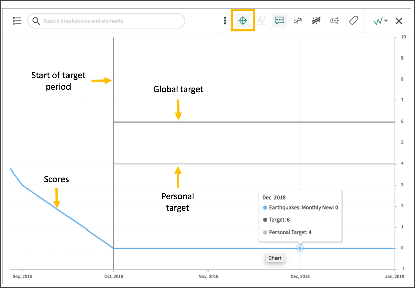
Which of the following can you do when you set a target for an indicator on the Analytics Hub? Select 3 Answers from the below options.
Correct
You can set target values for indicators. When you set a target for an indicator on the Analytics Hub, you can now do the following: * Set a start date in the future. * Set a review date on which to consider updating the target. * Set the target as an improvement on the average score or on the previous target. You can set the improvement as a percentage. You can have the targets apply only to specific breakdown elements and time series. The target starts to apply at a selected date and continues to apply until you set the next target. However, you can set a review date on which to reconsider the target. Screenshot: Creating, reviewing, and editing a target on the Analytics Hub Learn more here!
Incorrect
You can set target values for indicators. When you set a target for an indicator on the Analytics Hub, you can now do the following: * Set a start date in the future. * Set a review date on which to consider updating the target. * Set the target as an improvement on the average score or on the previous target. You can set the improvement as a percentage. You can have the targets apply only to specific breakdown elements and time series. The target starts to apply at a selected date and continues to apply until you set the next target. However, you can set a review date on which to reconsider the target. Screenshot: Creating, reviewing, and editing a target on the Analytics Hub Learn more here!
Unattempted
You can set target values for indicators. When you set a target for an indicator on the Analytics Hub, you can now do the following: * Set a start date in the future. * Set a review date on which to consider updating the target. * Set the target as an improvement on the average score or on the previous target. You can set the improvement as a percentage. You can have the targets apply only to specific breakdown elements and time series. The target starts to apply at a selected date and continues to apply until you set the next target. However, you can set a review date on which to reconsider the target. Screenshot: Creating, reviewing, and editing a target on the Analytics Hub Learn more here!
Question 2 of 32
2. Question
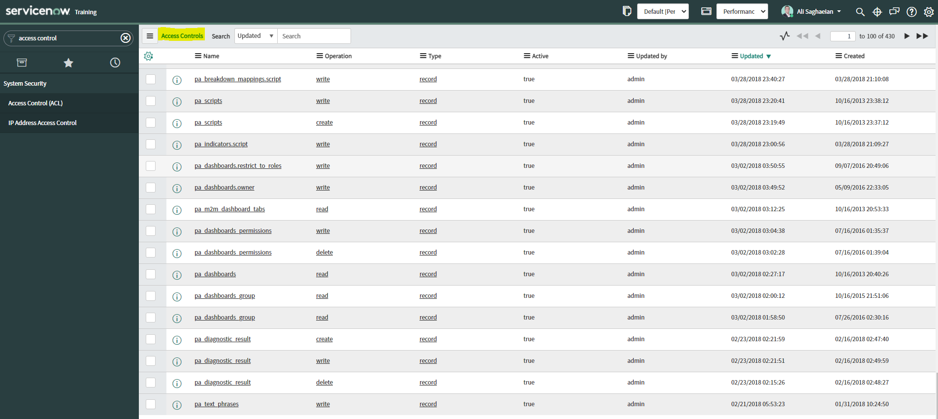
How can an admin improve the security of Performance Analytics?
Correct
There have been improvements to the security of Performance Analytics.
You can rely less on roles and more on access control lists (ACLs) to secure Performance Analytics.
On new instances, you no longer need the pa_viewer role to view the following items. Instead, indicator and breakdown ACLs are respected:
* Analytics Hub
* Text Analytics widgets
* KPI Details
* Breakdowns on workbench widgets
Performance Analytics widgets: In general, Performance Analytics widgets follow indicator and breakdown ACLs.
Targets and Thresholds: On the Analytics Hub, no roles are required to create personal targets and thresholds.
Screenshot: List of out-of-the-box Access Controls for Performance Analytics
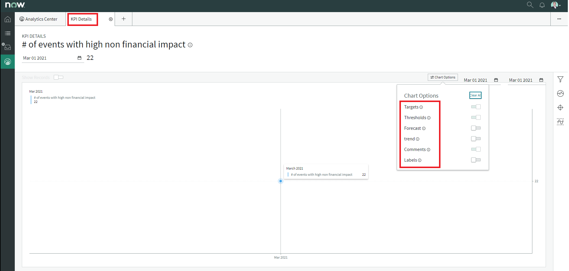
Which of the below items can be adjusted in KPI details? Select 3 Answers from the below options.
Correct
You can adjust targets, trendlines, forecasting, and comments in KPI Details.
You can create and edit KPI Details targets and modify KPI Details thresholds.
From a Workspace Experience, you can open KPI Details from the Analytics Center or a Performance Analytics widget. Other Now Experience applications may contain KPI Details or a component that links to KPI Details.
Screenshot: Different Chart Options on the KPI Details page
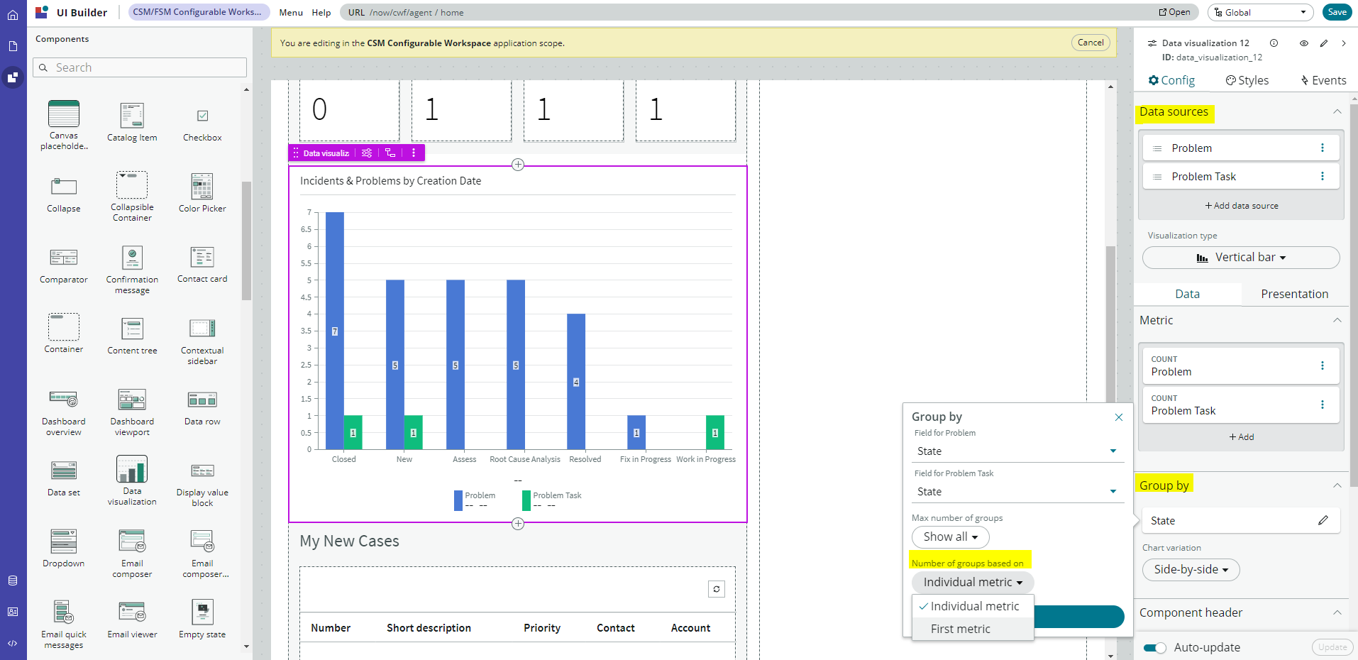
Which of the following is NOT a true statement regarding Performance Analytics visualisations?
Correct
The maximum number of groups for multiple data sources is either based on the first metric’s setting or set individually per source.
As an admin, you can configure a workspace to use Performance Analytics and Reporting visualisations. These visualisations show score, trend, proportional, and comparison data.
You can add multiple data sources of the same type for time series and bar visualisations but only one data source for pie, donut and single score visualisations.
You can continually visualise historical and real-time process statistics in role-based dashboards. The dashboards enable individual stakeholders to make informed decisions.
Screenshot: Options to set the number of groups for multiple data sources for a bar visualisation
Incorrect
The maximum number of groups for multiple data sources is either based on the first metric’s setting or set individually per source.
As an admin, you can configure a workspace to use Performance Analytics and Reporting visualisations. These visualisations show score, trend, proportional, and comparison data.
You can add multiple data sources of the same type for time series and bar visualisations but only one data source for pie, donut and single score visualisations.
You can continually visualise historical and real-time process statistics in role-based dashboards. The dashboards enable individual stakeholders to make informed decisions.
Screenshot: Options to set the number of groups for multiple data sources for a bar visualisation
Unattempted
The maximum number of groups for multiple data sources is either based on the first metric’s setting or set individually per source.
As an admin, you can configure a workspace to use Performance Analytics and Reporting visualisations. These visualisations show score, trend, proportional, and comparison data.
You can add multiple data sources of the same type for time series and bar visualisations but only one data source for pie, donut and single score visualisations.
You can continually visualise historical and real-time process statistics in role-based dashboards. The dashboards enable individual stakeholders to make informed decisions.
Screenshot: Options to set the number of groups for multiple data sources for a bar visualisation
Question 5 of 32
5. Question
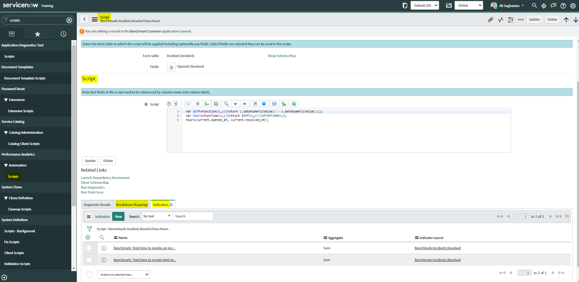
What related records can you create in Performance Analytics Script records? Select 2 Answers from the below options.
Correct
Script records have related lists for the breakdown mappings and indicators that use the script.
You can create a breakdown mapping or an indicator while you are in these lists.
The lists work like the Indicators list on indicator source records.
Performance Analytics provides several script objects for use in scripts and APIs for querying Performance Analytics data. The scripts serve as breakdown mappings or to calculate a value from an indicator.
Screenshot: PA Script record with the ‘Breakdown Mappings’ and ‘Indicators’ related lists
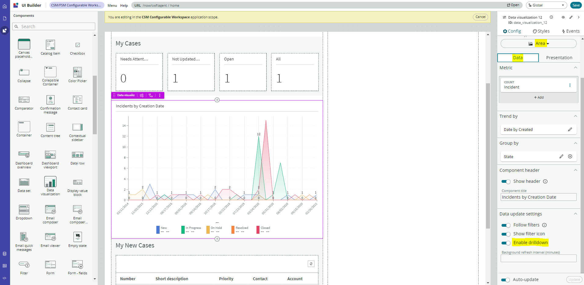
What option needs to be set for a workspace to allow users to click a visualisation value to display its data subset?
Correct
Enable drilldown is used for reports with a defined drilldown. It enables users to click a visualisation value or section and display its data subset.
For example, an agent clicks a single score value and is navigated to the underlying list of high priority cases.
‘Follow filters’ can be set for a workspace page. When enabled, the visualisation displays on a workspace with the filters set by the page. Toggle off to disable a visualisation from accepting any filter input.
The other options do not exist in the UI Builder for a workspace.
Screenshot: Setting the ‘Enable drilldown’ option from the UI Builder Data tab
Once upgraded to Quebec, what access should you provide to previous KPI Signals users to act on a signal?
Correct
If you have been using KPI Signals since Paris, assign a level of responsibility to all users who should act on a signal. Users with the admin, pa_admin, or pa_kpi_signal_admin role can reset a baseline or dismiss a signal without being a responsible user. Users with other roles must become responsible users to take such actions. These users also need a role that gives them access to a relevant workspace. Screenshot: Making yourself a responsible user for a KPI by activating KPI Signals for that KPI Learn more here!
Incorrect
If you have been using KPI Signals since Paris, assign a level of responsibility to all users who should act on a signal. Users with the admin, pa_admin, or pa_kpi_signal_admin role can reset a baseline or dismiss a signal without being a responsible user. Users with other roles must become responsible users to take such actions. These users also need a role that gives them access to a relevant workspace. Screenshot: Making yourself a responsible user for a KPI by activating KPI Signals for that KPI Learn more here!
Unattempted
If you have been using KPI Signals since Paris, assign a level of responsibility to all users who should act on a signal. Users with the admin, pa_admin, or pa_kpi_signal_admin role can reset a baseline or dismiss a signal without being a responsible user. Users with other roles must become responsible users to take such actions. These users also need a role that gives them access to a relevant workspace. Screenshot: Making yourself a responsible user for a KPI by activating KPI Signals for that KPI Learn more here!
Question 8 of 32
8. Question
What does the long-term absence of signals indicate?
Correct
When KPI Signals detects abnormal variation in the scores of a KPI, it generates a signal. When KPI Signals does not detect abnormal variation for a significant amount of time, it generates an anti-signal. The anti-signal lets you know that your workflow is under control. Both the presence and absence of signals convey information: The presence of signals lets you know that a workflow has changed or at least is not statistically stable. The long-term absence of signals indicates that a workflow is statistically stable. With this information, you can decide to launch a process improvement initiative, for example. Screenshot: Example of not detecting a signal for 28 days, so it shows a 28-day anti-signal. Learn more here!
Incorrect
When KPI Signals detects abnormal variation in the scores of a KPI, it generates a signal. When KPI Signals does not detect abnormal variation for a significant amount of time, it generates an anti-signal. The anti-signal lets you know that your workflow is under control. Both the presence and absence of signals convey information: The presence of signals lets you know that a workflow has changed or at least is not statistically stable. The long-term absence of signals indicates that a workflow is statistically stable. With this information, you can decide to launch a process improvement initiative, for example. Screenshot: Example of not detecting a signal for 28 days, so it shows a 28-day anti-signal. Learn more here!
Unattempted
When KPI Signals detects abnormal variation in the scores of a KPI, it generates a signal. When KPI Signals does not detect abnormal variation for a significant amount of time, it generates an anti-signal. The anti-signal lets you know that your workflow is under control. Both the presence and absence of signals convey information: The presence of signals lets you know that a workflow has changed or at least is not statistically stable. The long-term absence of signals indicates that a workflow is statistically stable. With this information, you can decide to launch a process improvement initiative, for example. Screenshot: Example of not detecting a signal for 28 days, so it shows a 28-day anti-signal. Learn more here!
Question 9 of 32
9. Question
What are the different dynamic filter options when filtering on breakdown elements? Select 3 Answers from the below options.
Correct
When filtering on breakdown elements, you can apply the [is (dynamic)] filter option.
This option shows personalised data applicable only to the person viewing the visualisation.
Element filter options include: ‘One of my groups’, ‘Groups I manage’, and ‘Me’.
The personalisation comes about through using a dynamic condition on the filter, such as [is (dynamic)] [me].
You can configure visuals with dynamic elements to show information that applies only to the person looking at the visual on a dashboard, service portal, or Workspace canvas.
Note: Personalised visuals apply only to first-level breakdowns.
Screenshot: The element filter for the ‘Groups I manage’ with a dynamic condition
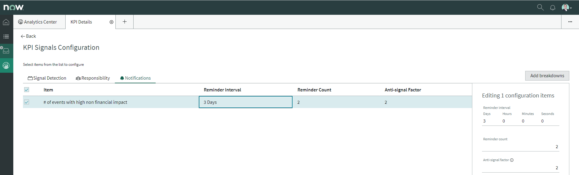
How are responsible users reminded when a signal remains unresolved?
Correct
As a responsible user, you receive email reminders about signals that have not been resolved. You can configure how frequently you get these reminders and the maximum number of reminders to get for a signal. Responsible users get email notifications about the following: * New signals * Unresolved signals * Actions to resolve signals * ‘Anti-signals,‘ which indicate that a KPI is long-term stable Even responsible users without workspace access get these email notifications. Screenshot: Setting reminder notifications on the KPI Signals Configuration Learn more here!
Incorrect
As a responsible user, you receive email reminders about signals that have not been resolved. You can configure how frequently you get these reminders and the maximum number of reminders to get for a signal. Responsible users get email notifications about the following: * New signals * Unresolved signals * Actions to resolve signals * ‘Anti-signals,‘ which indicate that a KPI is long-term stable Even responsible users without workspace access get these email notifications. Screenshot: Setting reminder notifications on the KPI Signals Configuration Learn more here!
Unattempted
As a responsible user, you receive email reminders about signals that have not been resolved. You can configure how frequently you get these reminders and the maximum number of reminders to get for a signal. Responsible users get email notifications about the following: * New signals * Unresolved signals * Actions to resolve signals * ‘Anti-signals,‘ which indicate that a KPI is long-term stable Even responsible users without workspace access get these email notifications. Screenshot: Setting reminder notifications on the KPI Signals Configuration Learn more here!
Question 11 of 32
11. Question
Which of the following items can you view without the pa_viewer role if the indicator and breakdown ACLs are respected? Select 2 Answers from the below options.
Correct
You can rely less on roles and more on access control lists (ACLs) to secure Performance Analytics.
On new instances, you no longer need the pa_viewer role to view the following items. Instead, indicator and breakdown ACLs are respected:
* Analytics Hub
* Text Analytics widgets
* KPI Details
* Breakdowns on workbench widgets
Performance Analytics widgets: In general, Performance Analytics widgets follow indicator and breakdown ACLs.
Targets and Thresholds: On the Analytics Hub, no roles are required to create personal targets and thresholds.
Which of the following styling options is NOT available with the data visualisation component configuration in workspaces?
Correct
The data visualisation component configuration adds more options and an enhanced user interface.
You can configure new visualisations in Workspace from tables and indicators using the Data Visualisation configuration.
From the UI Builder, you can add visualisations to your landing page based on Performance Analytics and Reporting data. Configure a new visualisation by dragging the Data Visualisation configuration icon onto the Stage pane.
The following styling options are added in the Quebec release:
* Show or hide a visualisation component header on a landing page, along with its label and icons.
* Change score sizes of single score visualisations.
* Set default, palette, or single colour options for data display.
* Sort on categories in bar, pie, and donut visualisations based on table data sources.
* Define data label positions and show labels that overlap on bar visualisations.
Creating a new visualisation type is not an available styling option.
Screenshot: Adding a Data Visualisation in the UI Builder for a workspace
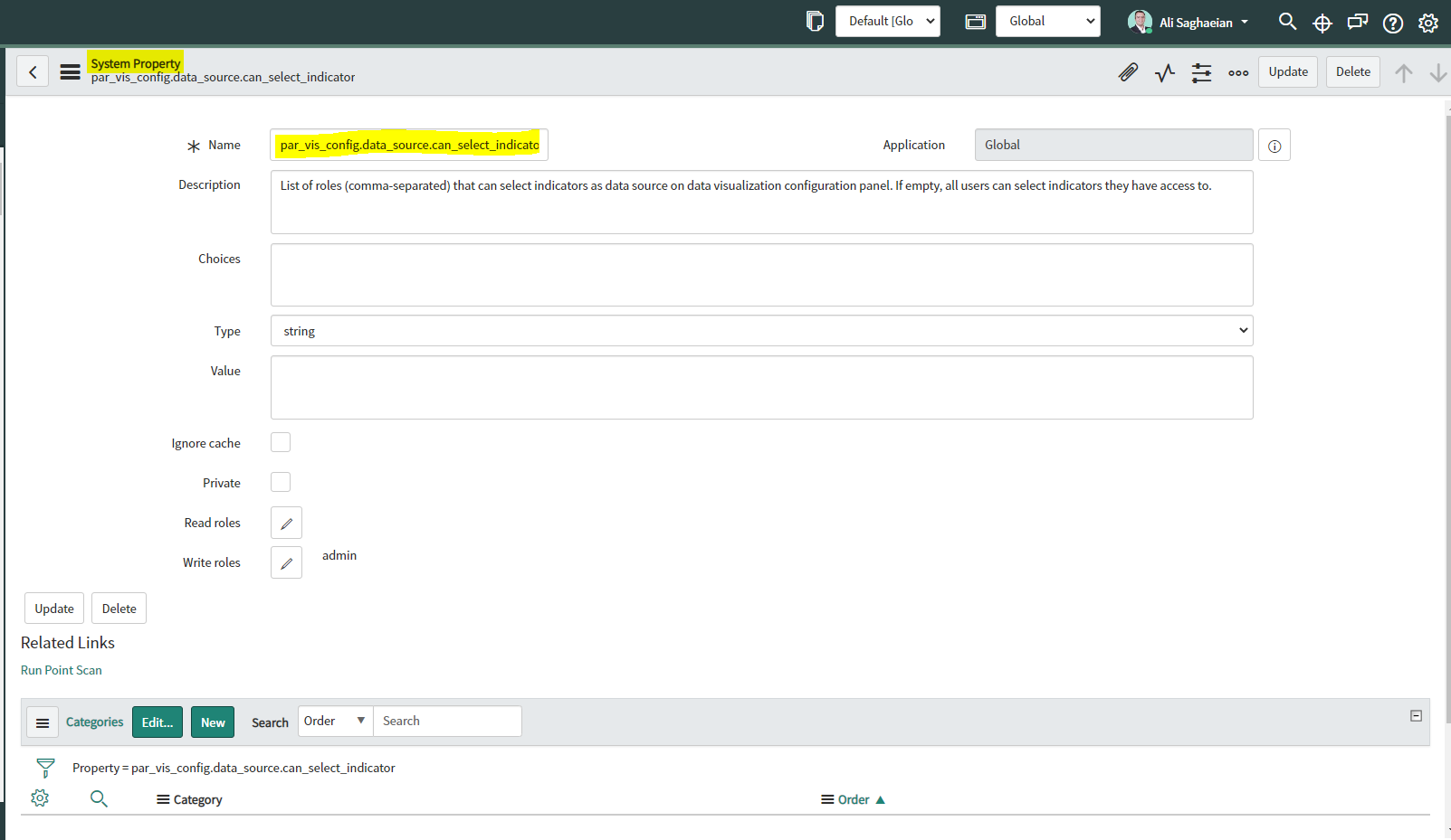
Which system property enables an administrator to allow specified user roles to select indicators as data sources from the Data Visualisation Configuration panel?
Correct
par_vis_config.data_source.can_select_indicator property specifies roles (comma-separated) which can select indicators as data sources from the Data Visualisation configuration panel. If empty, all users can select the indicator sources that they have access to.
Type: string
Default value: empty
Location: System Property [sys_properties] table
com.snc.pa.dc.max_row_count_indicator_source property sets the maximum number of rows allowed to be fetched from an Indicator Source.
glide.source_control.checksum_required property allows you to enable optional checksum validations and sanitisations.
glide.knowman.search.apply_role_based_security property honours read access to knowledge bases or articles specified for roles if set to true. If false, it enables specified user criteria to override read access specified for roles.
Screenshot: The system property for allowing roles to select indicators as data sources
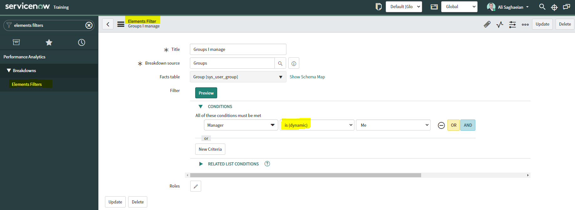
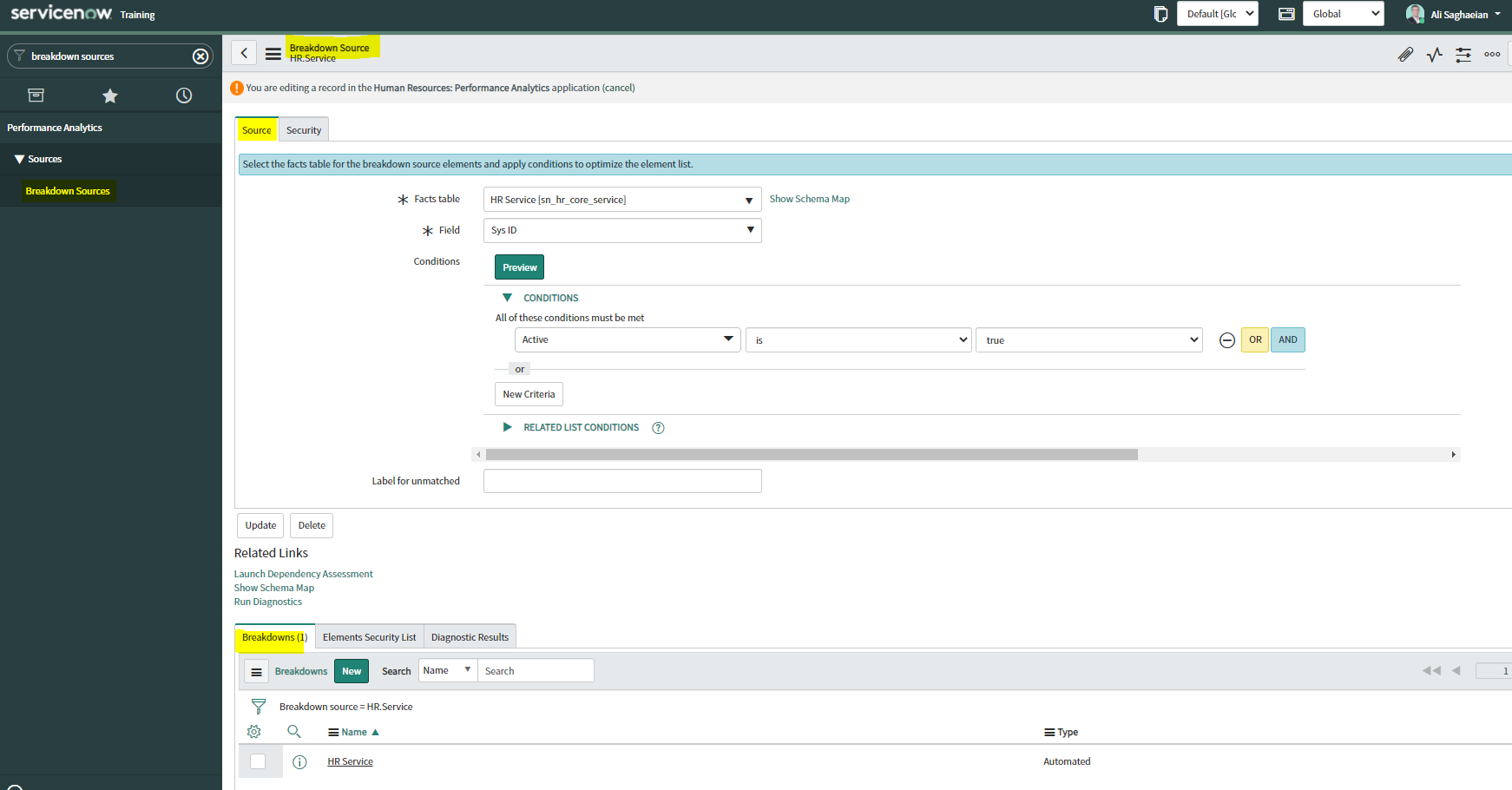
What condition do you use on the Elements Filter record for the Groups Breakdown Source to get only groups that had an incident assigned to them?
Correct
When you create an element filter, you can include conditions on a related field in a different table than the breakdown source table. Element filters enable you to limit the displayed breakdown elements on an Analytics Hub or widget using filter conditions, including personalised visuals. You can select an element filter when viewing breakdowns on an Analytics Hub or configuring a breakdown widget. For example, you could create an element filter on the Groups breakdown source, which uses the Group [sys_user_group] table. If you added a related list condition on Incident [incident]->Assignment group, you would get only groups that had an incident assigned to them. If this condition included [[Created][on][Last 6 Months]], you would get groups that were assigned an incident that was created within the last six months. Screenshot: Applying Related List Conditions on the Elements Filter record Learn more here!
Incorrect
When you create an element filter, you can include conditions on a related field in a different table than the breakdown source table. Element filters enable you to limit the displayed breakdown elements on an Analytics Hub or widget using filter conditions, including personalised visuals. You can select an element filter when viewing breakdowns on an Analytics Hub or configuring a breakdown widget. For example, you could create an element filter on the Groups breakdown source, which uses the Group [sys_user_group] table. If you added a related list condition on Incident [incident]->Assignment group, you would get only groups that had an incident assigned to them. If this condition included [[Created][on][Last 6 Months]], you would get groups that were assigned an incident that was created within the last six months. Screenshot: Applying Related List Conditions on the Elements Filter record Learn more here!
Unattempted
When you create an element filter, you can include conditions on a related field in a different table than the breakdown source table. Element filters enable you to limit the displayed breakdown elements on an Analytics Hub or widget using filter conditions, including personalised visuals. You can select an element filter when viewing breakdowns on an Analytics Hub or configuring a breakdown widget. For example, you could create an element filter on the Groups breakdown source, which uses the Group [sys_user_group] table. If you added a related list condition on Incident [incident]->Assignment group, you would get only groups that had an incident assigned to them. If this condition included [[Created][on][Last 6 Months]], you would get groups that were assigned an incident that was created within the last six months. Screenshot: Applying Related List Conditions on the Elements Filter record Learn more here!
Question 17 of 32
17. Question
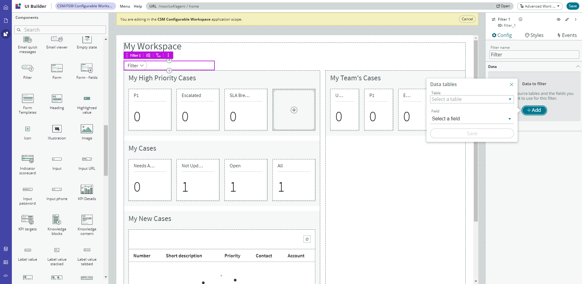
Which of the following statements are true about creating User Experience filters? Select 3 Answers from the below options.
Correct
You can create a single filter for use across all the visualisations in a workspace. Creating User Experience filters requires admin access. The filter you create is available in the workspace in which you created it. For filters to work in workspaces, you must configure an event handler to apply the filters. Screenshot: Using Now Experience UI Builder to create a filter for a workspace
Incorrect
You can create a single filter for use across all the visualisations in a workspace. Creating User Experience filters requires admin access. The filter you create is available in the workspace in which you created it. For filters to work in workspaces, you must configure an event handler to apply the filters. Screenshot: Using Now Experience UI Builder to create a filter for a workspace
Unattempted
You can create a single filter for use across all the visualisations in a workspace. Creating User Experience filters requires admin access. The filter you create is available in the workspace in which you created it. For filters to work in workspaces, you must configure an event handler to apply the filters. Screenshot: Using Now Experience UI Builder to create a filter for a workspace
Question 18 of 32
18. Question
What does anti-signal indicate in KPI Signals?
Correct
KPI Signals issues anti-signals to indicate long-term stability. Use anti-signals to make decisions based on the knowledge that your workflow is statistically stable over the long term. For example, use this information to plan improvement initiatives. When KPI Signals detects abnormal variation in the scores of a KPI, it generates a signal. When KPI Signals does not detect abnormal variation for a significant amount of time, it generates an anti-signals. The anti-signal lets you know that your workflow is under control. Both the presence and absence of signals convey information: * The presence of signals lets you know that a workflow has changed or at least is not statistically stable. * The long-term absence of signals indicates that a workflow is statistically stable. With this information, you can decide to launch a process improvement initiative, for example. Screenshot 1: Example of a Signal Screenshot 2: Example of an Anti-signal Screenshot 3: Example of No signal Learn more here!
Incorrect
KPI Signals issues anti-signals to indicate long-term stability. Use anti-signals to make decisions based on the knowledge that your workflow is statistically stable over the long term. For example, use this information to plan improvement initiatives. When KPI Signals detects abnormal variation in the scores of a KPI, it generates a signal. When KPI Signals does not detect abnormal variation for a significant amount of time, it generates an anti-signals. The anti-signal lets you know that your workflow is under control. Both the presence and absence of signals convey information: * The presence of signals lets you know that a workflow has changed or at least is not statistically stable. * The long-term absence of signals indicates that a workflow is statistically stable. With this information, you can decide to launch a process improvement initiative, for example. Screenshot 1: Example of a Signal Screenshot 2: Example of an Anti-signal Screenshot 3: Example of No signal Learn more here!
Unattempted
KPI Signals issues anti-signals to indicate long-term stability. Use anti-signals to make decisions based on the knowledge that your workflow is statistically stable over the long term. For example, use this information to plan improvement initiatives. When KPI Signals detects abnormal variation in the scores of a KPI, it generates a signal. When KPI Signals does not detect abnormal variation for a significant amount of time, it generates an anti-signals. The anti-signal lets you know that your workflow is under control. Both the presence and absence of signals convey information: * The presence of signals lets you know that a workflow has changed or at least is not statistically stable. * The long-term absence of signals indicates that a workflow is statistically stable. With this information, you can decide to launch a process improvement initiative, for example. Screenshot 1: Example of a Signal Screenshot 2: Example of an Anti-signal Screenshot 3: Example of No signal Learn more here!
Question 19 of 32
19. Question
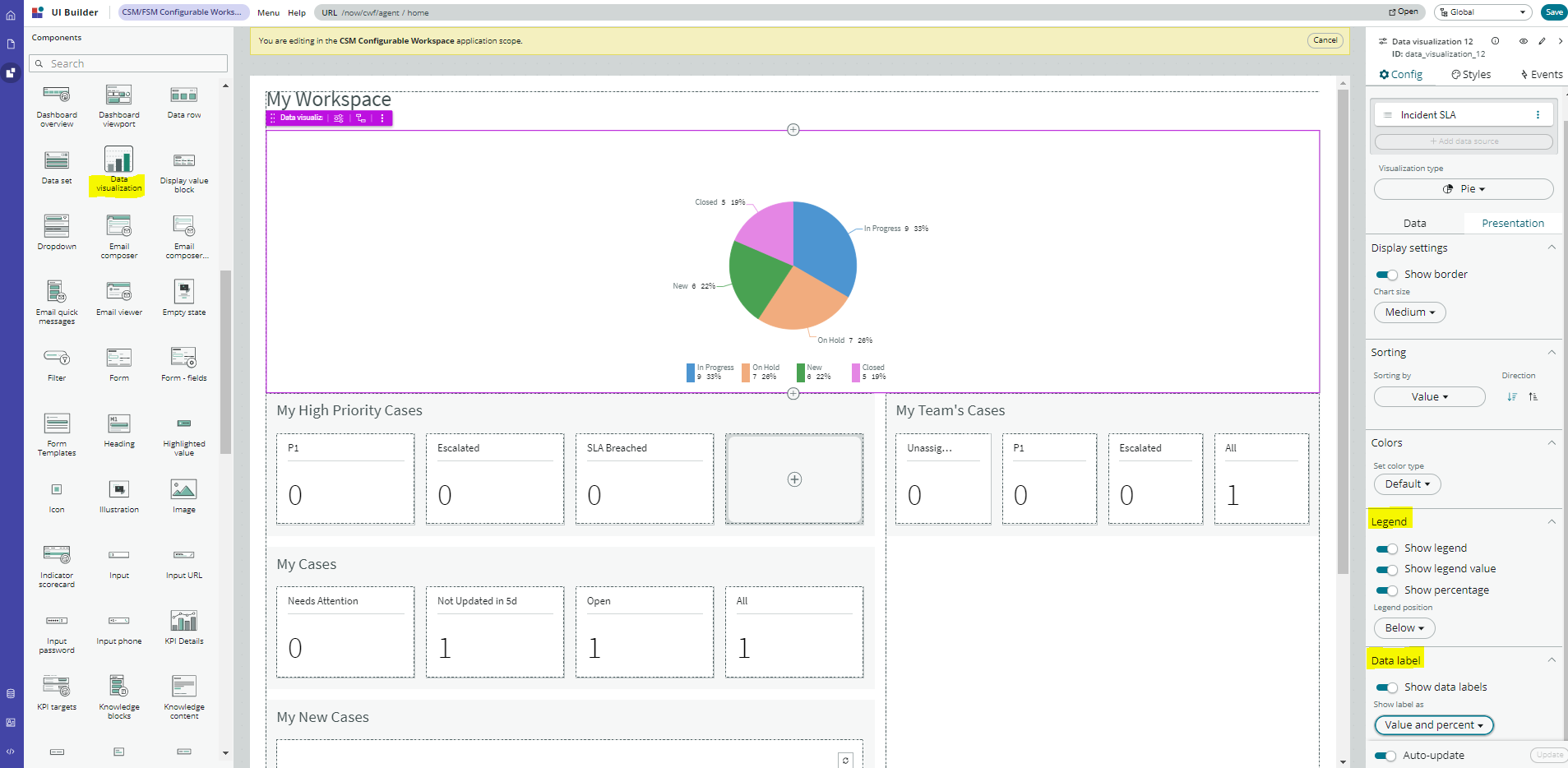
Which of the following are true statements about configuring pie, donut, and single score visualisations in workspaces?
Correct
A pie visualisation shows how individual pieces of data relate to the whole using a circle to represent the whole.
A Donut visualization shows how individual pieces of data relate to the whole using a donut shape to represent the whole.
Single score visualisations display a single, key business value or current aggregate indicator score. You can set a score to update in real-time.
The following enhancements are made to pie, donut, and single score visualisations in the Quebec release:
* The metric label name is displayed near the metric value.
* Legend percentages are shown along with values.
* Data labels are shown as only percentages, as values, or as both.
Gradient, texture, or no colour are not valid colour options for data display.
You can set ‘default’, ‘colour palette’ and ‘fixed element colour’ for pie and donut visualisations, and ‘default’ and ‘single colour’ for single score visualisations.
Screenshot: Configuration options for a pie chart visualisation in a workspace on UI Builder
What is an easy way for a responsible user to get real-time updates on the signals for a particular KPI?
Correct
As a responsible user, you can receive email notifications about new or unresolved signals, anti-signals, or any actions taken on signals.
You can configure how frequently you get these reminders and the maximum number of reminders to get for a signal.
You no longer have to open KPI Signals and manually check each KPI for signals.
Scheduling a report for the signal data does not provide real-time updates.
Manually check the KPI for signals and monitoring the signal score on a dashboard requires the user to constantly check for the updates without a pause, which is not easy.
Screenshot: Setting notification for a KPI in the KPI Signals Configuration
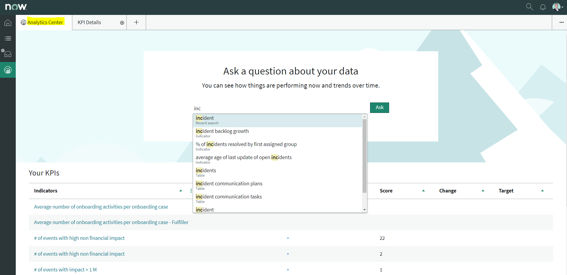
Which of the following are suggested when you type in a query on Analytics Q&A? Select 3 Answers from the below options.
Correct
When you use Analytics Q&A, the suggestions from previous searches are now shown together with the suggested indicators, tables, and columns.
As you type in a query, Analytics Q&A suggests recent searches, indicators, tables, and columns that match what you have typed so far. Only the tables and columns to which you have access are shown.
If Analytics Q&A cannot determine which table you want, it shows you up to three likely tables.
Screenshot: Different suggestions when searching for ‘incident’ on Analytics Q&A
How do you create and associate breakdowns on the breakdown source form?
Correct
A breakdown source is defined as a set of records from a table or database view or as a bucket group. Multiple breakdowns can use the same breakdown source.
Breakdown sources specify which unique values, called breakdown elements, a breakdown contains.
Breakdown source records have a related list that lists the breakdowns that are based on that source. You can create a breakdown by selecting the ‘New’ button while in this list. The list works like the Indicators list on indicator source records.
Other options in this question do not exist on the breakdown source form.
After you create breakdowns that use this source, these breakdowns are listed in the Breakdowns tab.
Screenshot: List of associated Breakdowns on a Breakdown Source form
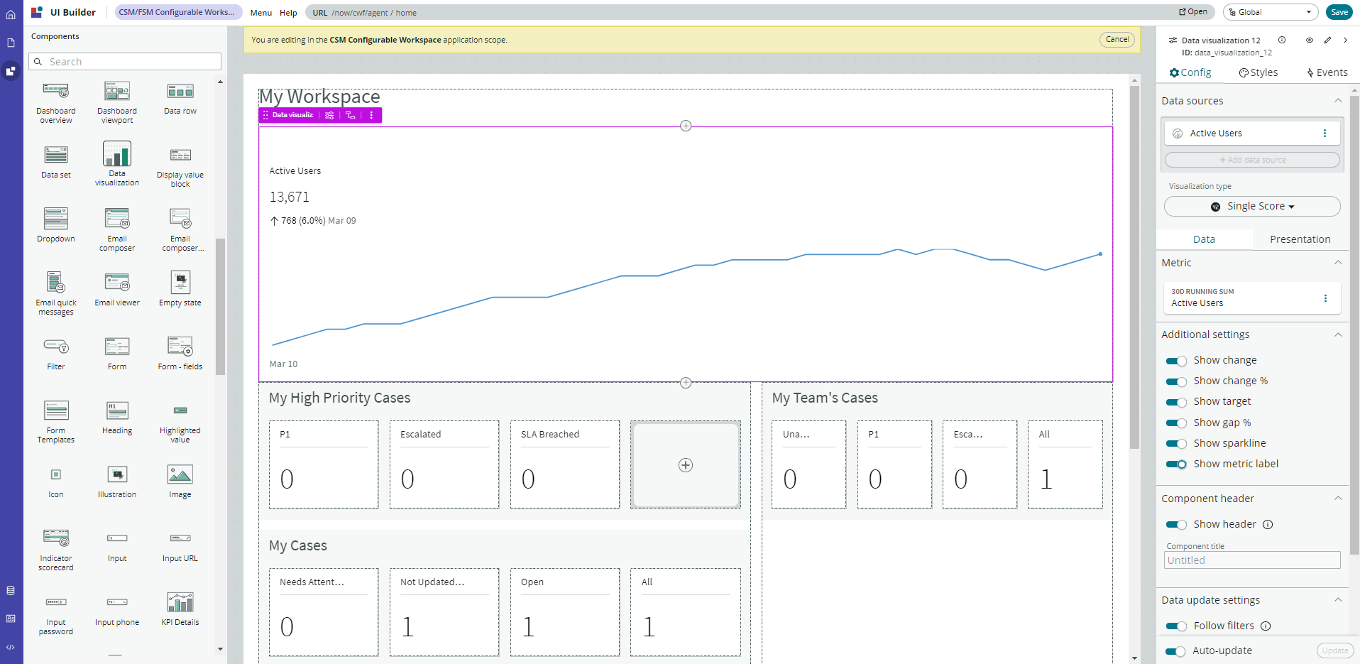
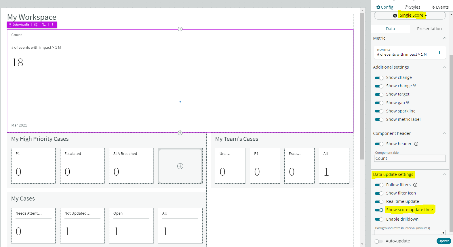
Which of the following data update settings for single score visualisations shows the timestamp of when the score was last updated?
Correct
Show score update time’ shows the timestamp of when the score was last updated.
‘Follow filters’ set for a workspace page. When enabled, the visualisation displays on a workspace with the filters set by the page. Toggle off to disable a visualisation from accepting any filter input.
‘Background refresh interval (minutes)’ shows how often, in minutes, the landing page refreshes the visualisation if you have navigated away from it.
‘Real time update’ updates score in real-time.
Screenshot: Different data update settings for a single score visualisation in the UI Builder
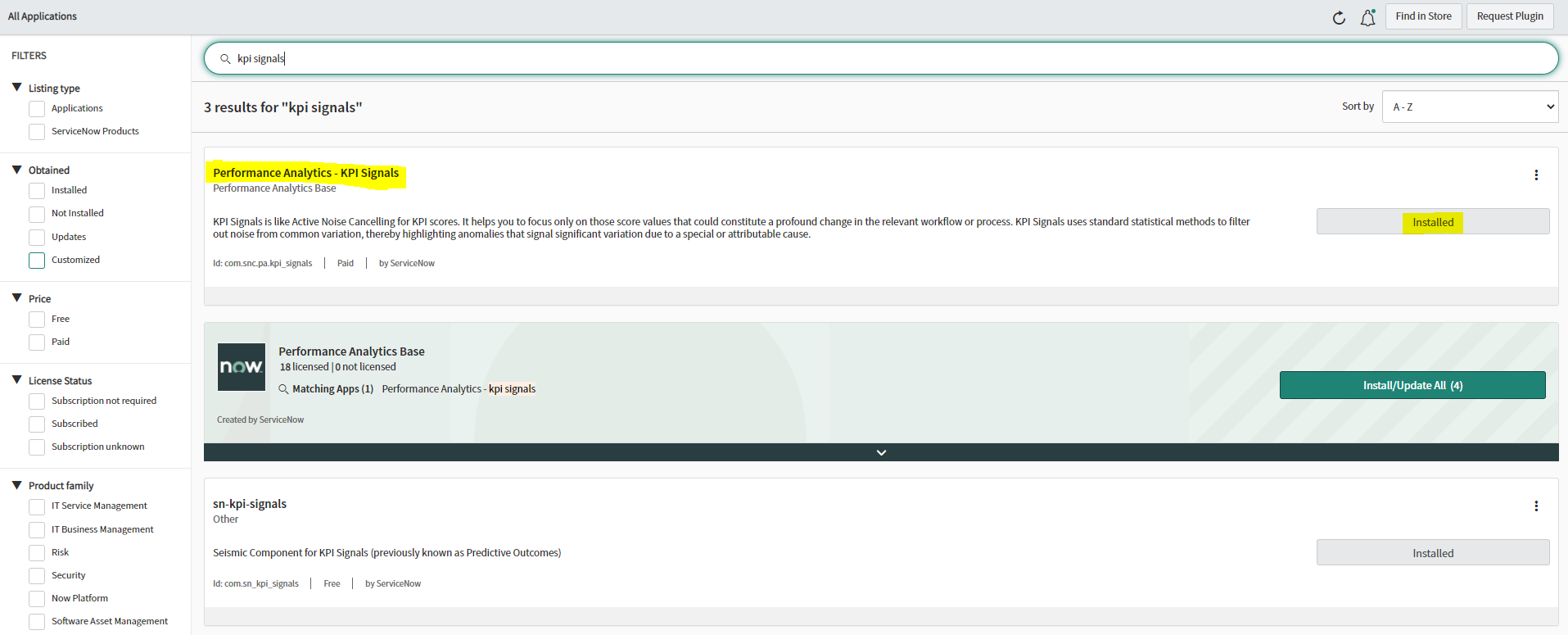
You no longer have to activate the KPI Signals (com.snc.pa.kpi_signals) plugin. It is active by default.
If you do not want this feature, request a Now Platform administrator to set the property com.snc.pa.activate_kpi_signals to false. Because this property does not exist by default, the administrator must add it.
If you reactivate KPI Signals, signal detection resumes from the time you originally deactivated the feature, not from the time you reactivated it.
Screenshot: The KPI Signals plugin, which is active/installed by default
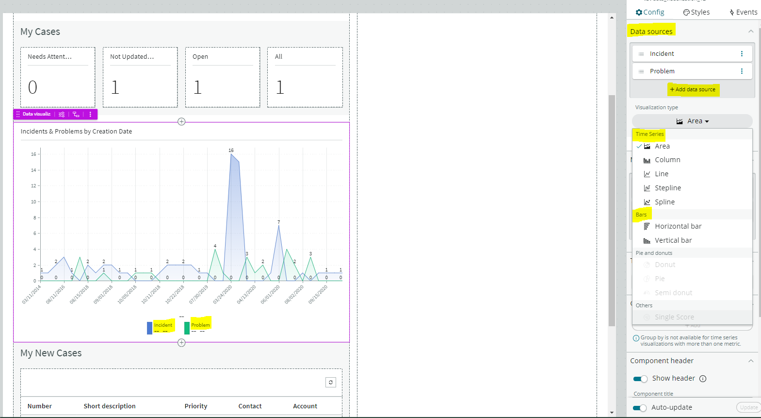
Which of the following visualisation types allow you to add multiple data sources of the same type in the UI Builder?
Select 2 Answers from the below options.
Correct
You can add multiple data sources of the same type for time series (including Area, Column, Line, Stepline, and Spline) and bar (including Horizontal bar and Vertical bar) visualisations.
Screenshot: Adding multiple data sources for a time series visualisation
You can add multiple data sources of the same type for time series (including Area, Column, Line, Stepline, and Spline) and bar (including Horizontal bar and Vertical bar) visualisations.
Screenshot: Adding multiple data sources for a time series visualisation
You can add multiple data sources of the same type for time series (including Area, Column, Line, Stepline, and Spline) and bar (including Horizontal bar and Vertical bar) visualisations.
Screenshot: Adding multiple data sources for a time series visualisation
What role or access do users need to act on a signal to reset a baseline or dismiss a signal?
Correct
Users with the admin, pa_admin, or pa_kpi_signal_admin role can reset a baseline or dismiss a signal without being a responsible user. Users with other roles must become responsible users to take such actions. These users also need a role that gives them access to a relevant workspace. You can assign responsibility for KPI Signals for a KPI to yourself or someone else. You can also unassign responsibility. Screenshot: Opening the KPI Signals configuration for an indicator, allowing to Reset Baseline or Dismiss Signal Learn more here!
Incorrect
Users with the admin, pa_admin, or pa_kpi_signal_admin role can reset a baseline or dismiss a signal without being a responsible user. Users with other roles must become responsible users to take such actions. These users also need a role that gives them access to a relevant workspace. You can assign responsibility for KPI Signals for a KPI to yourself or someone else. You can also unassign responsibility. Screenshot: Opening the KPI Signals configuration for an indicator, allowing to Reset Baseline or Dismiss Signal Learn more here!
Unattempted
Users with the admin, pa_admin, or pa_kpi_signal_admin role can reset a baseline or dismiss a signal without being a responsible user. Users with other roles must become responsible users to take such actions. These users also need a role that gives them access to a relevant workspace. You can assign responsibility for KPI Signals for a KPI to yourself or someone else. You can also unassign responsibility. Screenshot: Opening the KPI Signals configuration for an indicator, allowing to Reset Baseline or Dismiss Signal Learn more here!
Question 28 of 32
28. Question
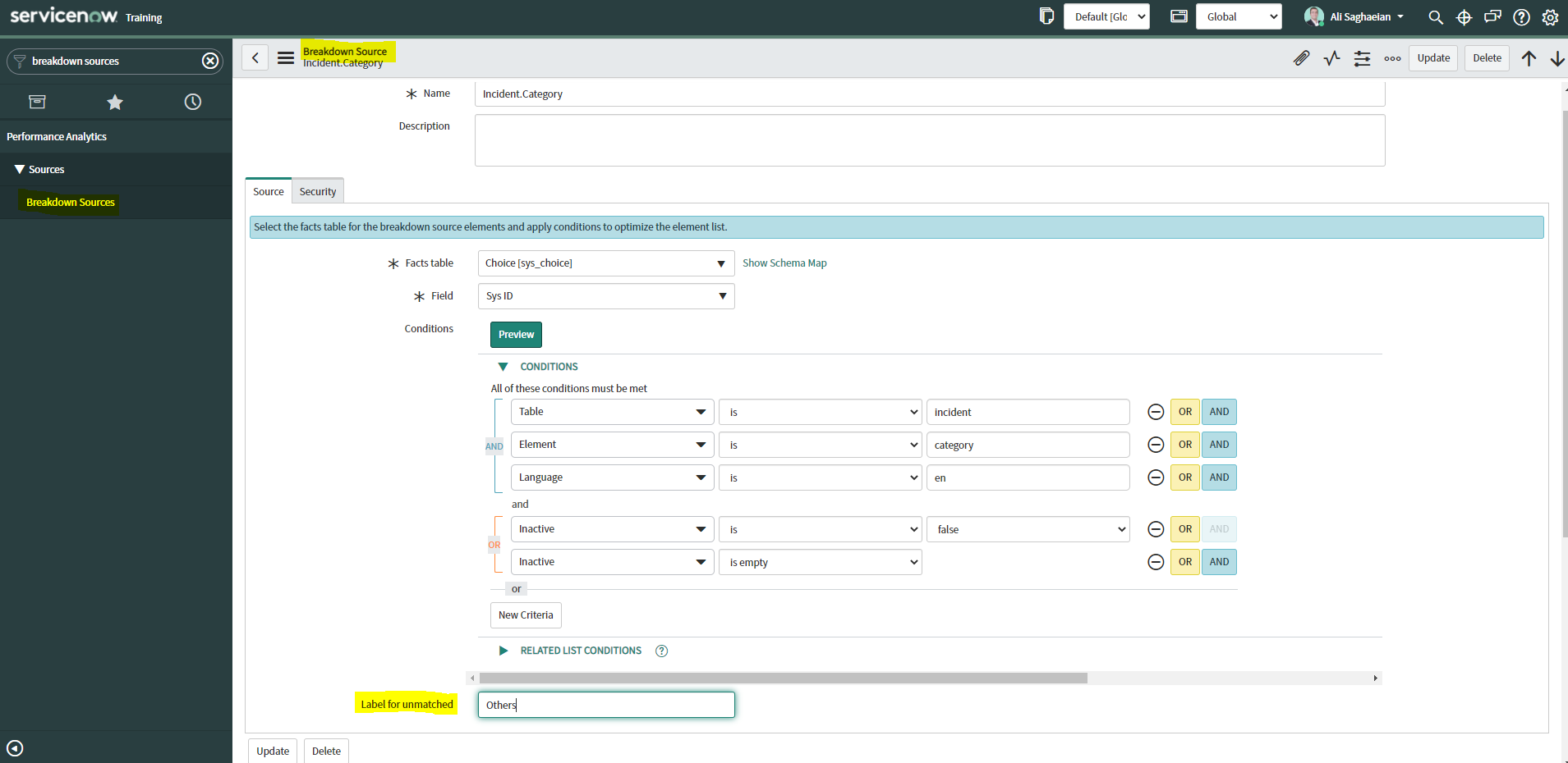
What option on the breakdown source record helps provide views into whether you need to create additional breakdowns or adjust data values?
Correct
When you select an indicator as the data source, you can filter the results by breakdown and breakdown element.
If you have the ‘Label for unmatched’ field defined on the breakdown source for a selected breakdown, this label appears in your choice of Elements.
Select the label to display scores that do not match any of the elements.
This option helps provide views into whether you need to create additional breakdowns or adjust data values.
Screenshot: Selecting a value for the Label for unmatched field on the breakdown source record
What calendar type can you use to analyse scores using time periods?
Correct
Analyse scores using time periods from a custom business calendar instead of only the standard calendar. When you are creating an Indicator Source, you can select either the standard calendar or a business calendar defined on the instance. If you use a business calendar, you can create data collection jobs that run on the Business Calendar: Entry start or Business Calendar: Entry end times. If you select a business calendar, you have the Calendar Frequency field. This field is required. The business calendar you selected determines the range of available frequencies. (Optional) If you have configured this indicator source to use a business calendar, set the number of periods to retain scores and snapshots and find seasonal patterns. Image: Business calendar schedule example for the month of December Learn more here!
Incorrect
Analyse scores using time periods from a custom business calendar instead of only the standard calendar. When you are creating an Indicator Source, you can select either the standard calendar or a business calendar defined on the instance. If you use a business calendar, you can create data collection jobs that run on the Business Calendar: Entry start or Business Calendar: Entry end times. If you select a business calendar, you have the Calendar Frequency field. This field is required. The business calendar you selected determines the range of available frequencies. (Optional) If you have configured this indicator source to use a business calendar, set the number of periods to retain scores and snapshots and find seasonal patterns. Image: Business calendar schedule example for the month of December Learn more here!
Unattempted
Analyse scores using time periods from a custom business calendar instead of only the standard calendar. When you are creating an Indicator Source, you can select either the standard calendar or a business calendar defined on the instance. If you use a business calendar, you can create data collection jobs that run on the Business Calendar: Entry start or Business Calendar: Entry end times. If you select a business calendar, you have the Calendar Frequency field. This field is required. The business calendar you selected determines the range of available frequencies. (Optional) If you have configured this indicator source to use a business calendar, set the number of periods to retain scores and snapshots and find seasonal patterns. Image: Business calendar schedule example for the month of December Learn more here!
Question 30 of 32
30. Question
How does KPI Signals support notifications?
Correct
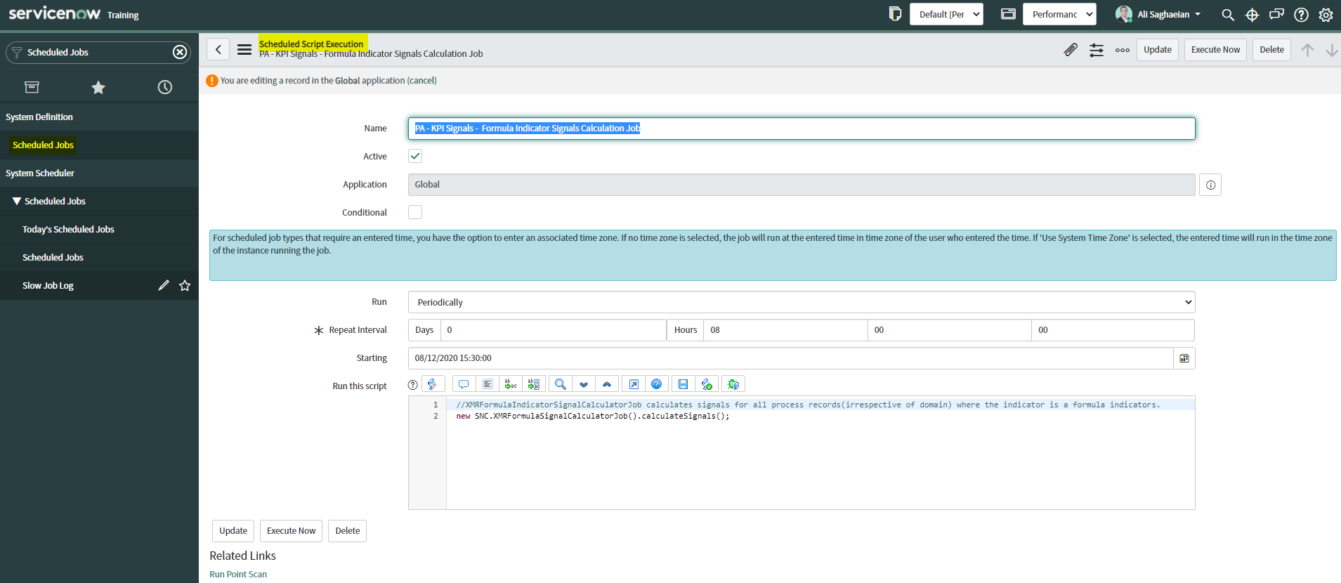
To support notifications, the KPI Signals application provides automated signal detection jobs. For formula indicators, you can modify the jobs to line up with the data collection jobs for the contributing indicators.
The KPI Signals application includes jobs that detect signals automatically. These jobs run so responsible users can be notified of new signals without opening the application. The job for signals on formula indicators requires scheduling.
When you view an indicator in KPI Details and open the KPI Signals panel, that indicator is checked for signals. You, therefore, always have the most up-to-date signals. However, the KPI Signals application also has automated signal detection jobs. These jobs send notifications about signals to subscribed users without them having the application open.
Screenshot: PA – KPI Signals – Formula Indicator Signals Calculation Job
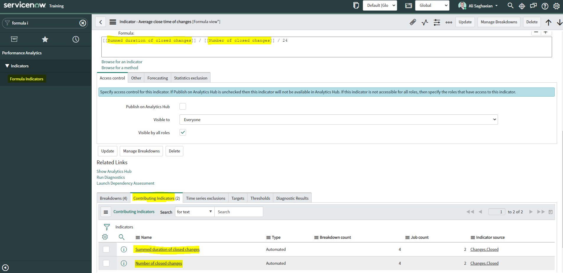
What ‘related lists‘ are available on the formula indicator form?
Select 3 Answers from the below options.
Correct
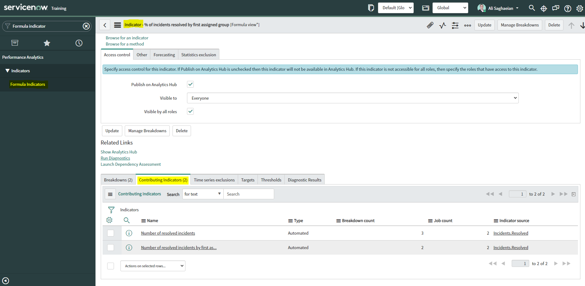
Here are the available related lists on the baseline configuration when navigating to the Formula Indicators form: Breakdowns, Contributing Indicators, Time series exclusions, Targets, Thresholds, and Diagnostic Results.
‘Signals’ is not an out-of-the-box related list on the Formula Indicators form.
Use the Contributing indicators related list to navigate to the indicators used in the formula or their indicator sources. If you include another formula indicator in the formula, both that indicator and its contributing indicators are listed.
Screenshot: The related lists on a formula indicator record
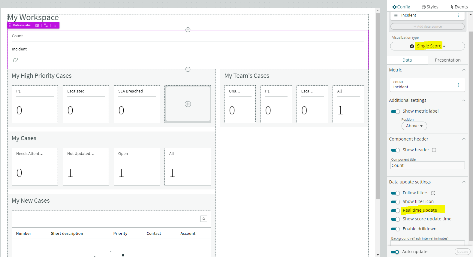
What data update settings can you enable for a single score visualisation to update the score in real-time?
Correct
Enabling ‘Real time update’ from the data update settings updates a single score visualisation in real-time.
‘Show score update time’ shows the timestamp of when the score was last updated.
‘Background refresh interval (minutes)’ shows how often, in minutes, the landing page refreshes the visualisation if you have navigated away from it.
With ‘Live refresh rate (seconds)’, you can choose the frequency in non-decimal seconds to have a single score reporting widget refresh. If set at ‘0’, the score does not refresh.
Screenshot: Selecting the ‘Real time update’ option on the UI Builder data update settings